
Offer alternatives
Accessibility is a lot about offering people alternatives.
Here’s an example from “real life”. When I was user testing with people with disabilities, this slider proved to be an obstacle for people with motor impairments. It was difficult to set it to the specific value the users wanted to.
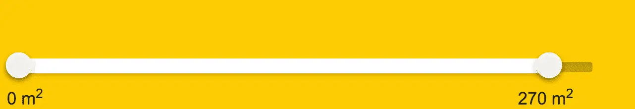
We solved it by offering an alternative. Users can now either use the slider or input the numbers directly in the input fields.
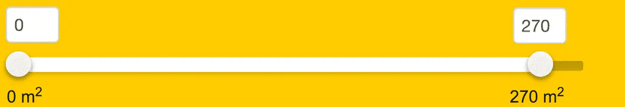
This turned out great for mobile users as well. Their fingers were previously covering the value under the slider as they were adjusting it. Now they could see it above the slider in the input fields as well. A win for everyone.
Here are some other examples of offering alternatives to users:
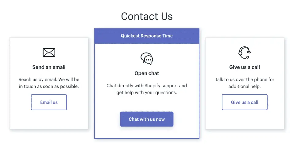
Instead of forcing people to call customer service, offer an alternative to write in a chat or email.
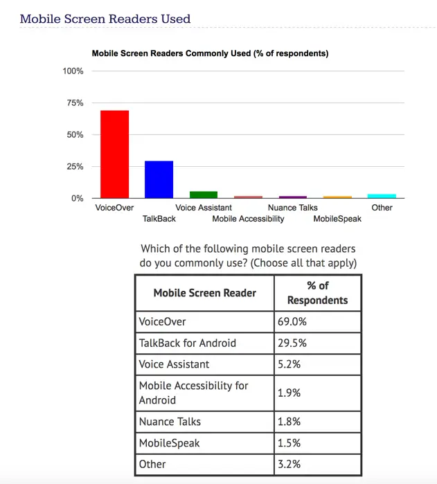
Instead of forcing people to understand a diagram, offer an alternative to see the data in a table:
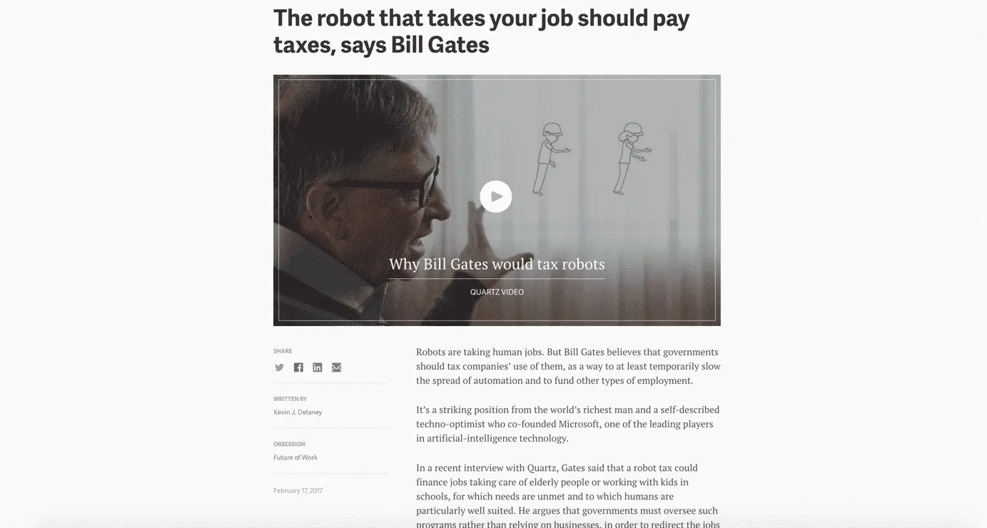
Instead of forcing people to read an article, offer an alternative to watch a video:
Note that it’s the combination of alternatives that’s the key. Not just a video or just text, but the combination of them. Let the user choose!
Colors
There are two main things to keep in mind when it comes to colors and accessibility: color contrasts and not relying solely on color.
Color contrasts
Good contrasts between text and background is important to make your content accessible to low vision users, or users who have sunlight reflecting off their screens.
Here’s an example of light gray text on Squarespace that doesn’t fulfill the contrast guidelines in the Web Content Accessibility Guidelines (WCAG):

A normal contrast failure is for link colors. Mediatemple have links that are far from acceptable:
To give you a feel for how little it takes to make your contrast sufficient, here is an example of failing contrasts for both the gray text and blue link, and an example of sufficient contrasts for the gray text and blue link.
You wouldn’t believe how hard I sometimes have to fight with art directors to get them to increase the contrasts to an acceptable level. Even though – in my view – everyone benefits and there’s not that big a difference aesthetically. Or is it just me?
Anyway, it’s easy to measure contrasts yourself. Here are some free contrast checkers we recommend!
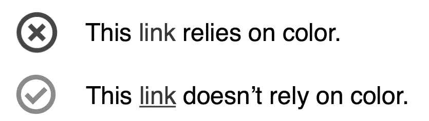
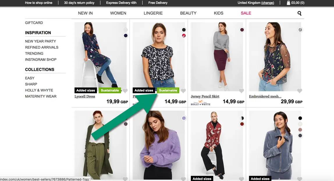
Don’t rely solely on color
Some people with color vision deficiencies can’t tell different colors apart.
Here’s an example that would create problems:
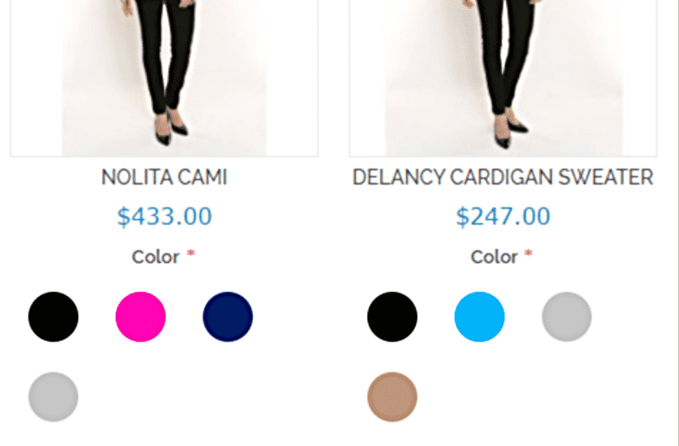

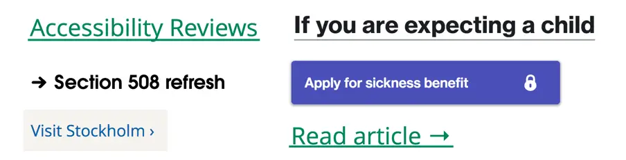
A common fail to this criteria is links that are only blue:
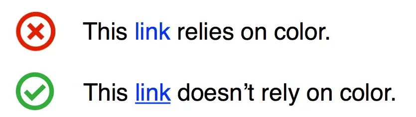
Viewing this in grayscale makes it clear why this is important:
Some ways to make your links pop out is underlining them, giving them link icons or making them look like buttons:
If you want to know more on this subject, check out our article on color blind accessibility.
Keyboard accessibility
Some users with motor impairments navigate using their keyboard. Many assistive technologies like switches, magnification and screen readers also rely on keyboard accessibility. But what does it mean to make your site or app keyboard accessible?
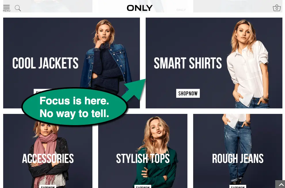
Focus indication
Make sure that it’s clear which element has focus when tabbing around in your interface.
The default focus indicator varies between browsers, but it’s often not very easy to spot.
Some sites, like Only.in, have even removed the default focus indicator. Most likely because someone googled how to remove it because they thought it looked ugly when focus was on their search field.
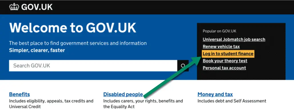
On gov.uk focus is indicated with an orange background that really stands out from the surrounding:
So design a clear focus indicator and implement it using the :focus selector in your css.
Skip-links
Skip-links are a bit magical! They don’t show up for most people, but if you navigate with a keyboard you’ll find them very helpful.
They are made visible only when they receive focus and basically provide a shortcut past all the links in the site header and menus, so you quickly can get to the content of the page.
Here’s a skip-link in action at www.starbucks.com.
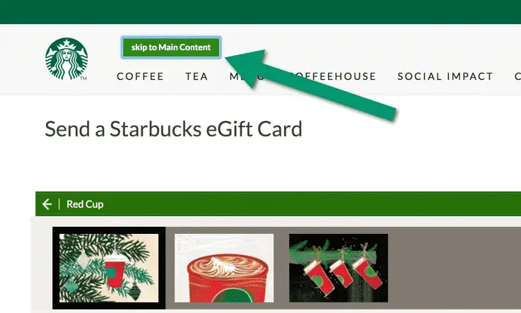
Try it out yourself by going to Starbucks and pressing the tab key on your keyboard until you see it (in any other browser than Safari, where keyboard navigation first needs to be activated in settings for some reason).
Screen reader accessibility
Making your site or app accessible for users with visual impairments who use screen readers is a lot about coding correctly and following the html-standard. For example: instead of building buttons and links out of spans, use the button and link elements.
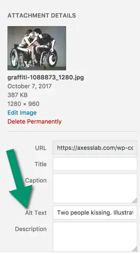
Another thing you need to do is add alt-texts to images, which conveys their meaning to people who can’t see them. Editors need to learn how to do this in their Content Managment System. It takes about 5 seconds for each image.
Accessibility is a lot about simplicity and usability. Make your interface intuitive and use a clean layout and you’ll help all users, including screen reader users.
Sometimes online shopping is more accessible than health care, simply because e-commerce sites focus so heavily on usability and streamlined design.
Wrapping it up
There is of course more to accessibility than I’ve listed above. But the point is that it’s not rocket science. Also, making your site or app accessible does not mean you have to make it boring and remove all colors, images and videos.
Accessible sites can – and should – be made awesome and beautiful! If you want our help achieving this in your projects, let’s work together!
Finally, I’d want to recommend the world’s best tumblr:
It’s a collection of accessibility wins – that is, examples of awesome accessibility solutions on sites and apps. Jump over there and read it all!