My experience of images on the web
I use a combination of magnification and screen reader when surfing the web. As a rule of thumb, I use magnification on larger screens and a screen reader on smaller devices.
I, like everyone else, come across many images when surfing the web. If I’m using a screen reader I depend on getting a description of the image – the alt-text – read to me.
Many times the alt-text is not helpful, often even a waste of my time because it doesn’t convey any meaning.
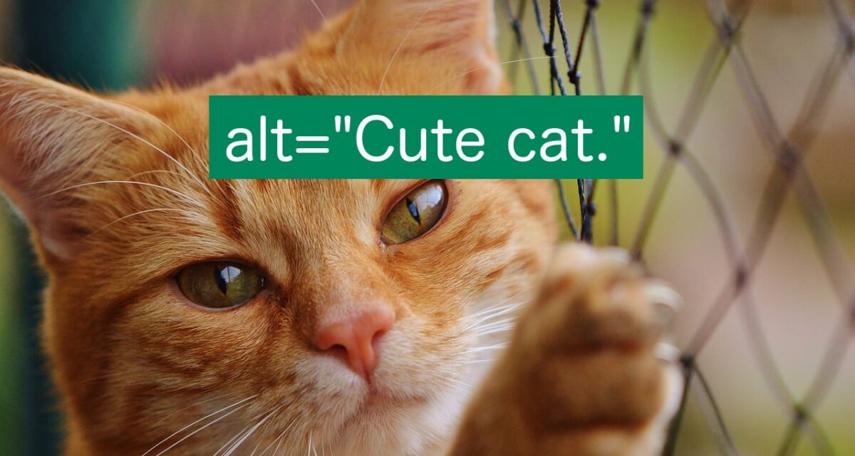
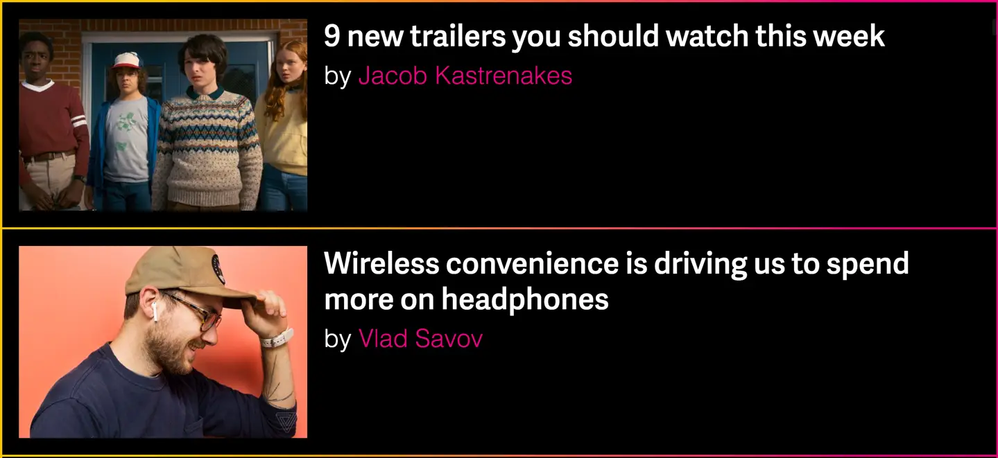
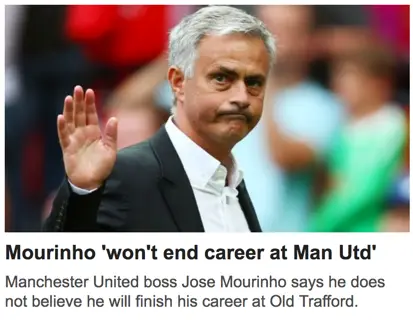
Let me illustrate this on The Verge’s startpage. This is what it looks like for sighted people:
Below is what I see. I’ve replaced the images with what my screen reader reads:
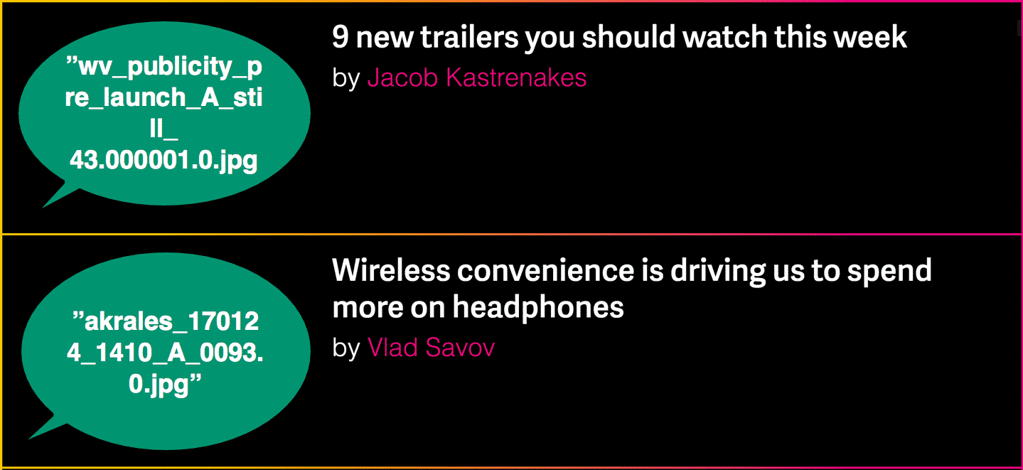
Not very useful, huh?
Here are some common alt-text-fails I come across:
- “cropped_img32_900px.png” or “1521591232.jpg” – the file names, probably because the image has no alt-attribute.
- “<Article title>” – on every image in the article, probably for improving search ranking (SEO).
- “Photographer: Emma Lee” – probably because the editor doesn’t know what an alt-text is for.
Alt-texts are not always this bad, but there’s usually a lot to improve upon. So whether you are a complete beginner or want to take your “game” to the next level, here’s our ultimate guide to alt-texts!
What is an alt-text
An alt-text is a description of an image that’s shown to people who for some reason can’t see the image. Among others, alt-texts help:
- people with little or no vision
- people who have turned off images to save data
- search engines
The first group – people with little or no vision – is arguably the one that benefits most from alt-texts. They use something called a screen reader to navigate the web. A screen reader transforms visual information to speech or braille. To do this accurately, your website’s images need to have alt-texts.
Alt-texts are super important! So important that the Web Content Accessibility Guidelines (WCAG) have alt-texts as their very first guideline:
All non-text content that is presented to the user has a text alternative that serves the equivalent purpose.
– WCAG guideline 1.1.1
If you want a second pair of eyes, our WCAG accessibility review covers image alt-text quality and coverage.
Or, if you prefer hands-on help while you ship, embed an accessibility consultant from our team to review alt-text patterns as you design.
How do I add an alt-text?
In html, an alt-text is an attribute in an image element:
<img src="dog.png" alt="Dog playing in meadow." />Most content management systems (CMS), like WordPress, let you create the alt-text when you upload an image:
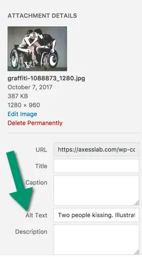
The field is usually named “Alt-text”, “Alternative text” or “Alt”, but in some interfaces it’s called “Image description” or something similar.
Let’s create the perfect alt-text!
Here are the steps to crafting fabulous alt-texts!
Describe the image
It might sound obvious, but an alt-text should describe the image. For example:
“Group of people on a train station.”
“Happy baby playing in a sand box.”
“Five people in line at a supermarket.”
Things that do not belong in an alt-text are:
- The name of the photographer. This is very common, but makes absolutely no sense.
- Keywords for search engine optimization. Don’t cram alt-text with irrelevant words you’re hoping to rank high on Google with. That’s not what alt-texts are for and it will confuse your users.
Content of the alt-text depends on context
How you describe the image depends on its context. Let me give you an example:

If this image was featured in an article about photography, the alt-text could be something along the lines of:
“Close up, greyscale photograph of man outside, face in focus, unfocused background.”
If the image is on a website about a TV-series, an appropriate alt-text could be completely different:
“Star of the show, Adam Lee, looking strained outside in the rain.”
So write an alt-text that is as meaningful as possible for the user in the context they’re in.
Keep it concise
Reading the previous section, you might be thinking to yourself: “I, as a sighted user, can see many details in the image, like who it is, how it’s photographed, type of jacket, approximate age of the guy and more. Why not write a detailed, long alt-text so a user with visual impairment gets as much information as I do?”
Glad you asked!
Well frankly, you can also get the necessary information from the image at a glance, and that’s what we’re trying to achieve for users with screen readers as well. Give the necessary information in the alt-text, but make it as short and concise as possible.
One of the few times you should write long alt-texts is when you’re describing an image containing important text. Ideally, you should not have images of text, but sometimes you need to. Like on some screenshots or photos of signs.
But the general rule of thumb is to keep it concise and avoid a verbose experience.
Don’t say it’s an image
Don’t start alt-texts with “Image of”, “Photo of” or similar. The screen reader will add that by default. So if you write “Image of” in an alt-text, a screen reader will say “Image Image of…” when the user focuses on the image. Not very pleasant.
One thing you can do is end the alt-text by stating if it’s a special type of image, like an illustration.
“Dog jumping through a hoop. Illustration.”
End with a period.
End the alt-text with a period. This will make screen readers pause a bit after the last word in the alt-text, which creates a more pleasant reading experience for the user.
Don’t use the title-attribute
Many interfaces have a field for adding title-texts to images close to where you can add an alt-text. Skip the title text! Nobody uses them – they don’t work on touch screens and on desktop they require that the user hovers for a while over an image, which nobody does. Also, adding a title-text makes some screen readers both read the title-text and the alt-text, which becomes redundant. So just don’t add a title-text.
When not to use an alt-text
In most cases you should use an alt-text for images, but there are some exceptions where you should leave the alt-text blank. Important note: never remove the alt-attribute, that would mean breaking the html-standard. But you are allowed to set it to an empty string, that is: alt=””. Do that in the following cases.
Repeated images in feeds
Pretend you’re scrolling through your Twitter feed. Everytime you want to read a new tweet, you first have to listen to “Profile picture of user <username of the person who posted>”. In my opinion, that would be super annoying!
Other examples of feeds are:
- A list of links to articles. Like the one on our page Articles.
- Chat or messaging feeds
- Feeds of comments
So for an ideal user experience, leave the alt-text blank for images that are used repeatedly in feeds.
Icons with text labels
You should always have text labels next to icons. Assuming you do, the icon should not have an alt-text. Let me explain why!
Let’s take a social media button as an example:

If you would write an alt text to the Facebook icon, a screen reader would say something along the line: “Facebook Facebook.” Very redundant!
OK, this is technically not about alt-texts but still important: make sure both the icon and the link text are in the same link-attribute, to get a smooth experience. Like this:
<a href="...">
  <img src="fb_icon.png" alt="" />
  Facebook
</a>
Another common mistake with icons is on menu buttons:

If the menu button has no visual text label – which, by the way, is really bad for the user experience – then it needs an alt-text (or another way of describing its function in code, like aria-label). Explain the icon’s function, like “Menu”. Don’t write “Three horizontal lines” or “Main hamburger”, which sadly are real examples I’ve stumbled on.
If the menu icon has a label, you should leave the alt-text blank. I often find menu buttons which are read as “Menu menu”. Once I even came across “Hamburger menu menu”. Somewhat confusing wouldn’t you say?
Images in links
Usually an image within a link is accompanied by a link text. Like in the example below:
In this case, the image and the link should be in the same link-tag in the html. In this case, you can just leave the alt-text blank. The important thing for the user is to hear the link text. An alt-text of the image would only distract by adding information that the user will not find necessary. The image is probably found on the page that is linked, and then you can give a good explanation of it in the alt-text.
If you really, really have to have an image in a link without an accompanying text, then the alt-text should describe the link destination, not the image.
Decorative images
Preferably, decorative images that do not convey any meaning to the user should be placed as background images in css. It probably goes without saying, but this means you don’t need alt-texts on them at all.
I’d classify most images that you place text on as decorative. You don’t need an alt-text on them. One example is the background image on Netflix’s startpage:

Some images intend to give users a certain feeling, like an artsy photo of a sunny beach next to a section about “Vacations”. Do not make the mistake of classifying such images as decorative just because they are pretty! If an image enforces a feeling, then a description of the image should be set to allow screen reader users that same feeling.
If an image is used to clarify a heading or label, like an image of a wooden table next to a heading called “tables”, it is not decorative and it should have an alt-text. It clarifies to users that we do not mean “tables of content” or any other kind of tables, but the ones you use to dine on. Such clarification should be given to all users.
A good rule of thumb when it comes to decorative images is that it is better to have one alt-text too many than one to few. And if you have to analyze the content of a photo to determine if it is decorative – then it probably isn’t! (We don’t need to know what is in the netflix background image above to know that it’s decorative).
Special cases
Logos in the banner
Logos in the banner almost always link to the websites start page. The opinions vary a bit on the topic of alt-texts for logos.
Some say it should include the company name, the fact that it is a logo and the destination of the link. Like such:
“Axess Lab, logotype, go to start page.”
In my opinion, this is a bit verbose. Too much noise! Since my screen reader already tells me it’s an image and a link, I only feel I need to hear the company name. From the fact it’s an image I assume it’s a logo and from the fact it’s a link I assume it follow conventions and links to the start page.
Svg
Scalable vector graphics (svg) is an image format that’s becoming more and more popular on the web. And I love them! They keep their sharpness while zooming and take up less space so websites load faster.
There are a two main ways of adding an svg to an html-page.
- Inside an img-element. In that case, just add an alt-text as usual:
<img src="dog.svg" alt="Dog rolling on gras." /> - Using an svg-tag. If you use this method, you can’t add an alt-attribute because there’s no support for that. However you can get around this by adding two wai-aria attributes: role=”img” and aria-label=”<the alt-text>.
Actually, for the second case, you’re supposed to be able to add your alt-text as a title-element in the svg, but there is not enough support for that from browsers and assistive technologies at the moment.
Can’t a machine do this for me?
Although machine learning and artificial intelligence is improving quickly and can describe some images quite accurately, they are not good enough at understanding the relevant context at the moment. On top of that, machines are not good enough at deciding what is “concise”, and will often describe too much or too little of the image.
Facebook has actually built in a feature that describes images automatically. But I feel like the descriptions are usually too general. One image in my feed right now is described as: “Cat indoors”. The actual photo shows a cat hunting a toy mouse.
So I’m sorry, you still have to write alt-texts yourself!
Thanks for making the web better!
I’m happy you read this far! It means you care about making the web a better place for all users. Spread the knowledge and keep being awesome!
Still a bit tricky? Send us an email at hello@axesslab.com or look at our workshops in content creation where you will master ALT-texts in no time.