
This article is inspired by and based on this original blog post: How to Make Your Website Accessible to People Who Use a Screen Magnifier (dev.to).
I also use a screen magnification daily, and experience many of the same pain points as discussed in the blog post. Here is a summary and a few thoughts of my own on this issue.
What’s a screen magnifier?
A screen magnifier is a software that magnifies the screen and displays a portion of it enlarged. Below is an example of how it can look.
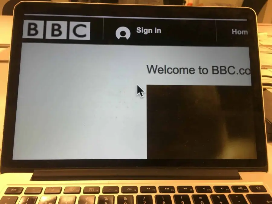
Screen magnification is different to browser zoom (that you do with ctrl +) in that it doesn’t cause responsive layout to kick in. Using browser zoom, the layout is usually changed to match the width of the screen, so the user doesn’t have to scroll sideways. With screen magnification you’ll always need to scroll sideways to see all content.
Making your interface screen magnifier friendly
1. Complement hover with click
The screenshot below shows how only part of a popup is visible when the user hovers over an info icon with a screen magnifier. However, when the mouse pointer is moved over to the popup it closes. So there is no way for the user to read it.
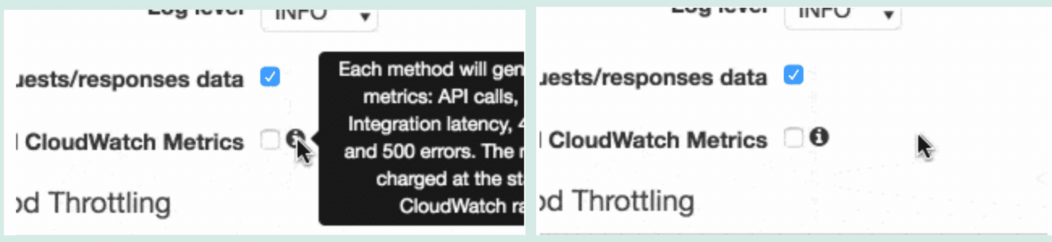
Instead, make the icon clickable so the user can decide to show the popup. This is also necessary for touch screens where there is no way to hover because of the lack of a mouse pointer.
2. Check your hover contrasts
Color contrasts need to be good for people with low vision, and many design teams know how to check contrasts. However, most forget to check their contrasts on hover. This can create a big problem for users with screen magnification, who may have no choice but to hover over what they want to read.
Below is an example from Kickstarter where content becomes almost completely unreadable when hovering.
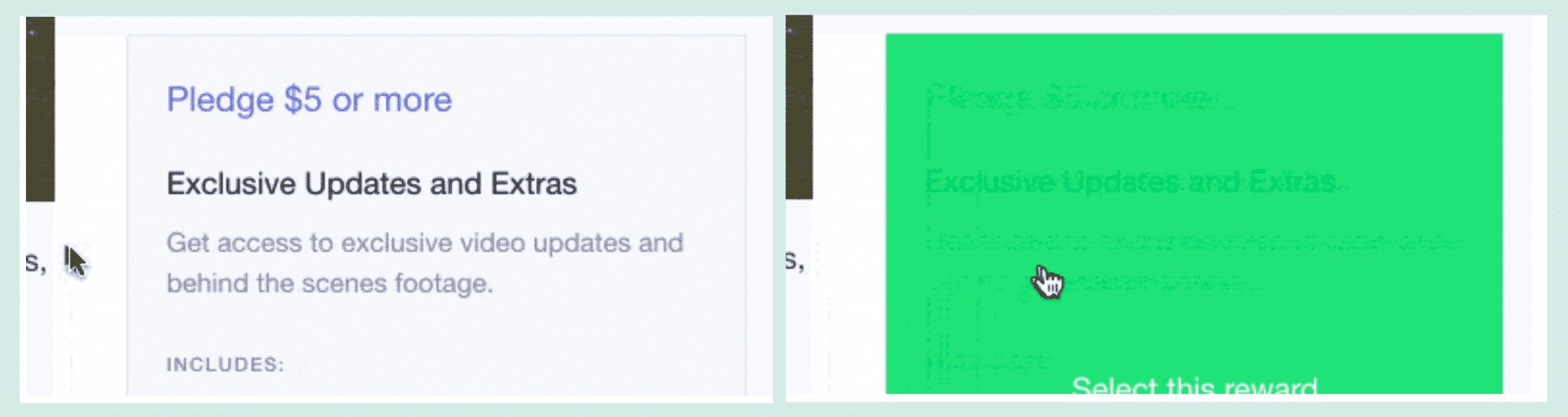
Most people could just move the mouse pointer to another place and read the text. But a person using screen magnification will probably have no choice but to hover over the area to read it, since they need the text to cover all the screen for it to be readable.
In the example below from MediaTemple, the links change to a really light blue color with insufficient contrast on hover.

So hey! I’ve got an idea. Instead of lowering the contrasts on hover, increase them!
Show results close to where it was triggered
When a user interacts with something they will often be shown feedback on what has happened. This feedback should be presented close to where the action was triggered.
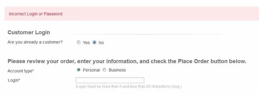
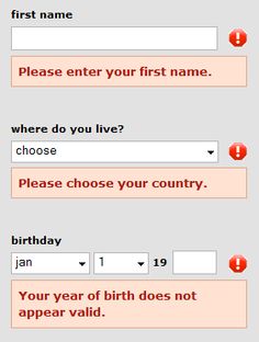
A common place where this fails is in error messages. The user presses a submit button and the error message shows up at the top of the form, or as a “toast message” (that also might disappear after a few seconds which is another problem).
Here is an error message that is displayed at the top of the screen that can be hard to find for screen magnification users.
Instead, show the messages close to where the user is when it’s triggered. The example below is better – but not perfect as many users zooming will not see things that far to the right of the field.
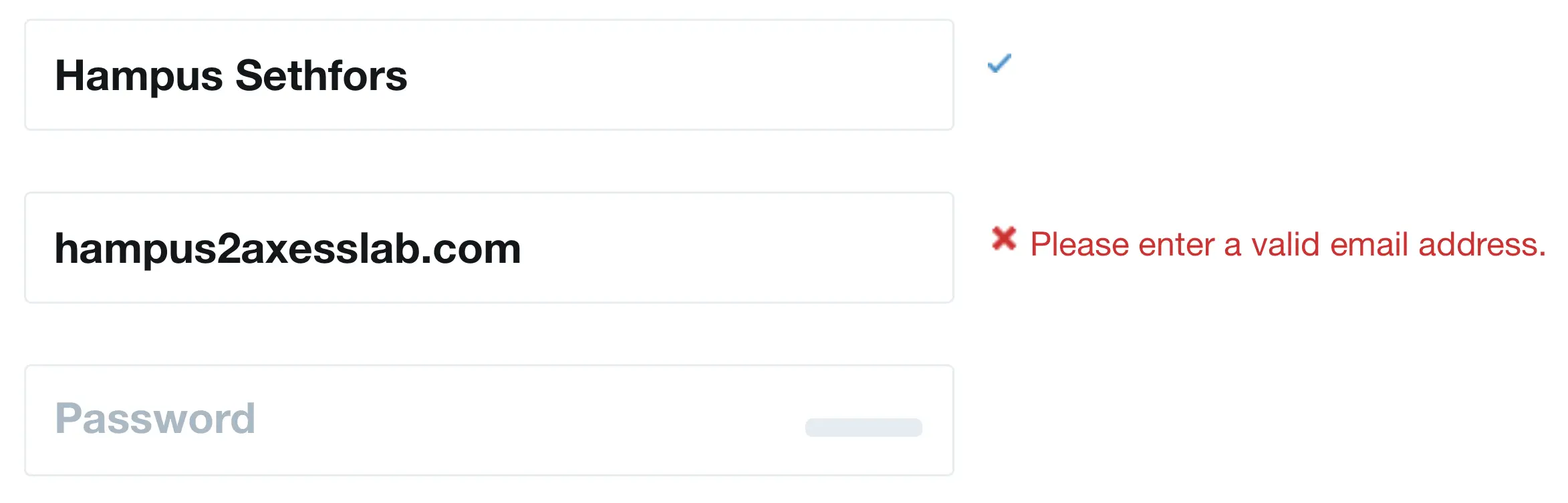
The best design pattern is to show the message just below the field that the user is at. Then they will not miss it.
Keep as much as possible to one column
Users with screen magnifiers don’t get as good an overview as other users. Because of that, they are more likely to miss the second column in forms and articles. In the form below, users with screen magnifiers will probably miss the required field “Message” since it’s in a separate column.
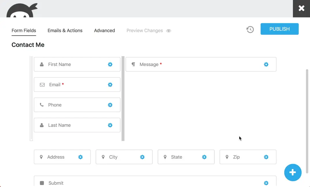
You can put navigation in a separate column because it’s a common design pattern on the web. But other than that, keep it simple and have only one column for your information. If you have “related links”, put them in the content where they are relevant or below the article. Not in their own column.
Want to learn more?
In our Interactive accessibility lab, your team gets hands-on with tools like screen magnifiers and works through real bugs together.