
Diagrams and infographics
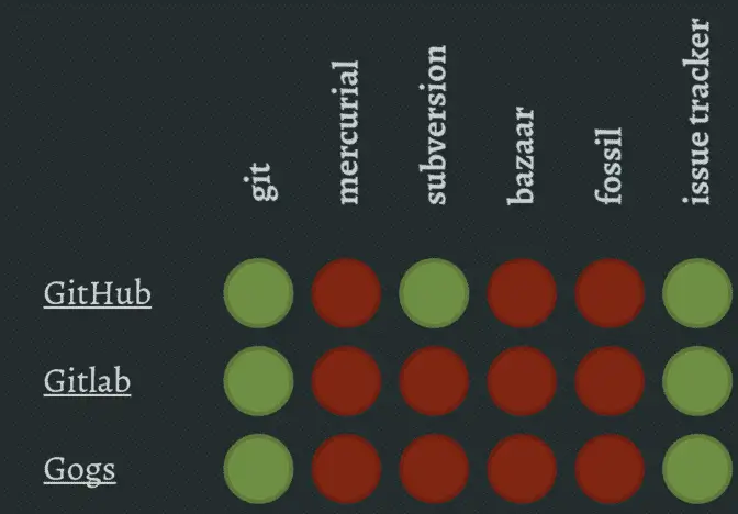
Diagrams and infographics are common offenders when it comes to creating accessibility barriers for people who can’t tell certain colors apart.
Green and red are the most common colors that are difficult for people to tell apart, which makes the diagram below extra problematic.
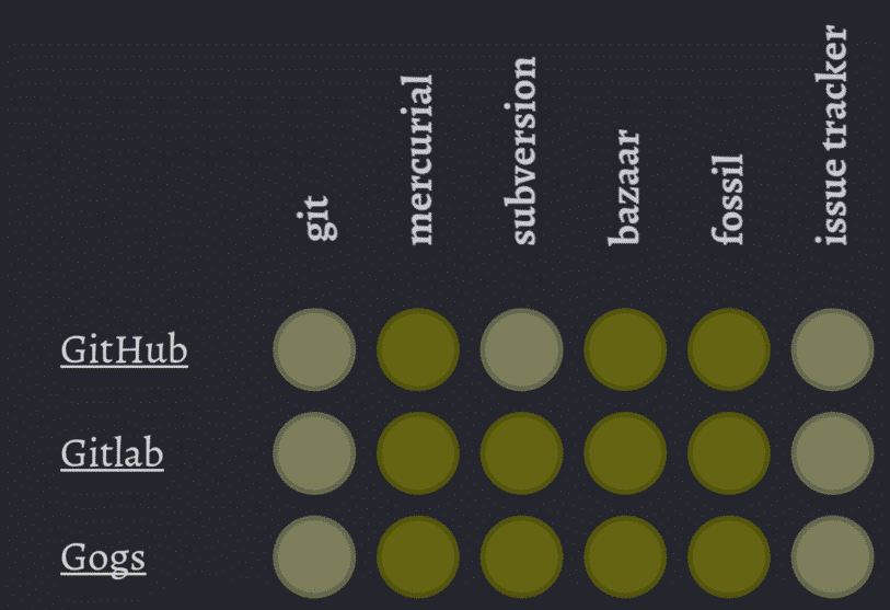
This is what it would look like with deuteranopia, a color defiency that about 6% of the male population has.
Pie charts are usually really inaccessible.
Reasons why I hate pie charts pic.twitter.com/e1ooavL7Zd
— Color Blind Probs (@WeTheColorBlind) January 28, 2014
If you really want to use a pie chart, put your labels in the chart.
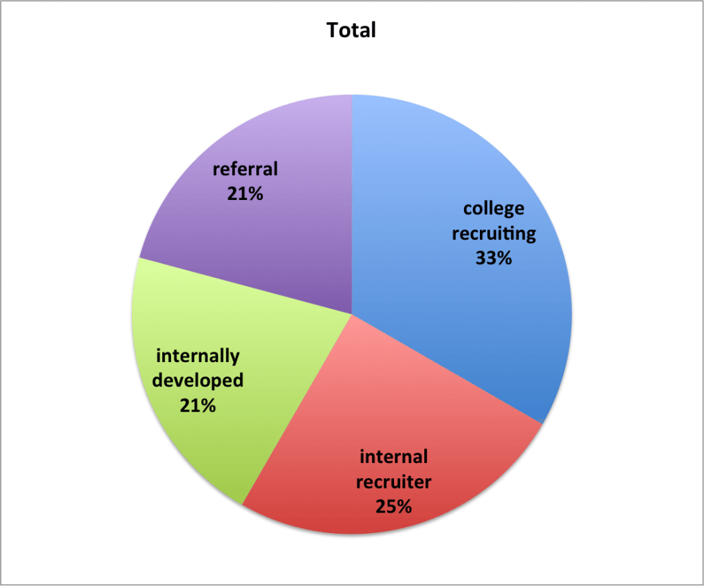
Or just use a bar chart instead because piecharts kind of suck.
Here’s a great article on how to make your charts more accessible with color blind friendly palettes.
Color pickers
Color pickers without labels will create a barrier for people with color blindness.
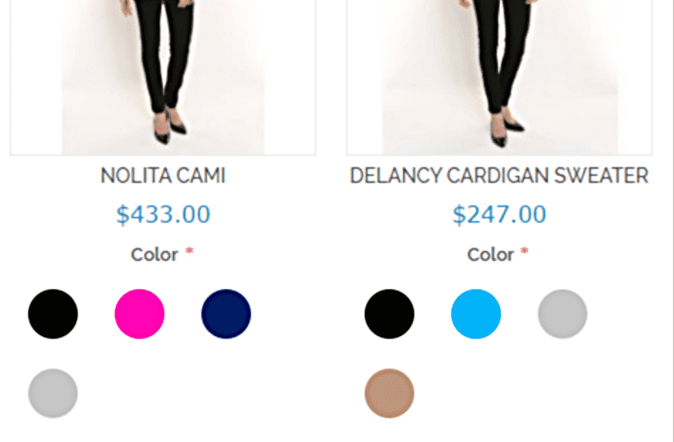
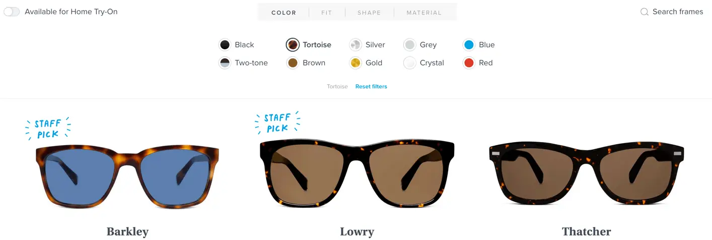
Instead, label the colors. This will help all users, since it can be hard to see the difference between certain colors like black, tortoise and brown. The great example below is from warbyparker.com.
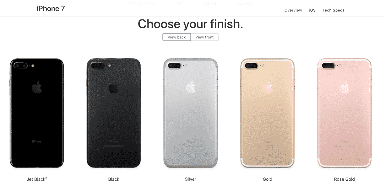
Apple also does a good job with this. Instead of showing a color palette they show the actual product in the different colors, with a label below.
Toggles
Here is what one person on Twitter answered when asked what causes accessibility problems for people with disabilities:
Colourblind. Text on background is usually fine, but things like colour-coded toggles, heatmaps, etc can be hard.
— Dan (@phrawzty) June 4, 2017
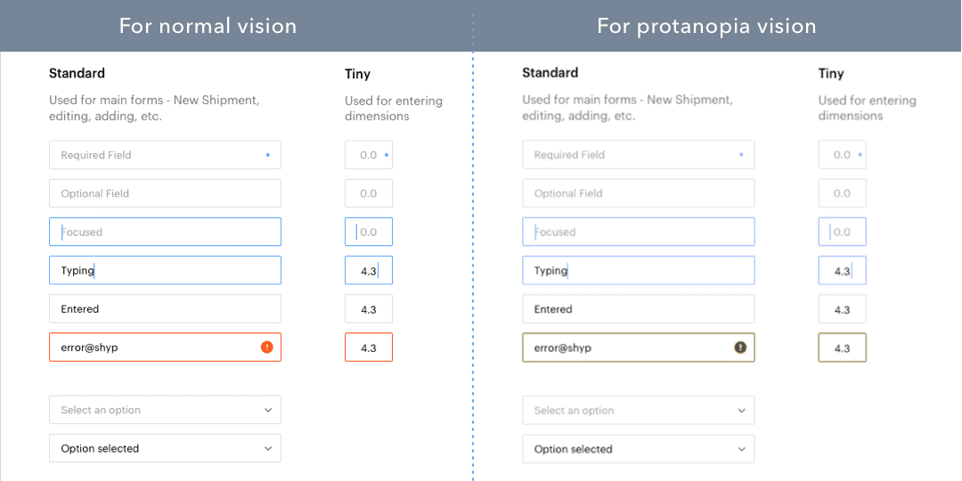
This is what iPhone’s toggles look like if you remove colors. Which one is on and which one is off?

A simple solution is to just use check boxes instead:

Error messages
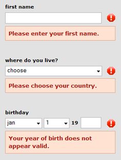
A red frame around error messages is not good enough, like illustrated by this image from the great article Designing eCommerce for colourblind users (uxplanet.org):
You need to make the error stand out more clearly by adding an error message:
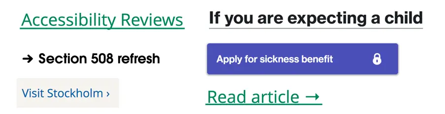
Links
Don’t just use color to differentiate links from other text. If you remove the color it’s really difficult to understand that the heading “Modules” is clickable in the example below.

You can use color, but in combination with something structural, like an underline, a link icon or a button design.
Here are a few examples of links that work well even if you have a color vision deficiency.
Contrasts
Make sure that you have sufficient contrasts between your colors. Avoid writing text on top of images, like in the example below from the article Improving The Color Accessibility For Color-Blind Users (smashingmagazine.com):

Make the background darker to improve the contrasts:

Measure your contrasts and make sure they are at least 4.5:1. Here’s a list of our favorite free color contrast checkers.
Below is an image of a big contrast fail in real life:

The overall accessibility guideline
The guideline for creating accessible content for people with color vision deficiencies is pretty straight forward:
Color is not used as the only visual means of conveying information (Level A)
– Web Content Accessibility Guidelines 2.0
So it’s fine to use colors to convey information, as long as it’s also conveyed in some other way.
A great way to check it is by viewing your design in greyscale before each release. You can use the free tool Funkify to do it right in your browser.
If you’d like to go deeper, you can join a practical workshop with our team, or even prepare for WAS certification to strengthen your skills in accessibility.
Keep updated on color blindness
Here are tips of two awesome Twitter accounts to follow that raise awareness on color blindness:
@colourblindorg
@WeTheColorBlind
And while you’re following great accounts on Twitter, follow me as well: @hampelusken!
Let’s end with this Tweet from @colourblindorg showing that color problems limit people outside of the web as well.
1/2 Why no section for ppl unable to watch matches due to ‘colour blind’ kit clashes #1in12men #1in200women @EHCR?https://t.co/bHnx8cqj1K pic.twitter.com/2jssIGPicA
— ColourBlindAwareness (@colourblindorg) August 11, 2017