First off – we really like you!
There’s rightfully been a lot of praise from the accessibility community about Instagram’s new alt-text features. Now, an Artificial Intelligence (AI) engine gives each image an automatic alt-text, and also makes it possible for user’s to improve that image description by writing custom alt-texts.
This is simply awesome, making one of the most popular social media platforms so much more inclusive to people with visual impairments. We see this as a sign that you’re interested in making Instagram more inclusive for users with visual impairments.
So Instagram: don’t stop now, keep moving forward! Here are three tips on what we think should be your next accessibility improvements for users with visual impairments..
Tip 1 of 3: The more-button
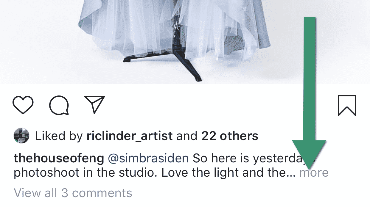
In the feed, sometimes you show a more-button when a description is too long to be displayed.

This button is completely inaccessible for screen reader users like myself (if you aren’t familiar with screen readers, here’s a great 7 minute introductory video on YouTube: Assistive tech: VoiceOver on iOS).
The more-button is actually read by screen readers – a great start! But the problem is that there is no way to activate it. When you try to click it, you’re redirected to the user’s profile page. Not at all what you’d expect! Here’s a video when I show this in action:
First off, a short sidetrack. Did you notice the great start of the video: “Image may contain text that says Accessibility is for everyone.” This is the new AI-engine in action, making image of text accessible to screen readers. Whoopee!
But later in the video the screen reader reads half a sentence and then the word “More”, like this: “I think that’s a…More”. When I click I land on the profile page’s back button, instead of having the description show.
To solve this conundrum, you can do one of two things:
- You probably already figured this first one out:
Make the more-button clickable. - Get inspired by your best buddy: Facebook. There, the whole description is read by the screen reader even if it’s collapsed visually. Meaning screen reader users don’t need to click the more-button to hear the full text. Super convenient!
Of these two solutions, we’d recommend you to go for number 2!
Tip 2 of 3: Stories
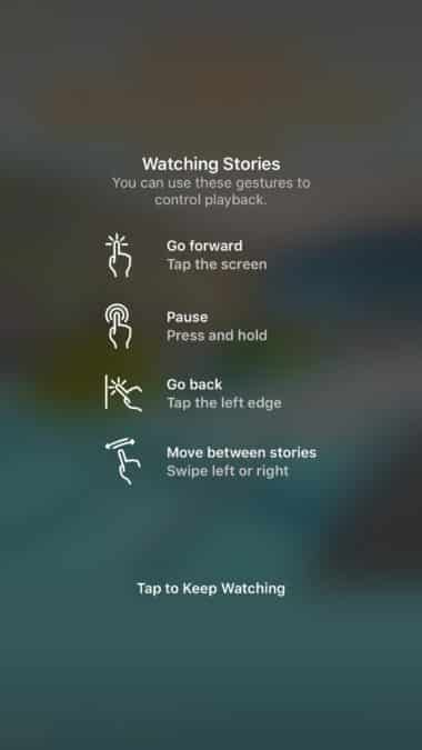
When viewing Instagram stories, basically nothing works for me and other screen reader users. To navigate Stories you tell us to press and hold to pause, tap to continue to the next story and so on.

So I don’t get any content read to me. But the worst thing is that I can’t pause the slideshow. If you have a vision impairment like me, you need to be able to pause the stories to have time to look closely at the screen (yes, most people with visual impairments still see a little bit), zoom in, read alt-texts and so on. Now each story just swishes by too quickly.
To make things even worse, I often use an iOS built-in zooming feature where you tap with three fingers to zoom in to images, which works poorly in Instagram Stories. So what I’ll do is turn off the screen reader when entering Stories, and instead rely on zooming and my limited vision. But the problem is that tapping with three fingers in Stories is often registered by the app as a single tap, which switches to the next story. Really frustrating!
So to conclude, right now Instagram Stories is a bit of a mess for a lot of users with vision impairments. A simple fix would be to include a setting or a pause button that disables the autoplay feature and instead gives users control of when to switch to the next story.
Tip 3 of 3: Naming of your icons
This last one is not a “show-stopper” for screen reader users like the two earlier sections. However, it is an easy fix that would improve the overall user experience and make it more pleasant to spend time in your app. You can compare this issue to having visually ugly icons. You could still use the interface, but it would feel unprofessional.
So the problem is that many of your icons are read as something like:
“Ig icon direct outline 24 direct message”
“Ig icon more horizontal outline”
“Ig icon x outline 24”
That’s probably the file name of the icons, which is not something your users should be exposed to.
Here’s a video of that experience with my screen reader.
So even though each icon’s description contains the meaning of the icon, it’s hidden between a bunch of nonsense. It’s like being forced to play a game of Where’s Waldo…
Luckily, this is something that should take you a matter of minutes to fix. So a really low hanging fruit! Yay!
That’s enough for now!
We have a lot of other input and ideas, but let’s start with these issues. Remember to give yourself a pat on the back when your done! Then take the next step. Accessibility is not something you do once and then are done with. Just like you’re never done with usability or performance improvements. Always strive to take small steps forward. Everywhere. All the time.
But do contact us if you want us to elaborate on this post and help out. There are a lot of tools you can use to catch these errors before they are in production.
Who’s next?
This was the first post in our Axessified-series where we give accessibility tips to teams behind important digital products that affect the life of many.
Accessibility tips for specific products is something we usually charge for, and it’s a big part of how we make our living as a company. But the sites and apps we look at in this series have such a big impact on so many users that we want to share these tips free of charge in hope that they reach the product teams, and inspires them to make their products more inclusive. Hopefully it also gives some nice insight to all readers on how to succeed with accessibility.
Which service do you think we should check out next? Tweet us or send an email to hello@axesslab.com.