
Trend #1: Bright and light
For a while now, it’s been considered modern to design things that are difficult to see. It’s a strange trend that’s causing problems for all sorts of users. Let me walk you through some troublesome bright and light trends out there.
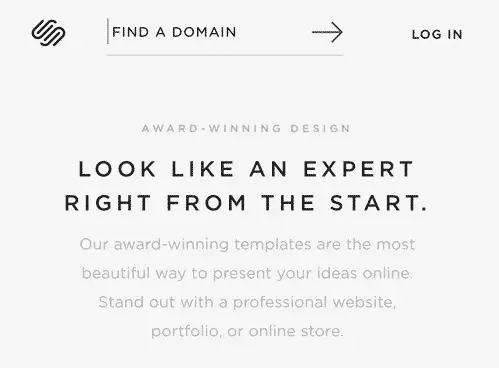
Thin, small, grey font
Slim, tiny, grey letters are popping up in interfaces all over the web, forcing users to strain their eyes while reading. Companies like Squarespace are even winning awards for this kind of unsightly design:
Running this interface through the disability simulator Funkify, this is what the interface above looks like with blurry vision:
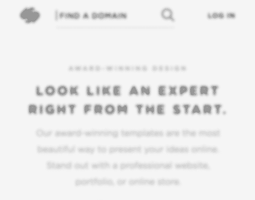
Not very pleasant, right?
Nobody likes to strain their eyes when reading, but this trend is especially hurtful to some user groups:
- Users with small devices
- People who are outside in bright sunlight
- Elderly users
- People with low vision
When asked what causes accessibility problems on the web (our full article: Accessibility According to Actual Users with Disabilities), quite a few people brought up this topic:
Nearly blind in my left eye. Tiny, thin font with low contrast to the background
— ⚡️Andrew So⚡️ (@AndrewDixonSo) 3 juni 2017
I know what you’re thinking: It’s Apple’s fault!
Yes, Apple introduced a thin font in iOS a couple of years back and they used grey text color a lot in their designs. However, they made sure the grey had a sufficient contrast level (how to check color contrasts) and the thin font wasn’t measured in nanometers.
The problem was that when other designers jumped on this trend, they made the grey color brighter and the letters thinner. Suddenly the text was only readable by designers with 52 inch retina displays and predator birds.
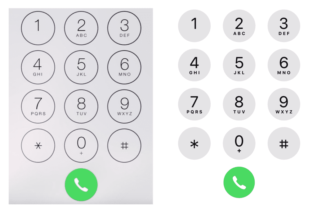
That’s why it’s so nice to hear that Apple is ditching it’s thin, grey fonts. Here’s a comparison between the old and new phone interface:
Bright color schemes
Many users with disabilities struggle on the web because of contrast issues in trendy interfaces.
Lack of contrast between font color and background color. Photo backgrounds that overpower the text on top of them.
— Megan Lynch (@may_gun) 4 juni 2017
One common offender is white text on brightly colored backgrounds:
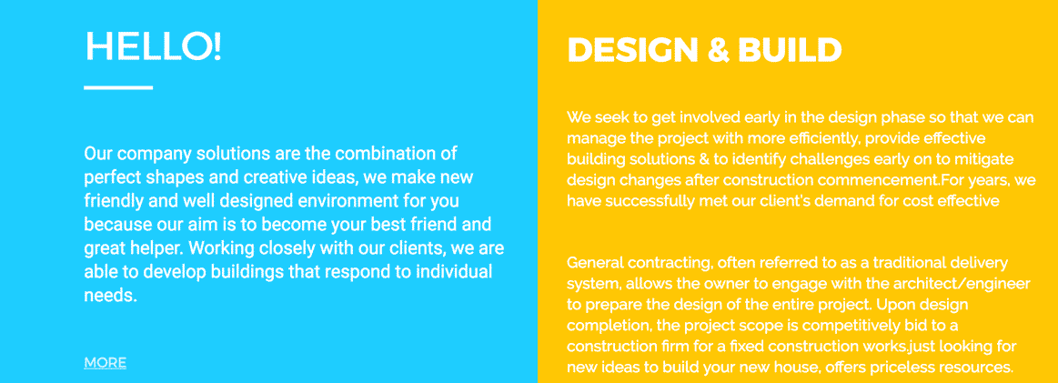
The color contrasts between the text and backgrounds above are terrible and far below the accepted contrast level in the Web Content Accessibility Guidelines (WCAG).
Like the tweet above said, another common contrast problem is when text is placed right on top of images, which is trendy now.

So start measuring contrasts and make your content easy to read for all your users.
Ghost buttons
Ghost buttons are transparent, thin buttons that have become popular lately. Like the name suggests, it’s quite a frightening design trend!
The background overpowers the important content, making the buttons harder to spot and read:
Make buttons stand out. It improves usability, conversions and accessibility. I think it’s time to stop scaring users away with ghost buttons.
Trend #2: Motion
Motion in interfaces is one of the top things that causes frustration when user testing with people with disabilities. It’s extra irritating for some people with cognitive disabilities, like adhd and autism.
ADHD: If there’s a “subtle” animation always running, I cannot focus. Biggest offender: https://t.co/KgfCA4a7lB‘s header gradient
— Taylor Hunt (@tigt_) 3 juni 2017
Assuming ADHD counts, it’s hard to locate content on overly busy pages and animations are a nightmare of distraction. #clickthemonkey
— mkb (@mojinations) 4 juni 2017
related, I’m also autistic and can get frustrated with, or repelled by, glitzy mouseover effects/animations, sudden autoplay, etc.
— back at the holler (@elementnumber46) 3 juni 2017
Let’s look closer at two motion trends that are annoying users: parallax scroll and image carousels.
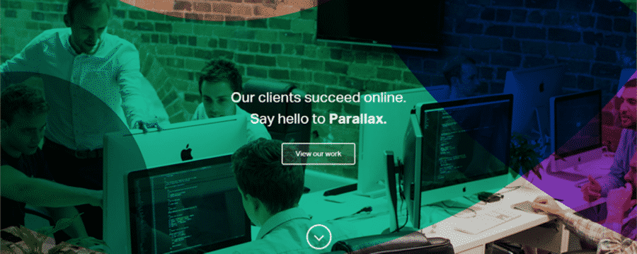
Parallax scroll
Parallax scroll is a technique that became popular recently. To highlight how terrible this design trend is, I give it two poop-emojis instead of just one.
Don’t you just love coming to a site to realize they’ve hijacked your scroll wheel? So that when you scroll, strange things happen on the site.
You’re not alone in thinking that’s frustrating!
Here’s an example where animations start cluttering the interface as the user scrolls:
It might look cool at a glance, but after a few seconds it gets really annoying. Not many users like it and some even get seasick, especially people with balance disorders.
Try the madness yourself at parall.ax.
Image carousels
Image carousels is another motion trend you should avoid, and something that the user experience (UX) community has warned about for years. Sadly, there are still plenty of sites that use them, creating distractions for users who are trying to focus on reading the site’s content.
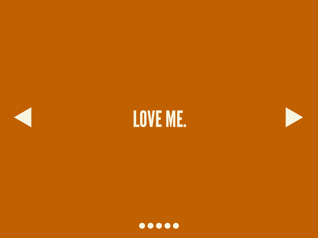
Why are carousels bad? I’ll let my favorite site on the web tell you the answer: shouldiuseacarousel.com.
Trend #3: Inaccessible social media posts
In feeds all across social media platforms, we’re seeing posts that exclude users with low vision or reading impairments. Let me take two examples.
Images of text
“Hahaha check out this epic meme:”
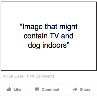
Hilarious, right? Didn’t think so. The image is a meme that contains text, which will not be read by assistive technologies. So this is the experience many users with disabilities will get.
Some social media platforms like Facebook will automatically describe what images might contain (like TV and dog indoors) to users with visual impairments who can’t see the image. But this description will not include the text in the image. So if you post an image of text, you should describe the text in the actual post.
Let’s try it again:
“Hahaha check out this epic meme! Making my dog watch commercials of the homeless dogs so he knows how good he got it.”
Much better right? And more along the lines of the experience a sighted user has:

The text description will also help users with reading impairments who use assistive technologies to read text. These assistive technologies will not be able to read image of text, so writing the text in the actual post is very helpful.
If you’re interested in learning more about accessible images in social media, check out this article on accessible social media posting.
Videos with text only
An awesome trend that has started on social media is captioning videos. Facebook autoplays videos in your feed, and 85% watch videos without turning the sound on. So people have started captioning, which is great for everyone but crucial for hard-of-hearing or deaf users.
However, lately this nice trend has shifted a bit too far. Now many skip the soundtrack altogether and only write text in videos.
Here’s an example, in Swedish but you get the point:
This excludes users who have a severe sight or reading impairment who depend on a voice narrating the video.
So don’t just use text on videos. And don’t just use sound. Sound and text in videos are like pancakes and jam – awesome together!
Trend #4: Icons only
Icons without text labels have blossomed with the rise of smartphones. There is a major shortage of screen space on small devices, so the idea of replacing text with icons is obviously an attractive one.
However, icons without text labels require users to do a lot of thinking and it’s causing significant usability problems. I wrote a whole article on that topic: How Icons are Ruining Interfaces.
Apart from usability problems, the icons often cause specific problems for assistive technologies. When there is no text label, a screen reader user is dependant on the presence of a description of the icon in the code. This is not difficult to do for a developer, but many, many, many forget it. Then the screen reader will say something along the lines of: “Button 3” instead of “Button Play clip”.
A young girl with a vision impairment I interviewed a while back told me about how her favourite app had updated, and suddenly there were no descriptions of any of the buttons. She had to get sighted help and memorise patterns to be able to using it:
To start I press button 3, then 7, then 2. I change track on button 11. It’s difficult to find but I’ve gotten quite good at it!
– Screen reader user
Not a very nice user experience, right? So the icons-without-text-labels-trend is causing problems for all sorts of users.
Why, oh why, does this happen?
Here’s my theory as to why so many new trends exclude users.
Go to Google Images and search for “web designers”. You’ll get a lot of results like this one:
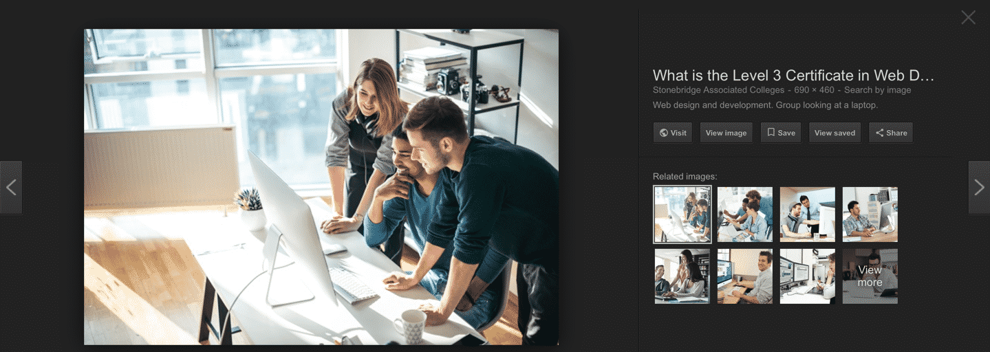
Young people sitting in front of giant monitors designing. This is how it looks in many tech offices around the world. Of course these people are not likely to react to problems with color contrasts or thin letters.
Almost anything looks good on such an expensive screen! However, the users’ reality is often a lot different.
Most designers and their colleagues are also very much more tech-savvy than the average person out there. Designers will often find new tech trends interesting, while most users just want interfaces to look and work like they’re used to.
What should we do about it?
Glad you asked! Here are my three best tips on reducing the excluding-trends-problem.
1. User test with a wider audience
I assume you already user test your interfaces. Otherwise start right away! But either way, make sure you recrute a wide range of users to your tests, for example:
- Old people
- People who are not fluent in your language
- People with disabilities
User testing with these user groups is extra important when you’re considering jumping on a new trend, to spot potential accessibility issues. If you make sure your interface works well for these users, you’ll also make it easier to use for everyone. Win-win!
2. Train your team
The best way to create inclusive products is to educate yourself and your team on the topic of accessibility. Take a course and learn to see things from new perspectives. Make sure your developers know the techniques for coding accessibility into their interfaces, designers know how to check for contrasts and testers know the basics of using some assistive technologies. Accessibility is not a one man show, it’s a team effort!
3. Test with Funkify
We’ve created a free browser plugin, Funkify, that let’s you simulate different disabilities, right on your site. View your site through a blurry filter, try navigating with a trembling mouse pointer and more. It can help you evaluate your interface in your day to day work!
Here’s a demo of the plugin in action:
That’s all, folks!
Let’s work together to embrace inclusive trends that make the digital world a better place for all users!