The cookie monster
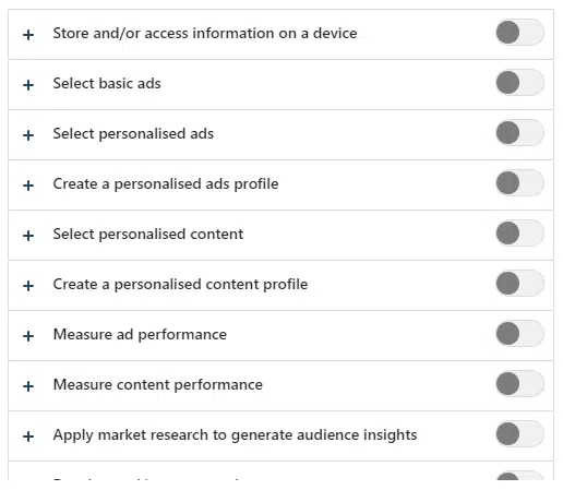
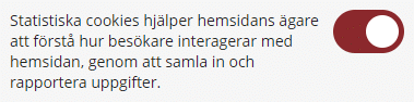
It all started when I wanted to find the best price for a new headset that I needed to perform my online courses for our clients. I went to www.pricerunner.com but I got interrupted by a cookie popup. Knowing that free websites use a lot of dark patterns and tricks to make us users accept trackers against our will, I wanted to make sure I did not accept any cookies. This is what I saw:
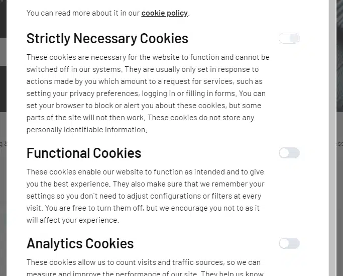
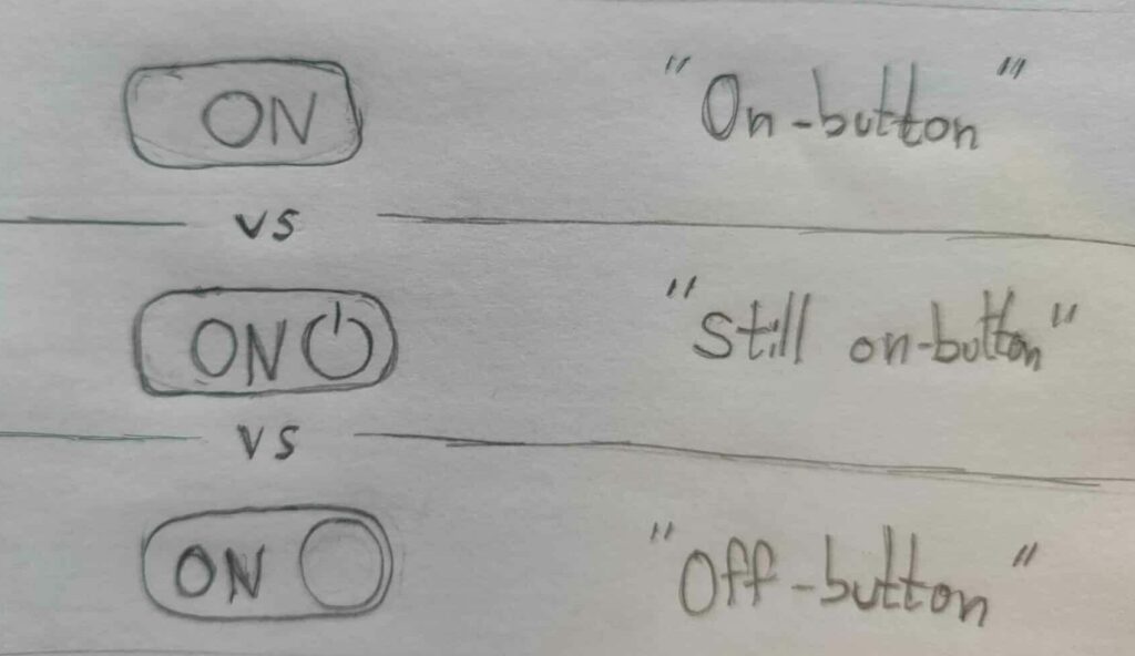
“Are they on” I thought? And does “on” mean I accept or decline the cookies? What’s going on here? This interface forced me to think!
Now, I’m no coward! My usual strategy online is to try pressing buttons to see what they do! Problem is – nothing seems to happen when pressing these buttons, so that doesn’t work! All I can assume is that pressing these gray things will change the setting. But change to what?! It took me far longer than should be necessary to figure it out. My confusion had time to turn into frustration and by the time I figured it out that frustration had lit a tiny fire of anger in my chest! I realized this was not my first time raging against unclear toggles, but I couldn’t exactly explain why I hated them so much?
So I decided to do some research and collect my thoughts and now I’m writing this article about Why Toggles Suck!
Short version
This is an in-depth article, so here are the main takeaways for readers in a hurry. Toggles fail to convey their current status without making users think! They also have very poor accessibility for users with disabilities. They are used inconsistently across the web, and they don’t have native HTML support. Use checkboxes or radio groups instead, or some of the other options described below!
What’s a toggle?
Digital toggles have existed since the early versions of smartphones. Especially common under different “settings” views on touch devices, they are used for things like turning WiFi on/off. They are called “toggles” or “toggle switches” since they switch something on or off, or “toggle” its status back and forth when activated.
To truly understand why they suck, it helps to compare them to two other controls that accomplish the same thing, but that actually work well. Physical toggles and digital checkboxes. Let’s first list some reasons why they work well, and then later investigate if digital toggles fulfill those same requirements or not!
Physical toggles
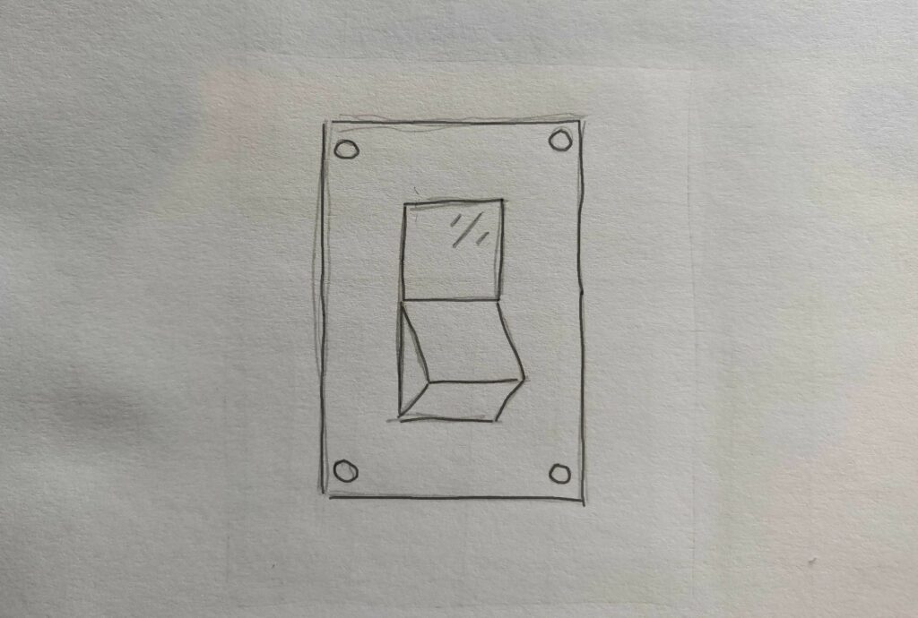
We are used to light switches turning the light on/off in a room.
And many electrical devices use toggles the same way
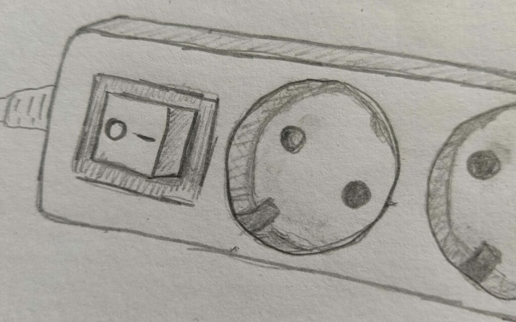
Toggles work well for lights and electrical outlets for many reasons, some more obvious than others:
- They enforce a mutually exclusive state, on or off.
- They let users press the state they want.
- Pressing “on” many times in a row is not a problem.
- Labels are a bonus but not really needed since:
- Context makes the current state obvious.
The last one is important. The results are obvious when turning on a light switch – the room gets lit! The results are also obvious when turning on the electrical junction box above because stuff connected to it starts working. The toggle also has a LED indicator lighting up when it has electricity so it’s obviously on because a LED cannot light up without electricity in the box. So you don’t really need to label these toggles. The junction box toggle above still has “O/I” labels though, for when it is not connected to a wall outlet, or if the LED in the button is broken.
But the light switch has no label, since context is enough… most of the time! But if that switch were to be placed – oh I don’t know – outside of my bathroom instead of inside 😡. Then the status of the switch is no longer obvious! Like when my fiancé is using the bathroom and I’m outside the door. In that situation, how can I know what its current state is? I can’t! So really – she has no right to be mad at me for making her poop-in-the-dark, when I’m just trying to help light up the room!
With a label like the one on the junction box you can put your finger on the choice you want and press it in. If you press “I” you can be sure it’s turned ON. If you want to be very sure, you can press “I” very hard or several times. It will still be ON. Assuming of course that you know that “O” means “off” and “I” means “on”. I still mix them up regularly; “O mean ON, and I means IN? No… what was it again?”. But I digress!
Same with the light switch outside my bathroom. If it had “on” written above the button, and “off” written under it like this:
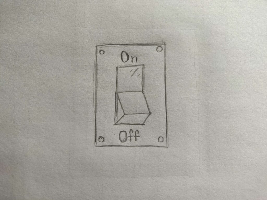
Then I would know the state from the control itself because of a principle called the “proximity principle” in visual design.
I would press closest to the “on” label. In both cases, you simply press the thing you want!
Pressing what you want is a natural human instinct and universal. There are no cultures in the world where the learned pattern is to “press what you don’t want”. Imagine a child standing by an ice cream stand pointing to all the flavors they don’t want. Doesn’t make sense, does it? Because we humans point with one finger, in order to single out one thing while excluding everything else! We point to the thing we want!
But then – how come we understand checkboxes?
Digital checkboxes
You see a checkmark and you want the thing to be checked – so according to “press the thing you want” I should press the checkmark to get it?
No! So how come we understand checkboxes?
A checkbox has two modes, “checked” or “not checked” and is normally part of a form.
The checkbox as a form component comes from the physical paper form where it has been used for ages, long before computers were a thing.
You would get an empty form
and be asked to post or hand over a filled in one.
It’s obvious that things are empty before I have started filling in the form. Text inputs are empty rectangles, checkboxes are empty squares. I use my pen to actively add things into the emptiness.
It would be absurd (but not impossible) to have it the other way around – imagine a form coming filled with stuff, and then having to erase stuff using white-out (like tipex) or an eraser to complete the form. That’s just not how we do things anywhere in the world!
So this has taught us a basic instinct over hundreds of years: empty shapes are not filled in, passive, untouched. Filled shapes are filled in, active, touched, and ready to be submitted.
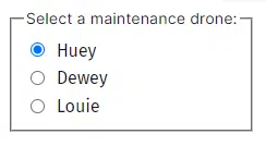
And that’s why checkboxes work, cognitively! Same goes for radio buttons where the filled in shape is the active one.
It even works for text input boxes! In our user tests, a majority of users will assume an empty text field is actually mandatory and expect an input to be made.
So much so that we even recommend you to not use asterisks * to indicate mandatory fields, and instead mark optional fields as “optional”.
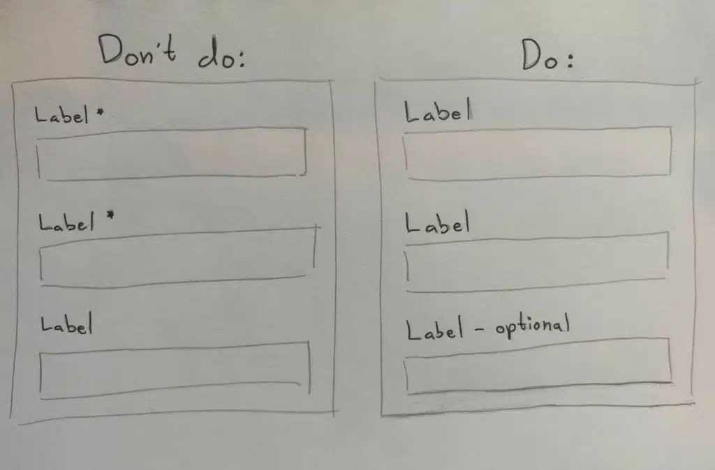
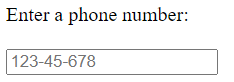
The “filled in = active / touched / done” pattern is so well recognized that if a text input field is not empty, many users will believe it’s done and requires no more work. That’s why you should try to avoid placeholder text…
… and labels that are positioned inside the input field like the commonly used Material UI component, even if it “moves away” on focus:
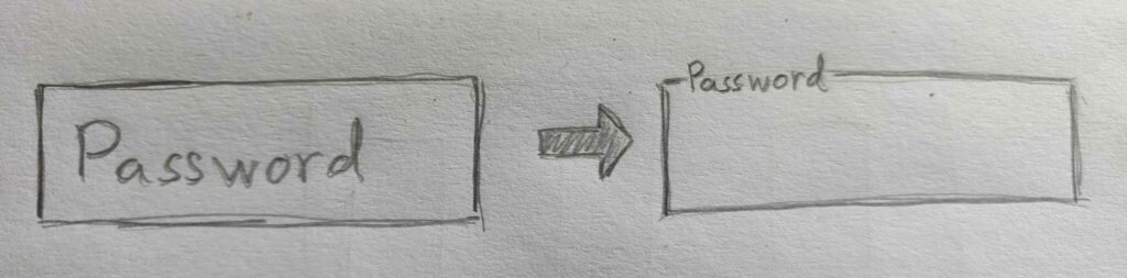
Users often assume “it’s filled in, so it’s completed” and skip to the next one looking for something empty.
Enter digital toggles
Now that we have established a few fundamentals that make physical toggles and digital checkboxes work – let’s see if digital toggles fulfill these criteria!
Press what you want
Nope! If a toggle says “On” then it’s actually an Off-button!
Allows multiple presses on the thing you want
Nope! Toggles change what they do each time you click them. This is also true for a checkbox (but they work for other reasons) – while a radio group fulfills this criteria!
Context makes labels unnecessary
Nope! Well, at least not usually. Toggles tend to be used for settings that are invisible or only visible later or in some other place.
Proximity principle
Nope! Labels are often put far away from the control, and you often have to move the toggle “knob” away from the label representing what you activate. Not closer to it!
Perhaps I can make my point clearer with this image:
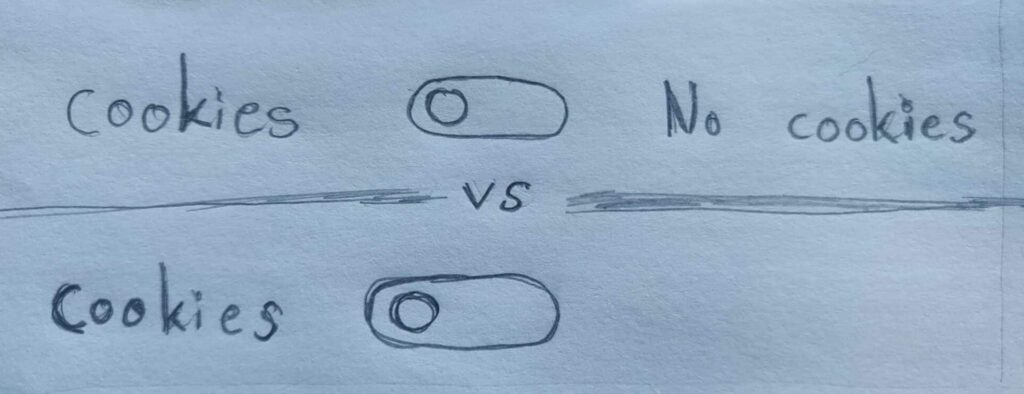
In the top toggle, users can understand that right means “no cookies” since it’s the rightmost label. While in the bottom toggle that looks like most toggles online with only one label on the left side, right means “cookies” all of a sudden. Proximity principle, schmoximity principle!
Of course this can be changed by having the toggle first, followed by the label.
But is that how people commonly use toggles? No! 👿
Empty = passive, Filled in = active
Nope! A toggle has no “empty” state. Only left/right. There is no obvious “default” state when untouched, and there is no universal agreement of which side a “knob” should be on to be passive or active, on or off.
Most western designers seem to assume that “right = active”. But that’s my point! “Most” designers, but not all! It’s completely up to the designer to do what they want with toggles on the web because a toggle is not even a thing in HTML (more about that later). So there is no established “out of the box” behavior, at least not for the web! Oh, and only western designers – in arabic speaking countries the designers often make “left = active”.
Perhaps it becomes even more clear that direction is not a universally understood pattern for active vs. passive in this image:

I held my phone on the side when taking this photo. But I decided to not rotate it. No matter how I hold my phone I can understand which checkbox is active in the first frame. But which of the toggles are activated in frame 2-5? I have no idea! You cannot rely only on direction for conveying status!
Conclusion #1
The most common toggle on the web fulfills NONE of the criteria that make physical toggles and checkboxes understandable!
So am I done now? Nooooo! I’m just getting warmed up! Let’s look at 3 more things that are awful about toggles!
Toggles don’t exist!
“By hey – if they are so terrible, why is the toggle even in the HTML language?” – you may ask.
It isn’t! It’s been made up by designers! HTML is the language of the web, where programmers add elements like <button> to create a button on the screen, or <img> to add an image. There are at least 111 different types of such elements to pick from. None of them is a toggle! And that’s because we already have elements for selecting boolean (on/off) values! You may remember them from earlier; checkboxes and radio buttons. Or as they are known in HTML:
<input type=”checkbox”>
<input type=”radio”>
You can style them as you like, make them larger, color them differently, have them auto-save or only save when you press “submit”. You can place labels before or after. Basically whatever use-case you have for toggling on/off values it can be done with these wonderful elements!
Here the HTML radio button groups are used by Amazon, a leading software company, as controls for their cookies:
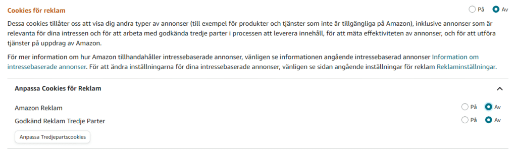
If native HTML elements are good enough for Amazon, why are they not good enough for you?!
You can even use other HTML elements to toggle settings. A normal <button> for instance! Here is how famous corporate chat client “Slack” uses HTML buttons instead of toggles:
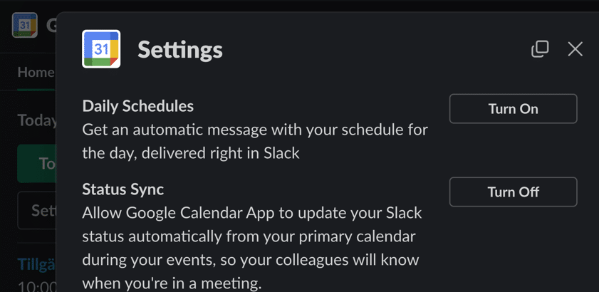
If native HTML elements are good enough for Slack, why are they not good enough for you?!
Text labels on normal buttons indicate the action of the button, especially when using active language like “Turn on” instead of “On”.
Now, I know toggles “exist” in iOS and Android SDKs, so this last argument is not as valid for native apps. But the cognitive issues remain for toggles used in native apps, so they still suck! They just suck a tiny bit less in native settings…
So toggles are not real, at least not on the web, but some designers want that fresh look and feel of the toggle! What’s the actual problem with not using built in HTML elements?
Accessibility is the problem!
Accessibility problems
HTML elements come with a lot of “hidden features” that help users with disabilities and their assistive technologies, like screen readers. HTML elements have invisible roles, states, and labels only read aloud by screen readers and other assistive tech. This is what makes users with disabilities able to interpret and interact with websites, even if they don’t see the screen, or can’t use a mouse, or if they use eye tracking, or voice control, etc.
If you just style a “box” (an HTML <div> element is commonly used) to look like a toggle, and add some “onClick” logic in JavaScript, then it will be unusable by people with assistive technologies. Making such a toggle fully accessible is not impossible – but it’s really hard!
Haydon Pickering has a very good article about it here: https://inclusive-components.design/toggle-button/.
There are some more good ideas in this one by Sara Soueidan: https://www.sarasoueidan.com/blog/toggle-switch-design/ with both “proximity principle” and “press what you want” support.
And Adrian Roselli has a nice article here: https://adrianroselli.com/2019/03/under-engineered-toggles.html.
So it is possible to make accessible toggles. The problem is – most web developers and designers don’t know enough about accessibility. So they copy some toggle code from the internet, and then that’s what their users get. And that’s often completely inaccessible to screen readers and other assistive technologies! The effect being that the toggle is unreachable for them, or not possible to activate even if they reach it.
Unhelpful colors
Because the toggle is known to be confusing, designers add colors to help clarify! That’s generally a good thing. But it’s not enough! 8% of male users have red/green color vision deficiency. That means it’s not much help for them using green as “on” and red as “off”.
And, again because a toggle is not really a thing in HTML, designers can decide to use any look-and-feel, since they’ve made this component up and there is no “built in browser version” of it! Can you guess what the status is of this little gem I found?
Well, when you have red as your company’s profile color – red means “ON”.
Obvious – right? Making it easy for internet users to learn how to use this fancy toggle thing – right? …*sigh*
Some designers make it darker on activation, some make it lighter! Some use gray as “off” – but also as “on but disabled”.
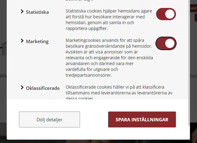
Even the digitization agency in Sweden, who are supposed to make sure others follow the accessibility guidelines, have this terrible color scheme on their cookie toggle with hardly any perceivable difference in color:

And even when colors are perceived and understood (“green = on”), there is still cognitive confusion; is this green color a status or an action? Is this an on-button or an on-status? It cannot be both!
We can get guidance from WCAG point 1.4.1 – “don’t rely on only color to convey meaning”.
And you know who doesn’t rely at all on color to convey meaning? Checkboxes don’t. Radio buttons don’t. Just say’n.
Are there any situations where toggles are OK?
Yes! The main problem is understanding the current state – so if the state is obvious to the user for other reasons – a toggle can be cognitively OK. As long as you make sure it’s accessible!
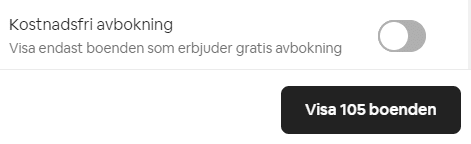
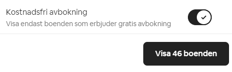
Here is a toggle for filtering on Airbnb where a toggle button limits the amount of available houses. Users can understand by the reduced amount of houses that the filter is active, even if they don’t understand the toggle control. The number in the button is physically close to the toggle control, and many users will notice the change as it happens and draw the correct conclusion from context.
Users using zoom tools or screen readers may still miss it though, so make sure to test for that!
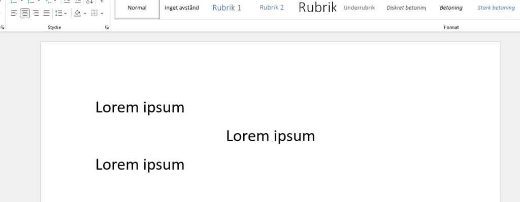
can be effective. Especially if the state can be understood also from context! A good example is the “justify text” options in Google Docs:

Having multiple mutually exclusive options means the active option is obvious, since it’s the only one with a different look from the others. It would not be as obvious if there were only two options:

The user can also instantly see how the text moves around to become centered or left adjusted, so context allows users to understand the state even if they would not understand the icons in the control:
Just don’t use it for 2-option settings:
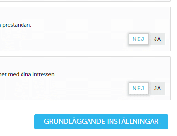
Personally, I think the “Ja” (yes) looks pressed “into the website”, so it should be active, just like the buttons on an old radio:

Of course – again – I was wrong…
The “toggles have instant effects” fallacy
So you’ve heard about this huh? I understand, I mean it’s in the top results when you search “when to use toggles”, and even promoted by my heroes at Nielsen Norman Group https://www.nngroup.com/articles/toggle-switch-guidelines/. The claim is that “Toggles inform users that settings have immediate effect while radio/checkbox inputs will be followed by a submit button”.
Let’s first assume this statement is correct (it isn’t). Let’s say 100% of users believe that toggles have immediate effect, that checkboxes and radio buttons cannot have immediate effect, and that 100% of websites use them that way (they don’t). Then by adding a toggle you will effectively have users who know something happened instantly when they pressed the toggle. But many of them still have no clue what happened. Congratulations!
Now let’s prove it’s not even true!
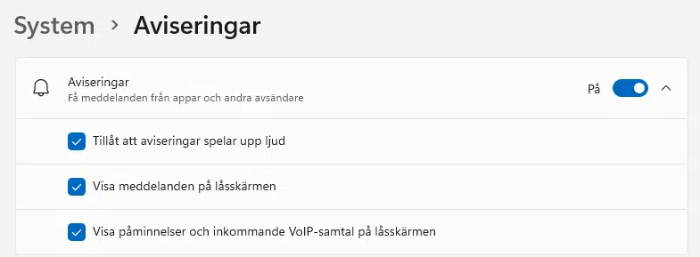
You’ve already seen how Amazon and Slack use buttons and radio buttons with immediate effect. There are countless examples of websites doing the same. Even the big ones! Here is a settings page in Windows 10 where all settings have immediate effect. Both the toggle and the checkboxes. No “submit” button anywhere.
So how can you claim that every user knows that checkboxes and radio buttons are always followed by a submit button, when even Microsoft’s Windows teaches them otherwise?
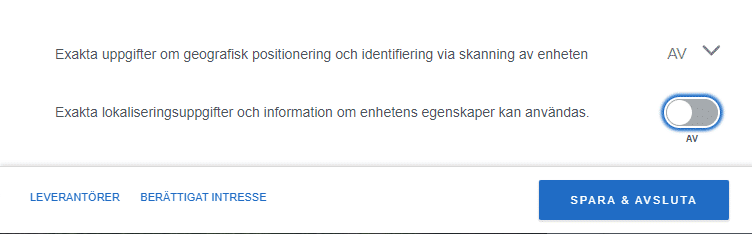
Next, almost every cookie manager uses toggles followed by a submit button like “Save & exit” or “Submit my preferences”.
And another one:
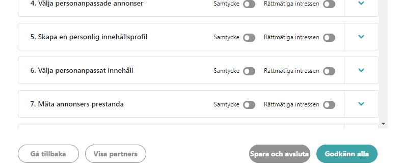
And another one:
So how can you believe that all users will know that toggles have an instant effect, when every cookie manager in the world teaches them otherwise?
This idea is simply not true!
And there is nothing code-wise that would motivate this belief! Remember, toggles are not a thing in HTML, so they are often coded as a checkbox, button, or radio button under the surface. So whatever you can do with a toggle, you can also do with those HTML elements!
Recommendation
Just use a checkbox or radio group! It’s quick to implement, accessible from the start, and doesn’t make the user think.
If you want to save the setting instantly – then do so! And inform the user either by making the effect obvious from context, like changing colors of the interface immediately when the user checks “high contrast mode”. If no visual or obvious effects exist, then inform the user with a toast or status update message like “setting updated!” or a loading indicator with the text “saving…” like Google does:

- Don’t do it!
But if they insist…
- Prepare to spend (waste) a LOT more time than you think to get this right
- Make the current state obvious from context
- Place the toggle close to what it affects
- Don’t add a state label into the clickable button itself, as it may be interpreted as an “on-button” instead of a “button that is on”.
- Don’t rely on color
- Don’t assume everyone thinks “right = active”
- Test the accessibility, preferably together with users with disabilities
- Read up on accessibility and follow the linked articles
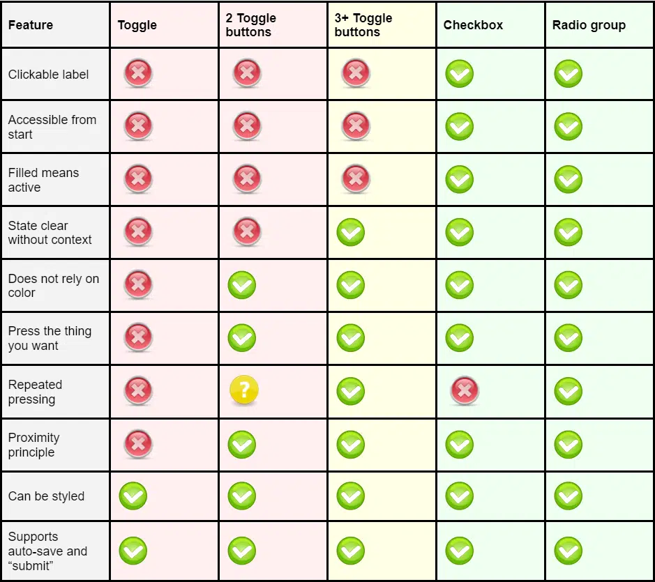
Summary
This table sums up the topics in this article:
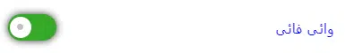
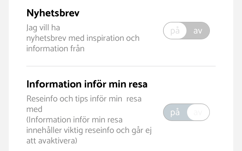
I’ll leave you with this “great” example from an anonymous Swedish ferry company, where I still to this day have no idea what I have selected.
Toggles suck!
Feel free to tweet us at @AxessLab and share your own examples of confusing toggles! Or let us know why we’re wrong!