
Our 5 top tips for more accessible takeaway apps!
The overall idea of a digital service to deliver food to your house is very inclusive, and at Axess Lab we love it! But for the idea to work it also has to be implemented in an accessible way. So we decided to pick three of the larger takeaway apps in Sweden: UberEats, Foodora and Karma and test them out.
From that experience, we give our tips to these types of app services to help them become more accessible:
Tip 1 of 5: Make sure color contrast are good
A common issue in these apps is that text and background colors are too similar in contrast. According to the Web Content Accessibility Guidelines the ratio between these color contrasts must be above 4.5:1. Which they often are not in these apps.
Poor color contrasts are an issue for users with low vision and users that look at the screen in harsh lighting conditions. This is often the case when you use mobile devices, especially outdoors.
Here are some examples of text with too low contrasts that we found in the apps:
Make sure to check all your contrast values and aim to be well over the limit of 4.5:1. Especially since these are apps that are being viewed on small screens. If you need testing tools, check out these Top seven free color contrast checkers & analyzers.
Tip 2 of 5: Combine icons with descriptions
The screen space is smaller in apps than on desktop. Therefore some functionality is only presented with an icon.Icons are great in combination with text descriptions but on their own they can be confusing and users often find it difficult to understand their meaning.
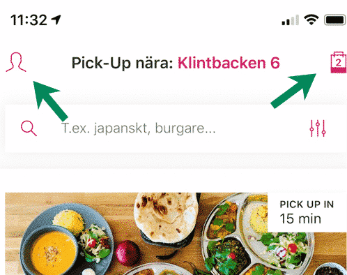
For instance in the header of one app we tested we found these icons that represent two buttons. But, what do the two icons mean?
The user has to explore in order to understand the meaning of them. Keep in mind that some users are careful in their approach to technology and don’t want to click on things to find out what they do. The icon to the right in the image above is the checkout where there currently are two meals. The icon to the left looks like a user profile but opened some kind of menu with random actions like “settings”, “contact us” and “invite your friends”.
Don’t make the users guess what different objects are for, explain it in short descriptions. If functionality is difficult to describe, it might be a sign that you should organize the content in a more logical way.
If you want to learn more about icons and proper descriptions to them, check out our post: How icons are ruining interfaces.
Tip 3 of 5: Make sure your buttons and links work with screen readers
The apps we tested generally did not work well with screen readers. A screen reader is an assistive technology, primarily used by people with vision impairments. It converts text, buttons, images and other screen elements into speech or braille.
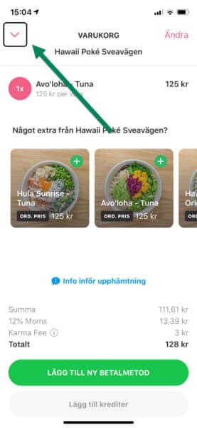
In these apps, buttons and links often lack descriptions in the code for the screen readers. In the example below, the screen reader was unable to find the register button. So the user we tested this with couldn’t even enter the app and as a consequence couldn’t order any food.
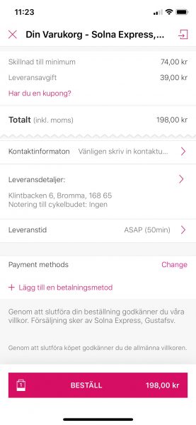
In other cases, the buttons leading to the checkout are impossible to understand. In the example below, the button leading to the order checkout had “view your cart” as a visual label but was read by the screen reader as the less helpful: “button”.
In some cases there where descriptions read by screen readers, but they were not very understandable. Such as this icon where the screen reader said “Tablist over icons”:
Or this icon that had the description ”Navdown”:
This video clip shows a page with several buttons and objects that are not properly described, in Swedish:
So, make sure to test the app with a screen reader during development. Today, screen readers are built into smartphones so everyone can test it. If you’d like training from our colleague who’s a screen reader user himself, just let us know at hello@axesslab.com.
Besides testing it yourself, make sure to test the app with real screen reader users to know what to prioritize. The real user’s opinion of the overall experience is what you should to focus on, after all.
As a good example, one of the apps had implemented helpful descriptions to screen readers on objects that visually was just an icon. For example the dollar sign in the following image was described by “Price: average or below”.

This video clip shows how it is read by a screen reader, in Swedish:
Tip 4 of 5: Reduce content
For many users, large amounts of information, both in terms of text and non-text content, can be a deal-breaker. So it is always a good idea to minimize content and focus on what is most valuable. Clean interfaces are especially important for users with cognitive disabilities.
In some of these apps we found that there was too much content. That makes it difficult to distinguish what information is primary. Especially for users that have difficulties with maintaining focus or who finds it energy-draining to read.
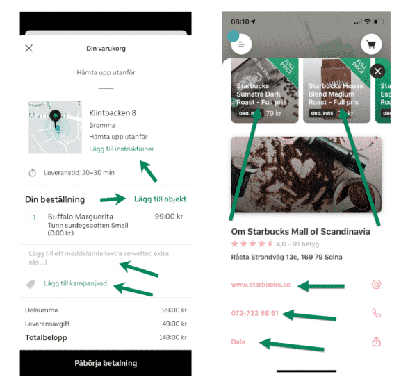
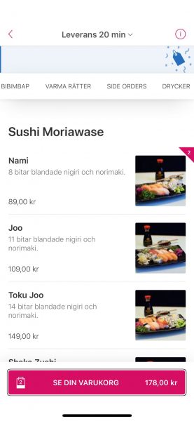
Here is one example of a checkout that was cluttered with information:
It has small text and lack clear headings and spacing in the presentation. Some information could benefit to be placed in later stages so the user can complete the checkout step by step. The payment method for example is not really relevant until the user decides to order.
Tip 5 of 5: Test with users!
In order to achieve an inclusive design it is fundamental to test with real users. Real users have a wide range of abilities. Focus on users that have the most difficulty in certain areas to find improvements that are beneficial to all users. For example, tests with users with cognitive disabilities to understand UX issues in terms of cognitive load.
Test the technical aspect with users that use different interaction methods, such as screen reader or voice input.
When testing with users the goal should be to find out if they can complete the process. Not just certain steps or objects. The user must be able to complete the whole process to be able to place an order.
Need help with user testing? Let us know, we do a lot of user testing! Also available as a remote service, during corona-times.
You can do it!
In conclusion, take small steps in several areas towards the goal of including more users. You can accomplish a lot by taking an interest in the users’ needs and by learning what accessibility really is. Let us know if we can help you in your mission!
Thank you for reading this blog post, take care, especially these days.