
Why we care so much about start pages
If your parents are like most parents, you’ve probably been raised to care a lot about first impressions. How to introduce yourself, shake hands in the right way, dress properly and so on. I remember my parents repeating “first impressions last” and “you never get a second chance at a first impression” to me as a kid.
Then time ticks on and kids with this mindset grow up. Some of us go into the web world and become designers, developers, content creators, scrum masters and so on. It’s natural for us to apply this first-impressions-matter-mindset to the projects we work on. So we focus on the start page and make sure our users get the ultimate first impression when using the interfaces we create.
The start page is also probably the thing that is displayed in marketing materials, on important board meetings and what you show friends or family members who ask what you actually do during the days.
But I believe it’s time to start questioning the importance of first impressions in digital products. Let’s use Nobel Prize-winning psychology to argue that we’re overrating the impact of start and landing pages, whilst at the same time underrating other aspects of the user experience. It’s time to shift focus if we really care about how our users experience, feel about and remember the sites and apps we build.

The peak-end rule
I don’t know Daniel Kahneman, but I feel quite confident saying he’s a smart guy. Kahneman is a psychologist who won the Nobel Prize in 2002 and has written the masterpiece Thinking Fast and Slow. He is an expert in the way we think, make decisions and experience the world. He and his colleagues have shown that two things matter a bit more than everything else when people judge an experience:
- How they felt at the peak of the experience (best or worst)
- How they felt at the end

For instance, let’s say you go through a medical procedure. Every minute you’re asked to rate how painful it is from a scale from 1-10. In the beginning, you don’t feel much pain at all, so you rate it a 2. But at its height there was a very painful moment that you rated a 10. And at the end of the procedure you rate your pain as a 6.
When you’re asked about the experience a few days later you’re likely to rate it at an 8. In other words, the average between the peak 10 and end 6. It doesn’t matter that your first experience was a 2. When thinking back on an experience, most people will only consider the peak and end. Here’s a more in-depth article about the peak-end rule (medium.com).
Applying the peak-end rule to web design
If you want positively affect the user experience your site or app, don’t focus a lot of time and energy on designing the first experience your users encounter. Instead, consider how you can make sure that the peak and last experience of using your site is awesome.
So let’s go through:
- How to create an awesome peak experience
- How to create an awesome last experience
Of these two, creating an awesome last experience is most important. I’ll get to why soon. But let’s go through them in order.
How to create an awesome peak experience
A great way to create awesome peak experiences is to think seriously about how you can make your users smile. I’ve written a whole article on charming interfaces, but in essence, it’s about working with microcopy (tiny words with a huge UX impact) – and illustrations to create pleasant experiences.
Let’s look at my favorite example of how microcopy can be used to create a peak positive user experience. It’s from Prezi’s sign up form, which makes it even more impressive since forms are usually really dull.
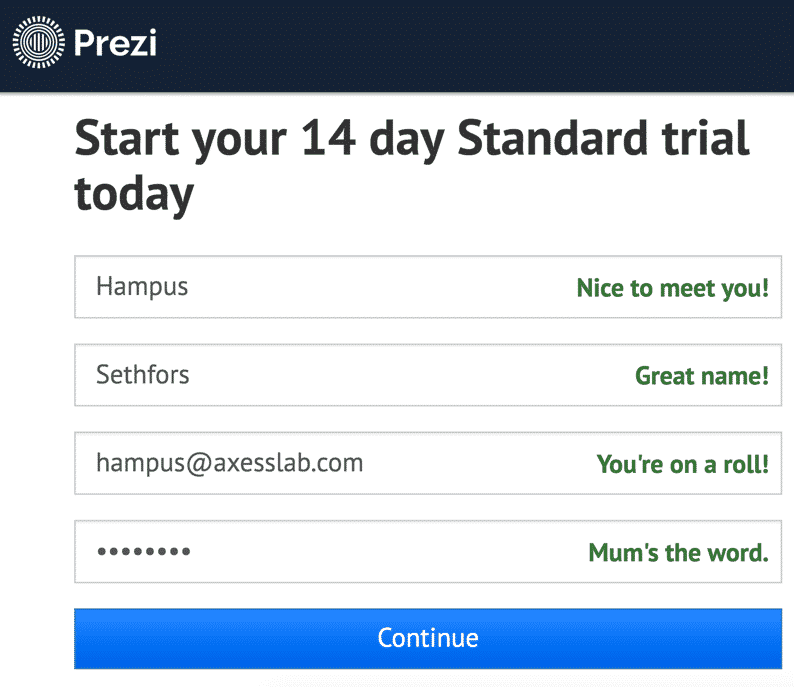
The form complements the user with brilliant microcopy after entering the details they ask for. Genious!
If you want to become a wizard in microcopy, I’d recommend:
- Microcopy and UX-writing (Facebook group)
- Good UX Writing (Instagram)
- Microcopy – the complete guide (book)
Apart from microcopy, working with illustrations and animations is a good way of creating positive peak experiences. Here’s a very cute login form from readme.io, where an illustrated owl peeks when you’re typing your email but covers its eyes when you type your password.

An important detail in the peak-end rule is that the peak experience, good or bad, is what will define a users overall feelings of the experience. So for all of us who design digital products – or any product or service for that matter – it’s very important that our users’ most positive experiences create a more intense reaction than their most negative experiences.
If a user finds most of your site pleasant, but their peak experience is frustration of filling out a CAPTCHA three times – well, sadly, the pleasant experiences won’t matter much at all.
As you probably experienced yourself multiple times: confusing or frustrating experiences easily create strong reactions. On top of that, these types of negative experiences are very common in digital products. So you need to work hard on minimizing the risk of strong negative experiences. On that topic, I have two tips:
- User test regularly. Nothing beats watching people use your site and seeing where they react strongly, get confused or get stuck. And while on that subject, consider testing with users with disabilities.
- Work on your error messages. It’s the one place where users are most likely to experience strong, negative feelings.
When it comes to error messages, the most important thing is to make sure users understand what’s gone wrong and how to fix it. This article on best practices for error messages is a nice read. But on top of that, error messages are often a good place to use some charm and humor to minimize the negative emotions they cause.


So before moving on to the last experience, let’s summarise how to create an awesome peak experience:
- Make your users smile. For instance by working with microcopy and animations.
- Avoid negative peak experiences. For instance by user testing and focusing on error handling.
How to create an awesome last experience
So let’s now shift our focus to the last experiences. This is a hugely overlooked opportunity to positively affect how your users remember your site. One of the best UX-hacks I know is to do everything you can to create an awesome last experience, thereby merging the last experience with the peak experience.
It would look something like this when applying Kahneman’s peak-end model:

So if the user’s memory of an experience is based on the average between the peak and end experience, and you make sure that the last experience is a 10, then most users will remember the whole experience as a 10.
I suggest moving a lot of that time and energy that you now spend on start pages to creating a fantastic last experience. That will most likely have a huge impact on the user experience and what people tell their friends about your service.
To do this, start by identifying where your users are when they stop interacting with you. It’s often at one of these places:
- Confirmation messages or order summaries – after having bought something or completed a form
- Offboarding processes
- Footers – after having read through your content
Then make sure these places are awesome! Let’s look at some examples.
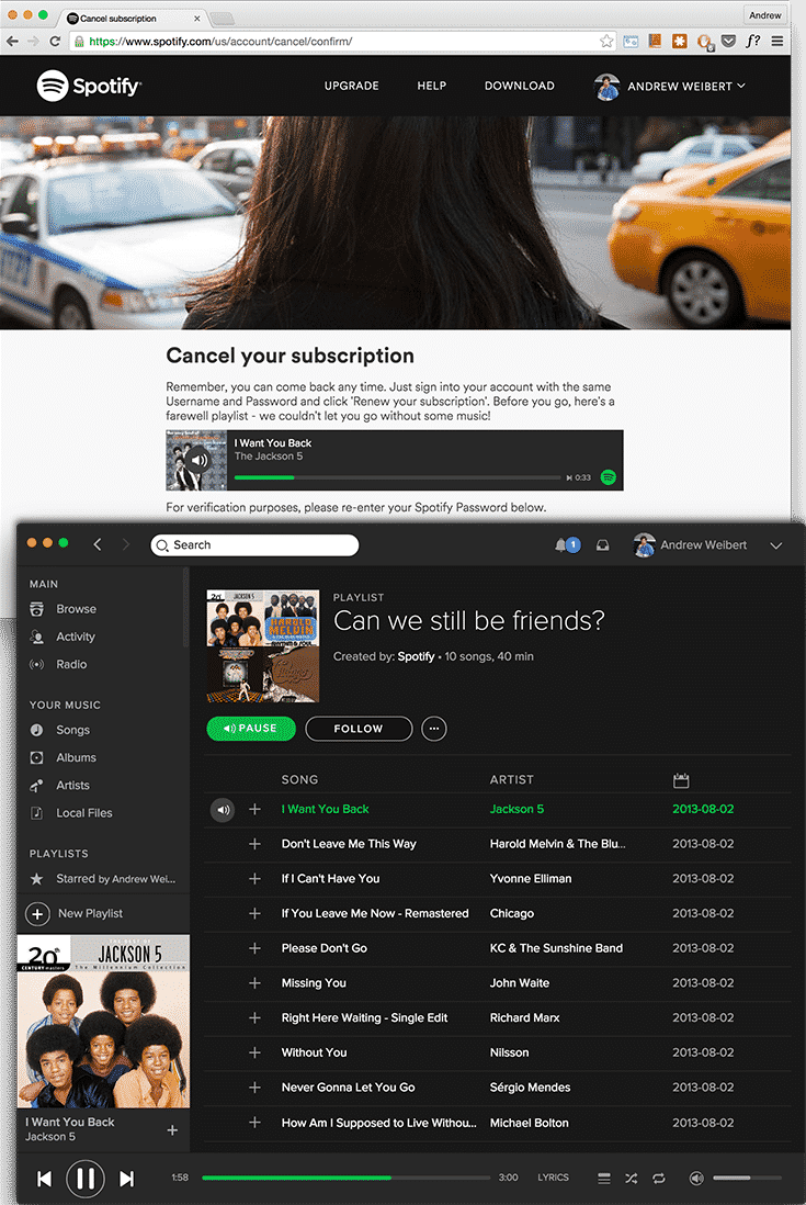
Spotify does this really well by providing an offboarding process with great microcopy and a charming playlist called “Can we still be friends?”:
Disney also gave some love to their offboarding:

Gov.uk focused on A/B testing the last experience of one of their thank-you-pages. They made it so good that each year, an estimated 100 000 more people sign up as organ donors each year through one link on that page. Nice!

It’s not only the digital world that can work on last experiences. When leaving the dentist as a kid, I remember always getting a sticker and some cheerful words. Some hospitals have taken this a step further, with an end of treatment bell:

Finally, back to the digital space! More sites could put some effort into their footers. It’s difficult to find many good examples of this, but some have at least added illustrations to their footers which I think is a step in the right direction:


A flipped approach to web design
So to sum up, if you’re serious about your user experience you should stop worrying about the pixels on your start page and begin focusing on the last experience.
“First experiences last” is an overrated saying.
“Last experiences first” is the new black.
If you liked this article
You might also enjoy these ones:
How icons are ruining interfaces