Photo: Francis Clarke for Wikimedia
The tweet that started it all
i'm curious to know: if you have a disability, what's the hardest thing about browsing the web?
rt for visibility, please and thanks!
— Safia Abdalla (@captainsafia) June 3, 2017
In this article I’ll summarize and group the main topics that people bring up in the thread.
But do click on the tweet and read through all the answers. It’s an awesome read for anyone interested in making the web a better place for all. And, in my opinion, a far better place to learn about accessibility than reading any checklist or standard.
Lack of captions
Videos without captions (subtitles) was by far the obstacle that most people commented on. Here is what a few had to say:
Being deaf, got to say captioning videos is number one issue for me
— Jay Jackson (@jjackson) 4 juni 2017
Video/audio with no captioning or transcript.
— Katelyn Reilly (@k_hack) 4 juni 2017
I’m hard of hearing so big pain for me is video with no captions. tweet or article just says “can u believe he said this?” & no summary
— Carol Carpenter (@carolmcarpenter) 3 juni 2017
Also, my sister says that she hates it when she comes across videos that are not closed captioned. She’s Deaf.
— Erica Boleyn (@radcrochetqueer) 3 juni 2017
Non-existing captions is something that can completely exclude users who are deaf or hard of hearing. But it affects many others as well. Anyone on the bus who forgot their headphones. Or some autistic users:
I’m Autistic and when I get overloaded, it’s harder to process auditory input. Especially if the person talking is offscreen or something
— act up, fight back (@UntoNuggan) 3 juni 2017
Many are hoping that automatic captioning solves this problem. But alas, not yet!
Not really YouTube’s auto subtitling is not accurate enough.
— Robin (@tohereknowswhe) 3 juni 2017
And the auto-captioning feature sadly isn’t available for most languages. So it’s still up to the video creators to caption.
Motion, animations and cluttered pages
Motion and animation can be annoying to anyone, but is extra frustrating to many users with cognitive impairments:
ADHD: If there’s a “subtle” animation always running, I cannot focus. Biggest offender: https://t.co/KgfCA4a7lB‘s header gradient
— Taylor Hunt (@tigt_) 3 juni 2017
Assuming ADHD counts, it’s hard to locate content on overly busy pages and animations are a nightmare of distraction. #clickthemonkey
— mkb (@mojinations) 4 juni 2017
related, I’m also autistic and can get frustrated with, or repelled by, glitzy mouseover effects/animations, sudden autoplay, etc.
— back at the holler (@elementnumber46) 3 juni 2017
Do your users a favor by not distracting them with autoplaying videos, advertisements or image carousels.
Wall of text
Many replies, especially from people with dyslexia or cognitive impairments, were about large chunks of text.
Dyslexic – not really seen as a disability, but large walls of text is painful.
Also never ending sentences and over complicated language.— Mustafa Kurtuldu (@Mustafa_x) 3 juni 2017
When ppl type large blocks of text w/ no spaces added
— Dead Ass (@MeBeShe4815) 3 juni 2017
Huge paragraphs. A page on Wikipedia often consists of many long paragraphs with long sentences. I lose my place within seconds.
— Ava Jarvis Art (@AvaJarvisArt) 3 juni 2017
ADHD + large, uninterrupted blocks of text or small bits of animation not part of the main content of a page
— back at the holler (@elementnumber46) 3 juni 2017
Large paragraphs, too many moving images, too much content as videos (especially help files), no subtitles, pages with too much going on.
— Polenth Blake (@Polenth) 3 juni 2017
The solution is so simple. Just create more paragraphs and sub-headings! And throw in more bullet-lists. Voilà!
Small font size
Amazingly there’s no minimum font size requirement in the Web Content Accessibility Guidelines. Even though it affects so many low-vision users.
Nearly blind in my left eye. Tiny, thin font with low contrast to the background
— ⚡️Andrew So⚡️ (@AndrewDixonSo) 3 juni 2017
Fonts are often too small and sites break when I increase font sizes.
— Brandon Savage (@brandonsavage) 3 juni 2017
Tiny font size and certain animations.
— Morgan Estes (@morganestes) 3 juni 2017
Zooming problems
Some users with low vision point to layout and navigation problems when zooming or increasing font-size.
My daughter has low vision and has to use 300-500% magnification. Many web sites are hard to navigate at this level
— Kir Kolyshkin (@kolyshkin) 3 juni 2017
Neurological vision problems due to CFS/ME. Small fonts, I browse everything with fonts enlarged, but sometimes it screws up the layout.
— Maija Haavisto (@DiamonDie) 3 juni 2017
for visually challenged, it is understanding the layout
— VAMSI KRISHNA (@VamsiJKrishna) 3 juni 2017
Low contrasts and image of text
One of the cornerstones of accessibility, color contrast, is still a major problem in a lot of interfaces.
Lack of contrast between font color and background color. Photo backgrounds that overpower the text on top of them.
— Megan Lynch (@may_gun) 4 juni 2017
Text rendered as graphics instead of text with no alt tags, no image description. From websites to memes.
— Megan Lynch (@may_gun) 4 juni 2017
That’s definitely lack of contrasts in colors
— charles dominic (@gamescharlie79) 3 juni 2017
So it is vital for web designers and art directors to understand how to measure and create accessible color schemes. Check out our list of seven great, free color contrasts tools.
Bright color schemes
Bright color schemes can be a big problem for users with low vision and is something that gets too little focus in accessibility discussions. It was interesting how many commented on it in the thread, and the different strategies they had to get around the problem:
(cont) so this is fairly simple but I really appreciate the “night” modes that some things have. Less eye strain that way.
— Callie 🌈 (@cxllielayne) 4 juni 2017
re: frequent & debilitating migraines, so many sites are coded with light color scheme&I can’t use them even w/ sunglasses on & monitors dim
— Pyrrh-T900XV1 (@xpyrrh) 3 juni 2017
I need to be able to get the article onto my Kindle Oasis to avoid backlight. I’ve also found the reader feature to be hit-and-miss.
— Kal Cobalt (@kalcobalt) 4 juni 2017
Relying only on color
This is also a cornerstone of accessibility that so many miss.
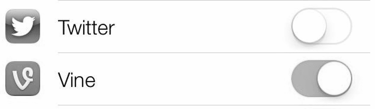
Colourblind. Text on background is usually fine, but things like colour-coded toggles, heatmaps, etc can be hard.
— Dan 🇪🇺 (@phrawzty) 4 juni 2017
It’s really easy to test, just view your site in greyscale. Here’s an example of a toggle that’s really difficult to understand when you take colors away. Which one is on and which one is off?
And it’s not only people who are color-blind who need information to be conveyed in other ways than color:
Sleep disorder: I have to read after 5pm with f.lux cranked up all the way, so sites that assume hyperlinks can be blue w/no underline…
— Taylor Hunt (@tigt_) 3 juni 2017
Mouse-focused sites
Even in this day of the touch-screen-revolution, too many sites still rely on mouse interaction. Especially for navigation on large screens. That needs to change.
I don’t have one but my mother has Parkinson diseas and mouse Interactions are really hard for her
— A dev has no name (@KodierKroete) 4 juni 2017
The number of sites which insist on using mouse over as the only means of menu triggering.
— Zack (@zkline) 3 juni 2017
For some users with motor impairments that navigate using only their keyboard, a clear focus outline is vital to being able to navigate the web.
Lack of focus outlines. Especially on links (they look ugly to most designers so they remove them) and custom components (eg dropdowns).
— nuton.dev (@NutonDev) 3 juni 2017
Too small touch-targets
This topic is related to the mouse-focused heading above. Many people bring up the problem with too small touch targets.
My brother-in-law has cerebral palsy, buttons and links are too small for him to use. He can only use touch because he can’t hold a mouse.
— Gary Rozanc (@garyrozanc) 3 juni 2017
Mobile twitter is also rly hard bc I have a tremor + visual-spatial processing issues. Often will click on the wrong thing by mistake.
— (((self crytptid))) (@plathituudes) 3 juni 2017
A great new insight for me came from Dave Ross who brought up the problem of too large click targets:
(Sometimes I have hand tics that make precise mouse control hard or I tap a touchscreen screen unnecessarily)
— Dave Ross (@csixty4) 3 juni 2017
Multi-touch gestures are also a deal-breaker for some users.
Yes! Kindle app has this “tap twice & hold” to get to the menu 4 display settings on books and it is super difficult. (Hand deformity)
— Kristen Anne Strater (@KristenAnneSF) 4 juni 2017
These are actually some of the more common problems we find in our Accessibility Reviews ever since mobile browsing became the norm. Fingers are never as precise as a mouse pointer, even with perfect motor skills.
CAPTCHAS
Finally, we end with a classic accessibility failure: the dreaded CAPTCHA. Annoying everyone who comes across it, but completely locking out many with visual impairments or learning disabilities.
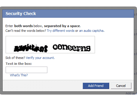
As to what drives her nuts, non-accessible captchas are the top. It can severely limit which services are available to her.
— Danny Does Code (@DannyDoesCode) 3 juni 2017
Final thoughts
Reflecting on the answers to this thread, a few things become clear:
- Web accessibility is about so much more than just blind people with screen readers.
- Basically everything that people with disabilities comment on are things that annoy everyone, so fixing these issues makes your interface better for all users!
- A lot of what people comment on is not covered by the Web Content Accessibility Guidelines. So you need to test with users with disabilities!
So thank you Safia Abdalla for tweeting your question. And thanks for everyone who responded and taught me (@hampelusken), and many others, a lot about accessibility.