Why I got pissed and decided to write this
A couple of weeks ago I got this comment at an event:
I really have to go now, but add me on Facebook and we can continue talking.
And I was thrilled! You see, I usually don’t thrive in social situations. Networking has never been my cup of tea. But there I was. At a meetup. Talking to an interesting person who asked me to be their online friend. Oh the joy!
So I threw myself on my phone, opened the Facebook app and found her. I got to the screen below, and that’s when everything almost went down the drain:
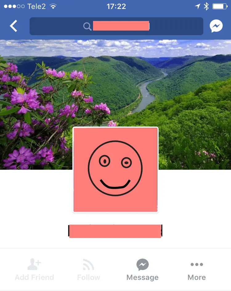
At first I didn’t see it at all. But luckily, I’ve got the eye sight of an eagle! I was just able to read the light grey text. “Add friend”.

Seeing as the text and the icon matched my goal perfectly, I pressed it!
Nothing happened.
Maybe I missed the touch target?
So I pressed it again. Same result. Started tapping it like it was the browser refresh button and Justin Bieber’s concert tickets were just about to go on sale. Didn’t work either. And I felt stupid for thinking it might.
Had the wifi crashed? Were we already friends? Had I reached the limit of the number of friends I’m allowed to have on Facebook? My brain was working on full speed.
Let’s pause the story a while. Sorry! I realize that you must be on the edge on your seat. What happened next? Why was the button not clickable? And would a disabled button spoil yet another friendship?
However, like all great entertainers, I’ll reveal the unfolding of this thriller at the end of this article. #cliffhanger
But first…
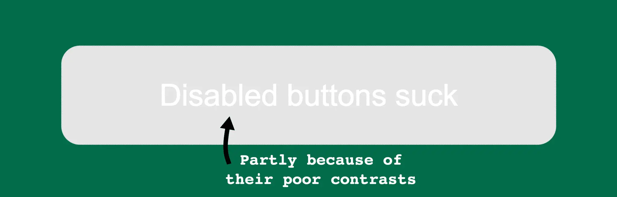
Why disabled buttons suck
Here are a few reasons why disabled buttons are gruesome things that will ruin your users’ day.
They fool users into clicking
Disabled buttons usually have call to action words on them, like “Send”, “Order” or “Add friend”. Because of that, they often match what users want to do. So people will try to click them.
When nothing happens users can feel irritated, confused, disappointed, nauseated, let down, angry or stupid. Terrible design patterns make users feel terrible.

They are hard to see
Most disabled buttons are really hard to notice and read. They make the users squint and feel at least 30 years older. Even though the button is disabled, the text can be crucial for understanding the context.
White text on light grey background, come on!

These insane contrasts, of course, create even bigger problems for users with low vision. For some unthinkable reason, the Web Content Accessibility Guidelines (WCAG) do not require sufficient contrast ratios for disabled buttons:
The visual presentation of text has a contrast ratio of at least 4.5:1, except for the following:
Text or images of text that are part of an inactive user interface component.
It’s simply impossible to understand why this exception is in the guidelines. Just another reason why you can’t follow them blindly (pun intended). But more on accessibility later.
They don’t give any feedback
99% of the disabled buttons out there give no feedback as to why they are disabled when you click them (source: gut feeling. No one studies disabled buttons. Probably because they suck).
Below are three disabled form elements in Google Analytics. Nothing happens when you try to interact with them.
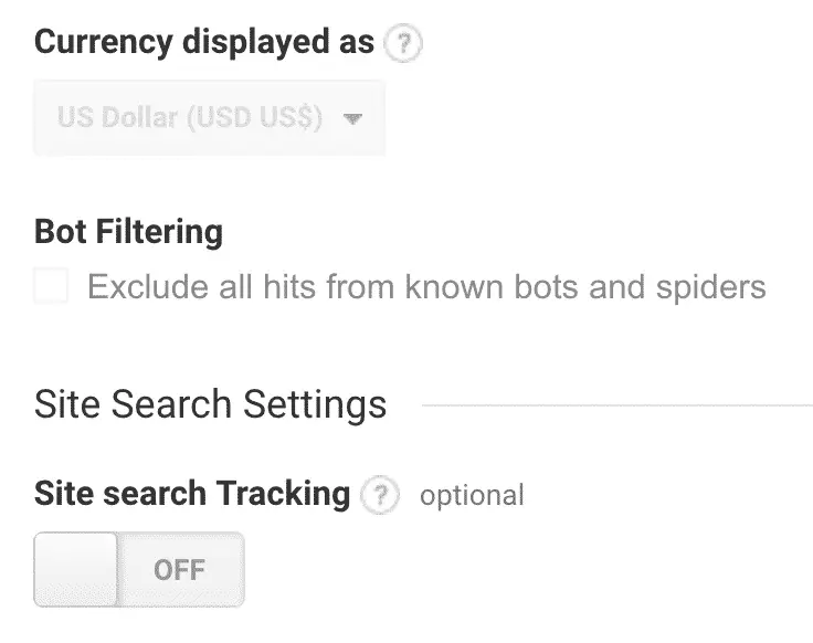
The reason they’re disabled is actually that the user doesn’t have the necessary permissions to control them. Why, oh why, is there no message to help them realize that?

They give design teams a reason to rush through error handling
If you’re working with IT, you probably hate error handling. “Hey! My users won’t make any errors in my perfect interface.”
You might think error handling is taken care of with live error messages that show up when the user makes a mistake.
Sadly, the users are often busy thinking hard about the answer to your next form field or looking down at the keyboard while typing, so they often don’t see your error message.
“Stupid User ©, just look at my beautiful error message” you might think to yourself.
But you have a plan B! You reckon that the user will see the disabled submit button and realize what’s wrong.

Sadly many users don’t get why the button is disabled. And most who do first get pissed off pressing the disabled button a million times before realizing what’s wrong.
You’ll need to put in some more effort to take care of the users who click the button. More on how later.
They make users think
Why does this button look so strange? What does it say? Why can’t I click it? What should I do now?
Few form fields can make a user think as much as a disabled button.
But is that really so bad? Yes. There’s a whole – epic – user experience book written about it: Don’t make me think. Users don’t want to think about your interface, they want to complete tasks with as little effort as possible.
Disabled buttons disable disabled users
Now that’s a tongue twister! But it’s true. Disabled buttons often create a big barrier for people with disabilities.
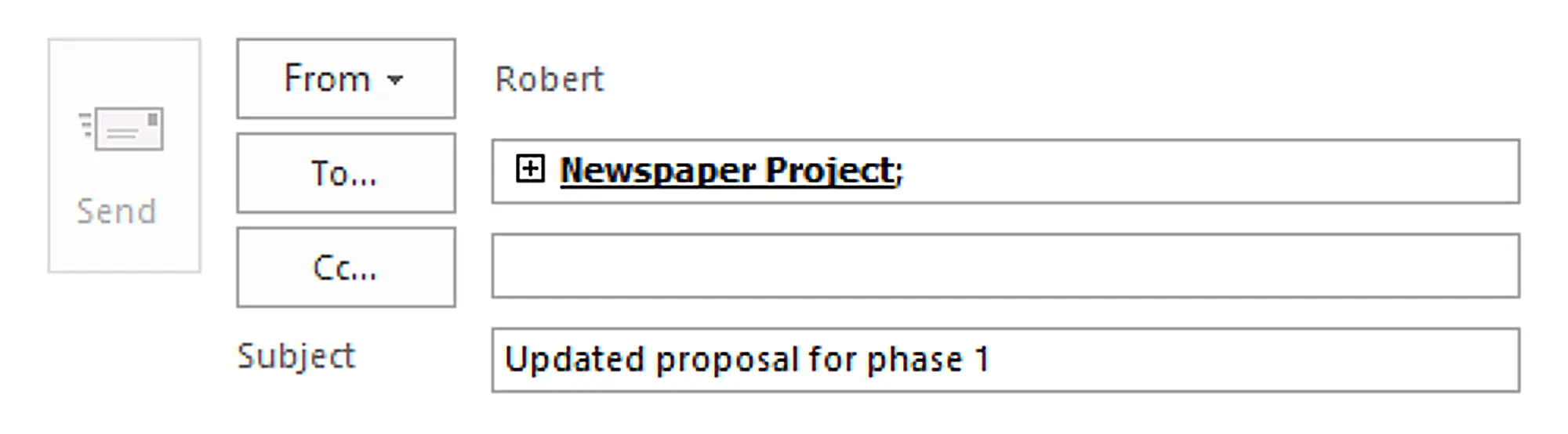
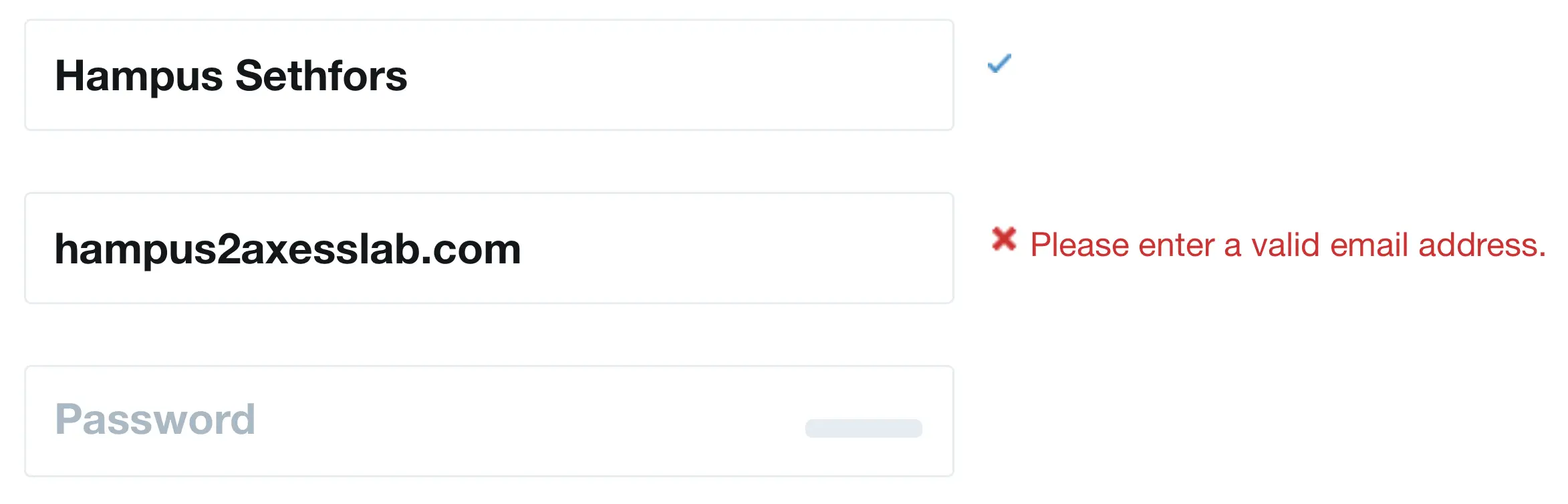
Why? Well, let’s pretend that you have low vision and you’re filling in the register form on eBay:
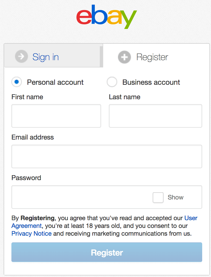
If you’re zooming the interface because of your low vision, you’ll most likely not see the second column:
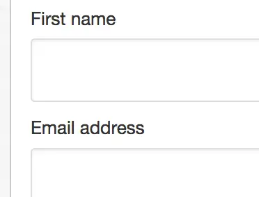
Maybe you’ll think they only need the first name. Or you might simply fill in both your first and last name in the field for “First name”. I’ve seen that done so many times in user tests, both by users with and without disabilities. You’re so used to writing your last name after you write your first that you do it by default.
So this is what you’ll end up with:
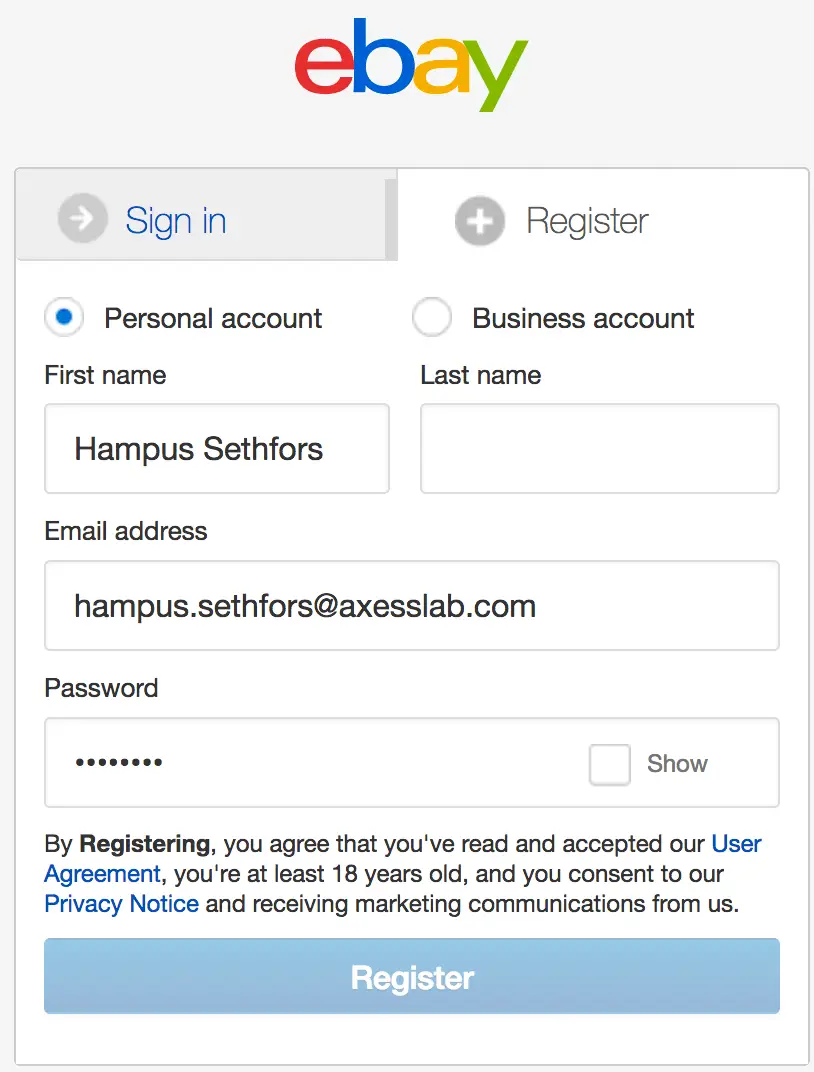
You’ll find yourself clicking the register button and getting no feedback. By the time you’ve realized there’s a second column in the form, eBay will have gone bankrupt for losing so many customers.
Aside from that, assistive technologies like screen readers and switches are usually not even able to navigate to disabled buttons. Try using the tab key on your keyboard to get to one in the eBay form. You’ll see it skips right over it. Frustrating, right? Many assistive technologies simulate keyboard navigation, so that’s the experience many assistive technology users will have.
Disabled buttons also tend to cause greater problems to people who make more mistakes when filling out forms. And this means many users with cognitive or learning impairments. Or people with dyslexia. Or problems with their motor skills. Or less tech savvy users. The list goes on.
So disabled buttons exclude users with disabilities. It’s one of the best reasons to stop using them.
What to do instead
Just don’t disable buttons! Have them enabled and then show an error message when the user clicks them.
Don’t trust me? Well, take it from A Definite Guide to Sensible Form Validations instead:
It is a bad practice to disable buttons. Disabling the button prevents our chance to tell the user what is wrong. The user keeps clicking the button and is totally in the dark why nothing happens. Keep the button enabled. Let the user click the button. Then show the message why it can’t proceed.
If you really, really want to indicate that a button is disabled, do some css magic and make it look a bit grey (but with sufficient contrasts). And then turn it green or blue when everything is filled in correctly. But keep the button enabled in the code at all times and put focus on an error message if it’s clicked and there’s something wrong.
Do you need help with this on your project? Our accessibility review service covers toggles, states, and interaction patterns across platforms.
The end of the thriller
The suspense is probably killing you..! Why was the “Add friend” button disabled on the Facebook profile?
The answer is – surprisingly – patriarchy! Ah, yet again, poor respect of women pops up as the cause of a problem in society.
She had activated a setting on Facebook that blocks friend requests from people that don’t share a mutual friend with her. It turns out that many women get spammed with friend requests from strange, creepy men. It makes me happy I’m not a woman, but at the same time embarrassed of my gender.
Luckily she was still around and could figure out why the button was disabled. We solved it by having her friend request me instead. But come to think of it, the disabled button almost cost me both a friendship and an important new insight! #feminism
So yeah…disabled buttons suck!
Want to know more? Send us an email at hello@axesslab.com or read more about our letting users with disabilities test your product..