
Hey…aren’t you accessibility experts?
Yes, at Axess Lab we specialize in accessibility.
But what does this post have to do with accessibility? Are you really allowed to use humor around people with disabilities?
Well, I’ve carried out some rigorous research and it turns out people with disabilities actually enjoy having fun!
Also, since technology is usually full of frustrating accessibility issues, I’d argue that people with disabilities benefit more from charismatic interfaces than most users.
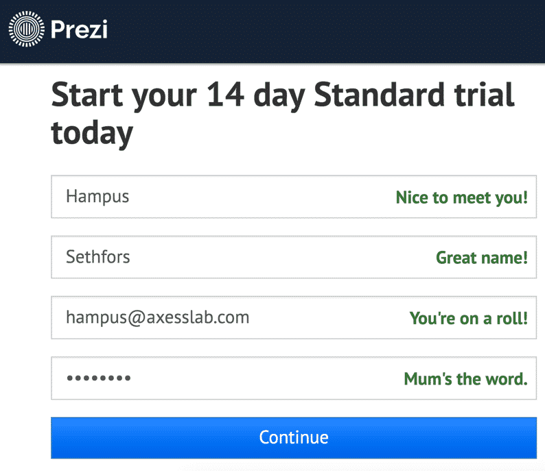
The polite registration form
In this article I’ll give you a bunch of examples of charming interfaces, talk about the benefits of using humor and give tips on how you can succeed. But first, a short anecdote on how I stumbled on this topic.
A few years ago, I was stuck at a login screen, trying a gazillion different email-password-combinations. My frustration grew for every incorrect-email-or-password-message I got thrown at me. You probably know the feeling.
I finally gave up, cursed and went to their registration screen to set up a new account. I was in a terrible mood.
I typed my first name in the registration form. A message popped up to the right of the field:
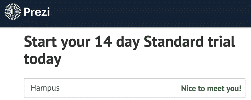
“Nice to meet you!” It caught me off guard, got me smirking and made me curious. I quickly moved to the field for last name. Another reply from the form:
“Great name!”
Probably the first complement I had got all week! It. Felt. Great!
I was probably humming Lego The Movie’s themesong “Everything is awesome” as I finished the last two fields.
How to use humor in interfaces
This experience got me thinking about how we can use charm and humor to enhance the user experience. I started collecting examples of interfaces that do it well. It’s an underused technique, so it’s quite hard to find good examples, but I’ve been searching for a long time!
So now I’d like to share what I’ve found and hopefully inspire some of you to work on making your users smile.
I’ll give examples on three ways to use humor in interfaces:
- Make errors less frustrating
- Make users smile at details
- Convince users to do something they don’t really want to
Let’s dive in!
Make errors less frustrating
One great place to start experimenting with charm is in error messages. Try to make your users smile with an illustration or unexpected wording. If you succeed, it will make your users more forgiving and they’ll hopefully find the energy to get around the error.
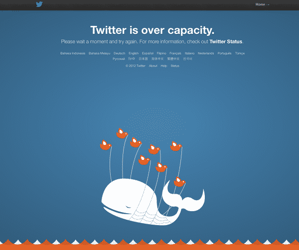
Twitter shows an adorable illustration when it’s down due to overload:
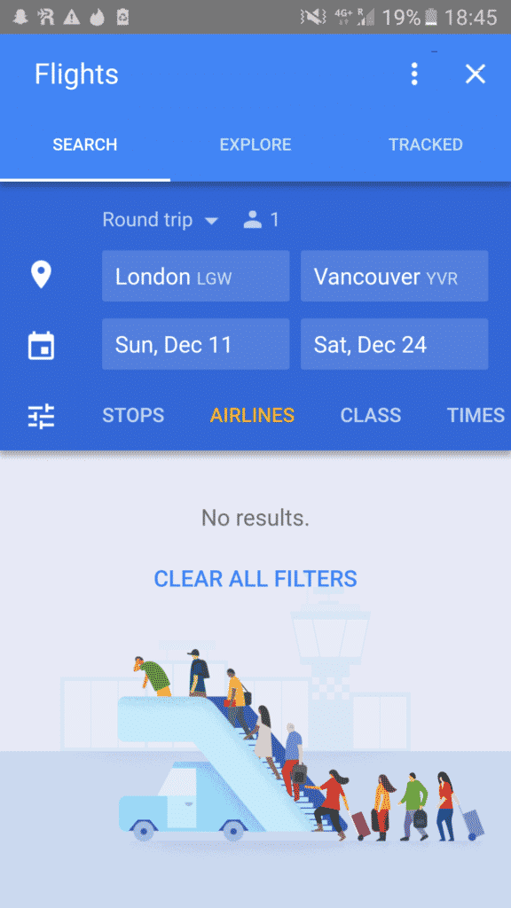
Google also uses funny illustrations if there are no results when searching for flights:
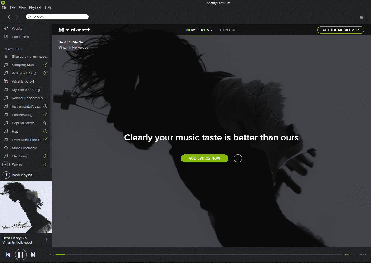
Spotify cleverly complements the user instead of just saying “There are no lyrics available for that song”:
Mailchimp hints of an evil twin if the username you want is taken:

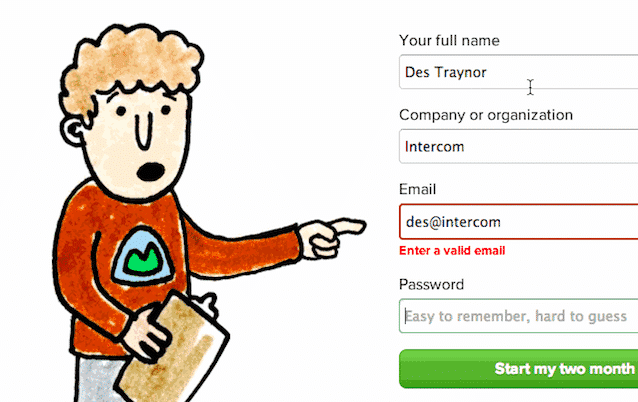
Basecamp has an illustrated boy pointing to each form field as you fill them in. He turns surprised when you make a mistake:
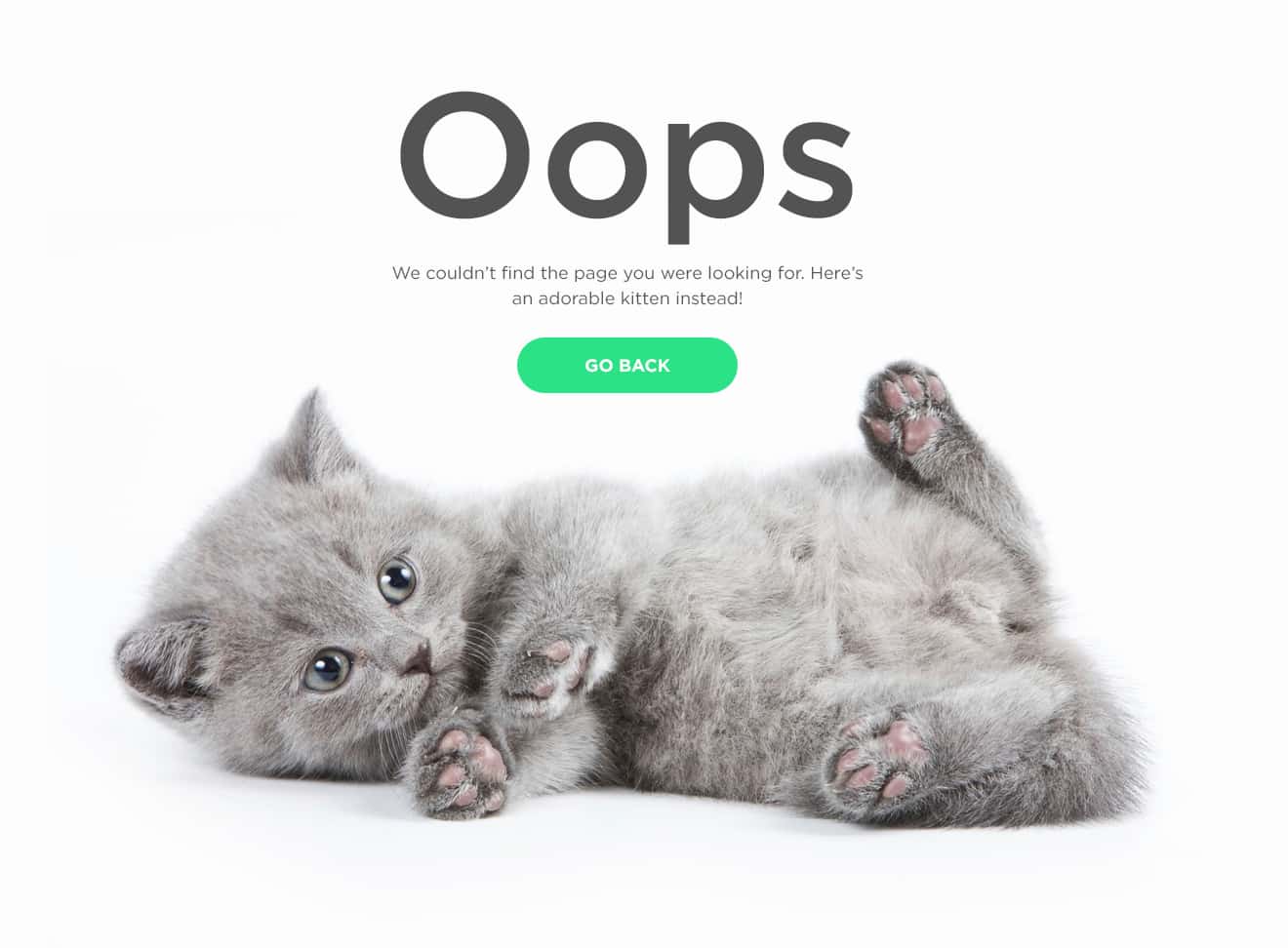
A 404-page is an awesome place to add some humor. Olivia Ricci exploits every user’s strong feelings for cute kittens. Aww!
Why do charming error messages works wonders?
Well, users will likely be irritated when they see the error. Luckily, it’s close to impossible to stay angry when you’re looking at a cute kitten.
If you’re interested in the science behind it: smiling and laughing releases dopamine, endorphins and serotonin which acts as mood-lifter and makes you relaxed and feel less pain. You’re basically drugging your users when they need it the most!
Make users smile at details
Another great place to use humor is in the details. Leave small treats for your users!
There is a great site dedicated to this: Little Big Details. If you find this article interesting, you should definitely check it out. I got quite a few of my examples from it.
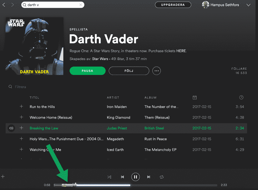
In Spotify the time bar turns into a light saber in the Darth Vader playlist:
Google Hangouts show charming animations when you type certain words, like “Happy new year”:

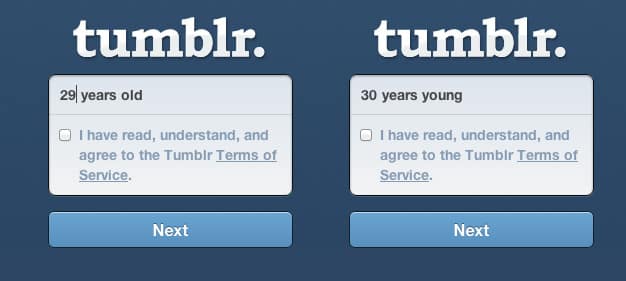
Tumblr changes their wording depending on the age of the user:
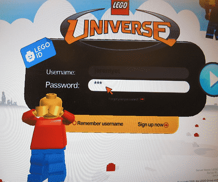
A Lego figure covers his eyes when you type your password on Lego Universe:
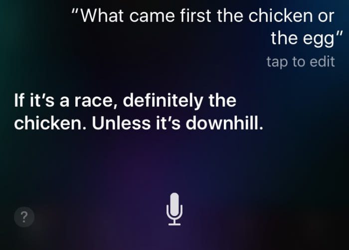
Siri answers some philosophical questions in clever ways:
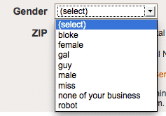
Generally, you should not ask users for their gender if you really don’t need that information. But assuming you do, you can add some humor:
Mailchimp shows a high-fiving chimp hand when you’ve shipped an email campaign. Clicking it – or high-fiving it back – makes the hand gradually more red.
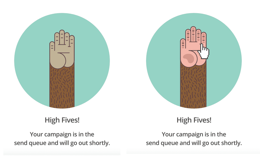
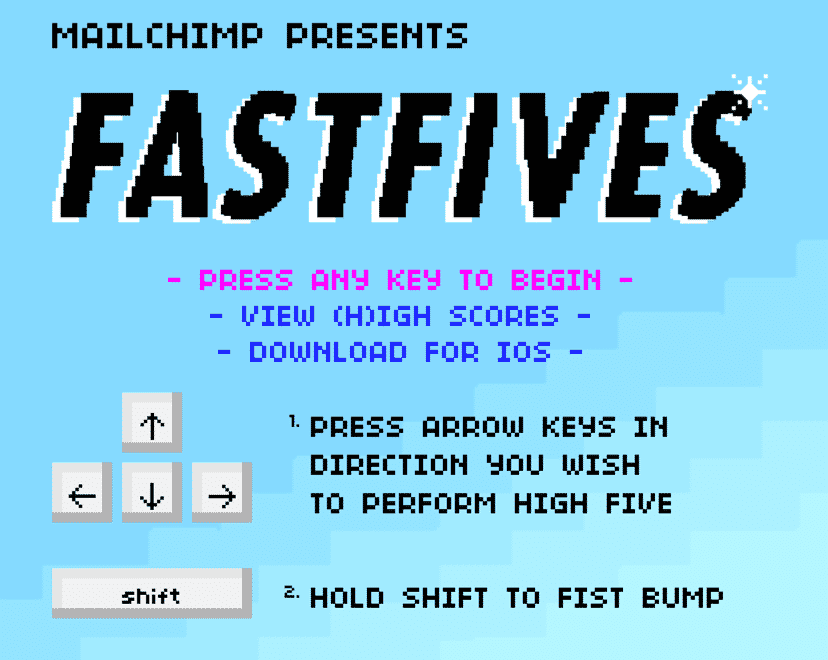
If you continue to click the hand, a high-five game starts in your browser. It made me wonder if Mailchimp’s developers have a bit too much time to spare…Or hey! Maybe they prioritize this type of content because they know it works!
Here are some advantages of using humor in the details:
- It makes the interface sharable. The first thing I did when I saw the Mailchimp high five feature was to take a bunch of screenshots and share them with my colleagues on Slack. You’ll get your users to market your product for you. Genious!
- It makes the user feel special. It’s kind of like finding a hidden treasure! It builds a connection between the user and your brand.
- It makes users search for more special details in your interface. A quick search on Google and you’ll find tons of funny things to ask Siri. This can help build loyal users who share their findings.
Convince users to do something they don’t really want to
Increase conversion rates by manipulating with charm! It might sound a bit odd, but you can use humor as an energy-boost for carrying out tasks that users might not feel like doing.
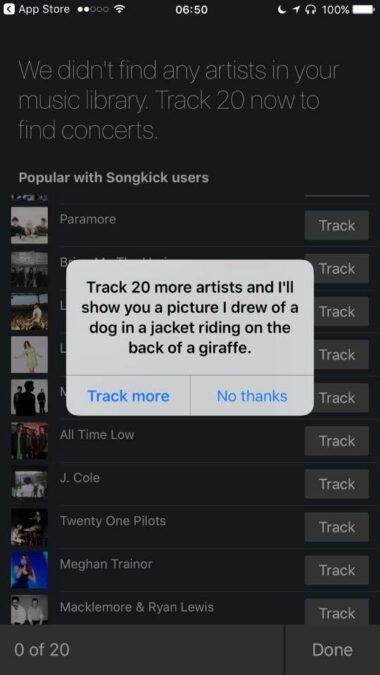
Songkick charms their users by offering something silly if they track 20 artists. Who wouldn’t put down the effort just to see the drawn picture they offer?!
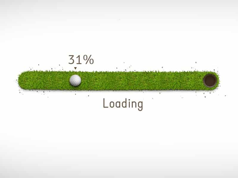
Nobody likes to wait, but as the old saying goes: “Time flies when you’re having fun”. There are some charming progress bars and loading spinners out there. Here’s a nice one by Dennis Perepelenko:
OkCupid shows this epic banner to people who use ad-blockers to get them to donate.
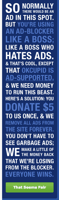
You will be much more inclined to do something if you’re in a good mood! That’s the simple brilliance behind this technique!
Still skeptical?
“I see your point, but I can’t design whimsical interfaces because I run a professional/business-to-business/multi-million-dollar/fortune 500/<insert your excuse here> company.”
I understand your concern, but – at the risk of sounding like a polite Englishman – I beg to differ. People don’t stop liking humor just because they go to work or become rich CEO’s. It’s human nature to enjoy smiling. And to appreciate the person (or interface) that made you smile.
As you’ve seen in the examples in this post, there are many ways to be charming. Everything will not work in every interface, but you should always be able to find a style that fits your brand. Everyone benefits from happy users!
Create memorable experiences
Lastly, I’d like to draw a parallel to one of the best articles on user experience I’ve read: User Memory Design: How To Design For Experiences That Last.
In short, the article is based on research done by Nobel Prize-winning psychologist Daniel Kahneman and talks about something called the “peak-end rule”. The gist of the rule is:
People’s memories of an experience are based on a rough average of the most intense moment (the peak) and the final moment (the end).
So when people evaluate your interface, their feelings about it will be based mainly on what they felt at the end and what they felt at the most intense moment. So when designing interfaces you should focus on creating one powerful peak moment and a great last impression.
You probably see where I’m going with this!
Happy is a powerful feeling. You can use charm and humor to achieve that! It’ll be extra effective if you inject humor when the user is done with a task, like the Mailchimp high-five example from earlier in this article.
Spotify cleverly uses humor in their offboarding by offering the user a “Farewell playlist” when they cancel their subscription:
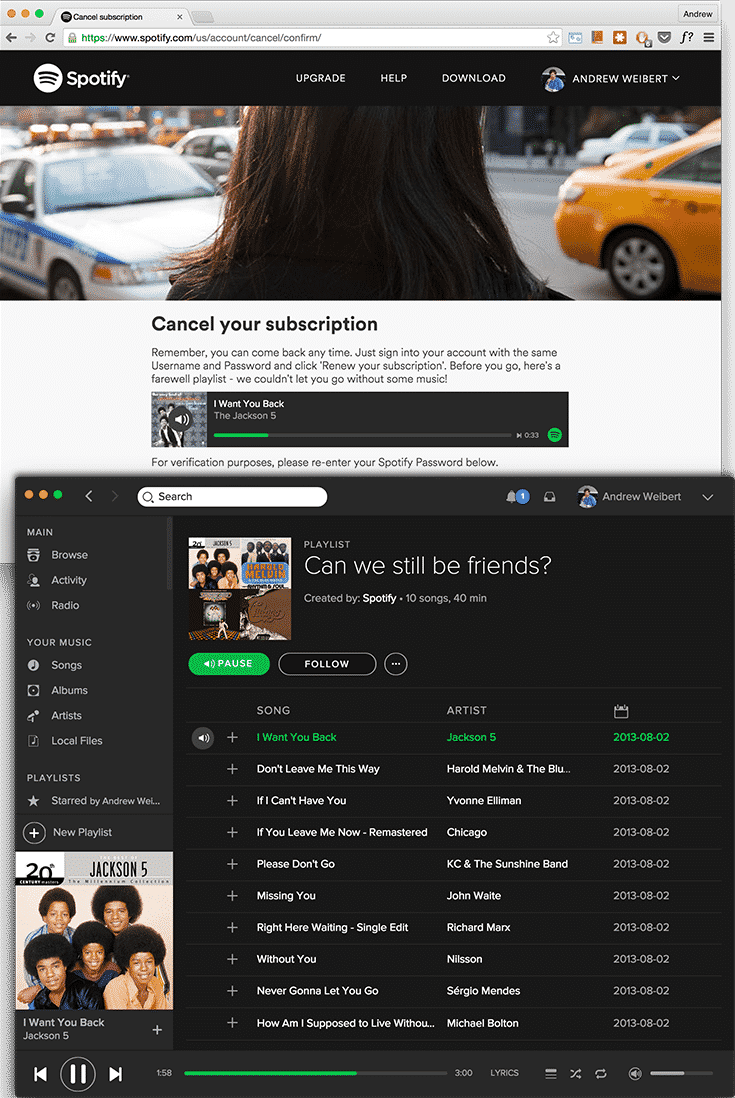
Maybe they won’t make a whole lot of users change their mind, but at least the user is more likely to leave with a smile on their face and have a slightly better memory of Spotify, which probably increases the chance they’ll come back some day.
A final joke
I want to live like I learn! Since the article is just about over, here’s a joke:
How many graphic designers does it take to change a light bulb?
Four. One to change the bulb and three to argue about whether they should have used serifed or sans serifed fonts on the packaging.
Ahh, priceless! If I listen closely, I can just about hear the endorphins flowing through your body helping you remember this article!
Hope you enjoyed!