
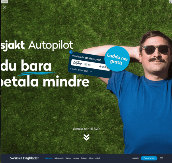
Examples when it does not work
Contrast issues
Contrast issues affect all users and impacts users with vision loss most. It puzzles me that companies paying for ads do not think of visibility since they pay for creators the work and for the placement. This is too common on bus-ads where you have so little time when you are behind the bus driving or as a pedestrian. You should really, with good vision, be able to see it from 100m away. Don’t get me started on company cars with bad screen print, that’s format for another ranting article.
It’s important to have a look at 1.4.3 Contrast (Minimum) which says text must have 4.5:1 for regular text in contrast ratio. Large text can pass with 3:1.
Remember this is the minimum level and not maximum allowed level, so aim higher!
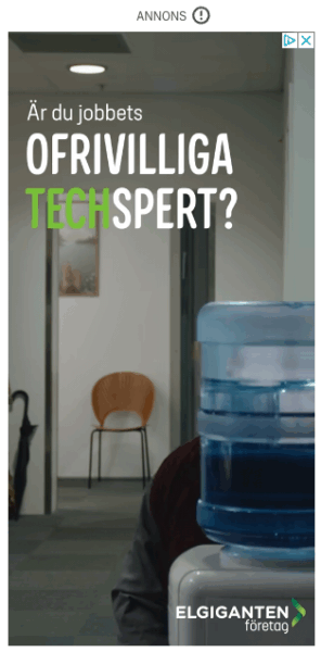
Ad for Elgiganten on Dn.se, default view:
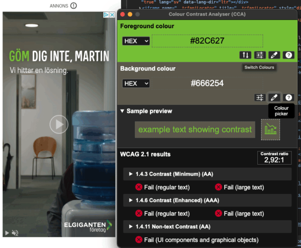
Ad for Elgiganten, where green text has low contrast of 2.92:1 in contrast ratio:
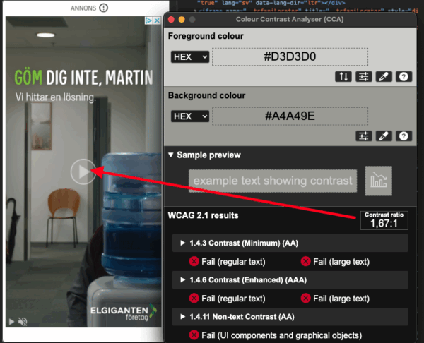
Ad for Elgiganten, play button has very low contrast, 1.67:1 in ratio:
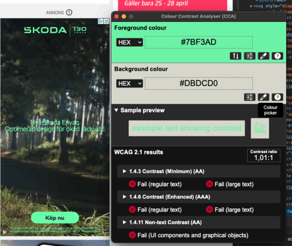
This ad for Skoda must win the contrast ratio with a staggering 1.01:1 in ratio:
ALT-text is missing
When making image ads that have a clear message to donate to a cause, in the example from Aftonbladet. Without vision you cannot donate to the cause since the ALT-text is missing. Thus you are being excluded.

I haven’t found any ads with meaningful alt-texts. Sometimes there’s a generic alt=“Ad” but this means you’re both excluding users and not getting the ad across to all potential users.
Text cut off on zoom
Some ads do resize with the content on zoom even if it’s an image, but the bounding box does not allow for increasing the space or changing from a 3 column view to 2 or 1 columns. The example on Coop.se shows content gets cut-off after 200% zoom and text-resize.
Default:
200% Zoom:
Text-resize of 200% (32px):
Overlapping when text is resized
Some ads actually have real text. But, the website or the advertisement platform is not adapting. While this ad probably works better in a screen reader, it’s impossible to read with larger text size set.
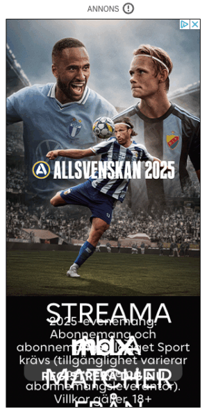
The example shows Dn.se Allsvenskan MAX ad fails resize text getting overflowed.
Default view:
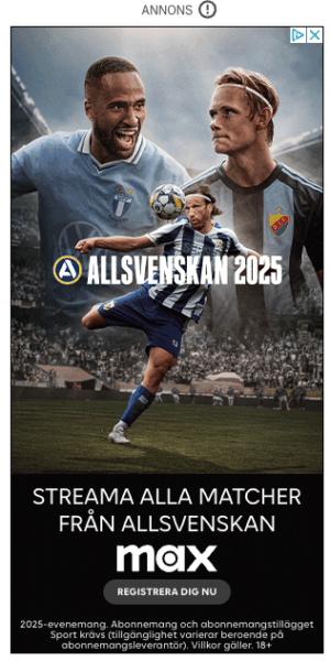
Text resize 200% (32px) overlapping the text on top of each other:
Resize of page does not affect the ads.
Ads not affected by text-resize
For most people using text-resize in the browser the company will pay form the ad-view but the user will not see the ad text.
Text has been resized but does not affect the ad for Jula.
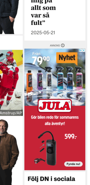
Default view without text-resize enabled:
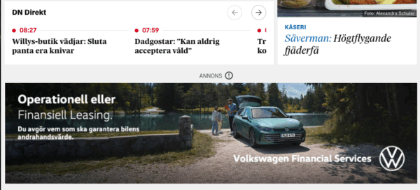
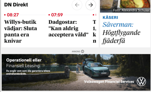
Volkswagen ad does not resize the text:
Overflow fail
People use different widths on their browsers, sometimes to be able to use multiple programs on the same screen. Overflow fails when you narrow the window and the ad is just an image.
Example of SVD.se:
Strange inverted zoom
Ad on Aftonbladet.se for Blocket. Zooming in on content does the opposite for the ad and actually zooms out and decreases size. Clearly they have not tested this at all with accessibility in mind.
Let’s make it better
Use real text – not text as part of images
In the world of ads, sometimes you do not have a choice or it’s not easy to do. There are of course benefits to using real text since you can change the zoom without loosing quality – an image becomes pixelated when zooming.
Other benefits:
- Text-resize
- Change of color
- High contrast modes
- Font flexibility
- It is possible to translate
- Content is reusable for different formats and platforms.
- Easier to adopt to dark mode
Links in images
If you do use a link (URL) in the image, be sure to make it short so the ALT-text also can be understandable. An image with a QR-code should state that the QR-code is in the image and also where it leads. Using a QR-code could be easier for some since they do not have to memorize the link.
For all text content in an image you need to consider 2.5.3 Label in name.
What should you include in ALT-text?
As all ALT-text you should start with the most important part and continue with less important parts. The basics of writing ALT-text can be read in Alt-texts: The Ultimate Guide.
Practical example
Let’s look at an example where AI-services have done complicated things on an ad with a lot of text in it.
AI suggestion:
Original in Swedish:
ALT=”ICAKaviar_Mildrökt_VälbalanseradRökigFastGod_TestAlltOmMat_20241014_DisplayAnnons_GAM360”Translated to English:
ALT=”ICAKaviar_Mildrökt_WellbalanceSmokeyFirmTasty_TestAlltOmMat_20241014_DisplayAd_GAM360”
Underscore and capitalized words makes the ad unnecessary verbose and hard to read. Not all contents is added and the AI function cannot know the context and what is important.
Better example:
Original in Swedish:
ALT=”Annons från ICA för ICA Kaviar mildrökt. Utsedd till bäst i test enligt Allt om Mat 14 oktober 2024: Välbalanserade smaker med tydlig rökighet. Bra lagom fast konsistens. God eftersmak. Gå till ICA.se för att se produkten.”Translated to English:
ALT=”Advertisement from ICA for ICA Kaviar mildrökt. Named best in test according to Allt om Mat 14 October 2024: Well-balanced flavours with a distinct smokiness. Good, firm consistency. Delicious aftertaste. Go to ICA.se to see product.”
End with the action, “Go to Ica.se to see product”. It might be too verbose starting with “Advertisment” so test it with users on your platform.
Depending on context, use clarifying wording that it’s an ad. Put all the text in the ALT-text.
Video ads
Start with making sure the script for the video production includes verbal descriptions of such things as names or texts on display in the video and important visuals. This decreases the need of alternate video with audio description tracks. Always include captioning since most people view video content on social media without sound. They can be on a bus without headphones or putting kids to bed and rather not wake them up. So if you miss captions in the content you miss the chance to sell to a lot of people. Some platforms do not allow captions with files ( such as .srt or .vtt formats), embed the caption in the video in these cases since it is better than no caption at all.
For audio, people can listen to video content but move focus when the ads arrive. If you miss the visual description in the audio track you’re missing a lot of users. Personally I am in the habit of multi-tasking and focusing on something else. So if you don’t even verbally tell me the company name or pitch you pay for views without value.
Other parts of importance:
- Put text on solid backgrounds with good contrast.
- The video and audio should be easy to follow, so don’t go too fast.
- Make sure captions come synchronized and at least one line at a time.
- Avoid very high sound in the beginning and keep volume at the same level.
- Autoplaying sticky videos should be avoided.
- Make sure not to have ARIA-LIVE reading out updates such as the number of seconds to the next video. It interrupts the user.
Conclusion
Ads suck today, either the advertisement platforms do not support what is needed for accessibility or the publisher platform has restrictions. Let us increase the demands when choosing and procuring a platform. Everyone should be able to read ads if they want to.
Want our help with making your ads and services better?
We’ve guided many organisations through this process before and can make it a whole lot easier for you too. Check out our accessibility consulting services or just drop us a message at hello@axesslab.com – we’re happy to help!