The problem
First a short background if you’re not familiar with screen readers. When navigating a web site on a touch screen, my screen reader – VoiceOver – will read what’s under my finger. It enables me and other people with visual impairments to use technology.
What I should hear when touching a link with my finger is:
- The name of the link.
- What type of element it is: “link”.
For instance: “Contact information, link”.
However, sometimes I just get to hear what type of element it is, not it’s name. Just “Link”. Not very helpful.
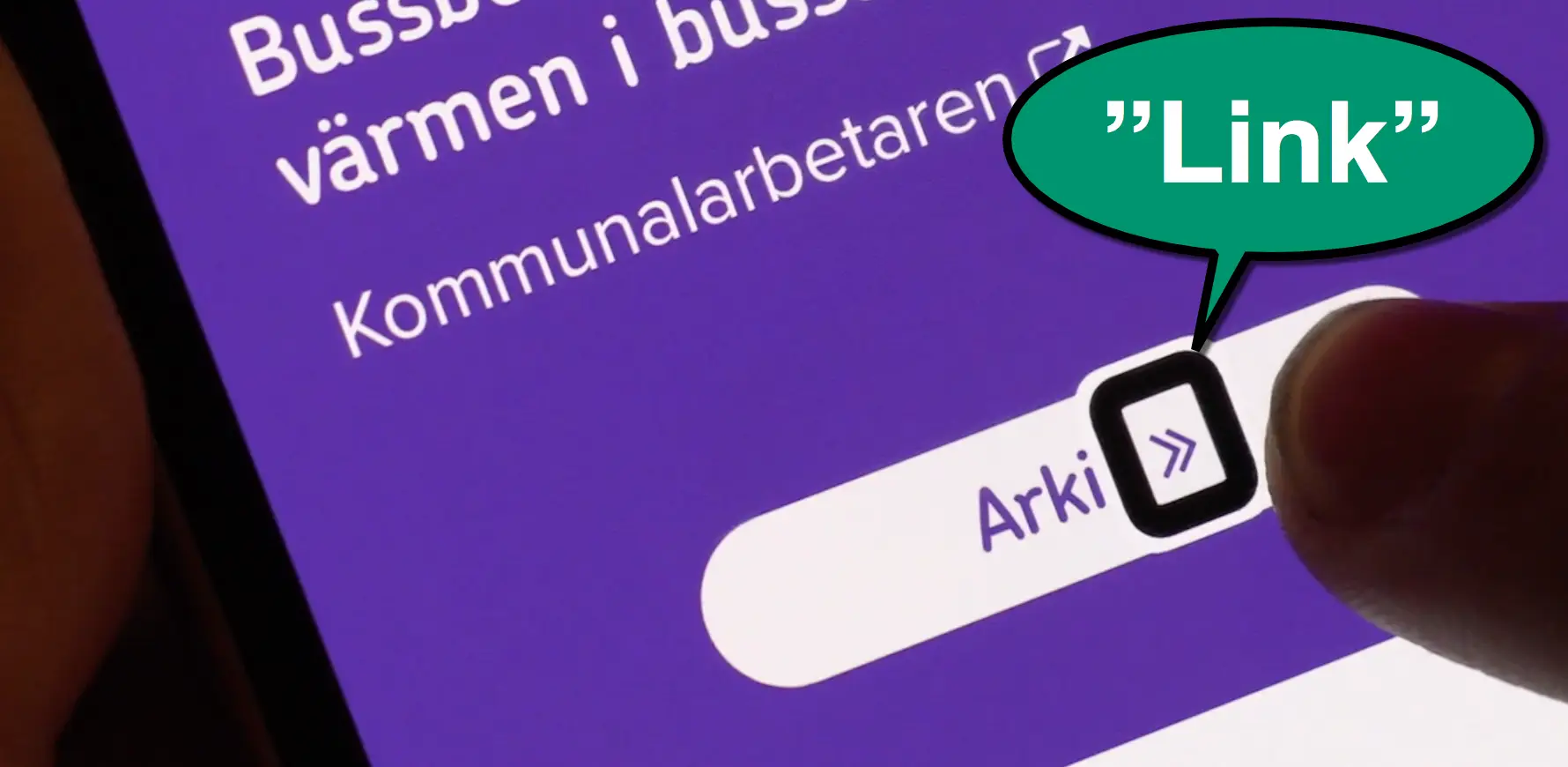
The 16 second video below is from a Swedish site, but I think you’ll get the point even if you don’t know Swedish.
Notice how it just reads “Link” if my finger is on the right side of the elements – a bad user experience. If I touch the left side of the links, I get to hear the names together with the type of element – a good user experience.
What’s going on here? Well, let’s take the last link in the example above. It’s made up of two parts: The name “Arkiv” and the link icon.
<a href="...">
   Arkiv
   <span class="link-icon">
   </span>
</a>
In the code, the icon is placed in its own span-element. A perfectly fine way to code your links. It should be read as one object, as the link-element is wrapping both the link name and the icon-span.
But VoiceOver interprets it as two different objects if I touch the right span, rendering me confused.
OK, so Apple should fix this?
Yes, I wish. But I reported this error in 2012 and it’s still not fixed, so my hopes aren’t great. While we wait for Apple, there’s an easy workaround for developers to fix this on your sites.
The solution: role=”text”
We had a similar problem on our site with headings, but the solution I used will work for links as well. Let’s look at it.
Here I’ve got an h1-element that looks like this in the code:
<h1>Digital accessibility, <br>
for everyone.</h1>
As you can see in the video below, the br-tag causes the screen reader to interpret the title as two separate objects, just like the span did in the previous example. I want it to read the whole heading to me at once.
So to force a screen reader to interpret the heading as one object, I wrapped the text inside the heading in a span and added role=”text”.
<h1>
  <span role="text">Digital accessibility, <br>
    for everyone.
  </span>
</h1>
And voilá, here is the result:
Beware! Don’t put role=”text” in the heading-element. This would erase the h1-semantics, so it would not appear as a heading in a screen reader. Every element inside the role=”text” will lose it’s semantics. So you need to add a span within the element and put role=”text” in that span.
Apple, if you’re listening, please fix this. But until then, developers, please do the visual impaired community a favor and check your elements with a screen reader and fix them if necessary.
Update – questions and answers
This post went a bit viral! Which is great, but I’ve gotten a few questions that I want to clarify.
Can’t we just use aria-hidden on the icon?
Yes, we can, in some cases! In my first example, the link-icon is unnecessary to understand the purpose of the link, so you can just use aria-hidden=”true”. But we’d like the recommended technique to work in as many scenarios as possible.
So imagine the following case. You have a link or heading with three words, where the middle one is stylized. For instance:
<a href="...">Buy <strong>t-shirts</strong> now</a>
Here, VoiceOver would announce them as separate links: “Buy link”, “t-shirts link”, “now link”.
Now we can’t use aria-hidden since that would hide a word for the screen reader user. It would just say “Buy now link”, skipping the t-shirt part.
However, using the role=”text” technique will work great in this scenario as well.
Is this just a problem with explore by touch?
To navigate with a screen reader you can either touch parts of the screen and have the objects you’re touching read to you – explore by touch – or swipe your way across the interface from object to object. I use explore by touch in my videos.
One person asked if this problem only occurs if you explore by touch.
However, sadly it happens both on explore by touch and when swiping.
Why don’t you keep writing to Apple?
Apple have actually answered me. They think this is a feature. It makes it possible to recognize that different words are styled in different ways.
I think it’s a nice thought. But in reality, it’s not practical. For us screen reader users, it’s more important to get the whole sentence read than to recognize that something has a different styling.
One idea would be to make the styling differences clear in some other way, like changing the pitch of the voice.