
The article about the Product Detail Page can be read here: Making an iOS E-Commerce Product Detail Page Accessible to VoiceOver and Beyond
And the full webinar recording is available here: Webinar Developing and testing iOS Apps using a screen reader with Diogo Melo
Product List Page: The Hidden Problems
The PLP is built in SwiftUI using a NavigationStack. Each row is a product cell containing:
- A small image on the left
- The product’s name, description, price, and a star-based rating in the middle
- Tapping the product name or information opens the Product Detail Page
- “Add to Cart” and “Wishlist” buttons on the right, with the heart icon reflecting the wishlist state)
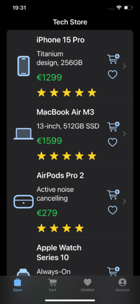
In code terms: an HStack containing the image, a VStack with product information (including an HStack for the stars), and a second VStack for the action buttons.
In the first implementation, VoiceOver skipped the star rating entirely and didn’t expose the Add-to-Cart or Wishlist actions. Because the entire row sat inside a NavigationLink, VoiceOver treated everything as one big “button,” leaving the product actions completely unreachable.
The initial Product List implementation can be found on the files ProductListViewV1 and ProductCellViewV1 in this GitHub repository. The fixes that follow are implemented in ProductListViewV2 and ProductCellViewV2.
Labels and Actions: Fixing the PLP
The star icons were not being read at all. To fix this, I gave them a proper label. Since they’re rendered inside a ForEach, I needed to collapse them into a single accessibility element to avoid repeated labels and present the rating as one meaningful unit.
HStack {
ForEach(0..<Int(rating.rounded())) { _ in
Image(systemName: "star.fill")
}
}
.accessibilityElement(children: .ignore)
.accessibilityLabel("Rating: \(ratingAsString)")
Now VoiceOver announces a clean “Rating: 4.5” instead of ignoring the stars or reading “star, star, star…”
To expose the Add to Cart and Wishlist options, I used accessibility actions. Embedding interactive controls inside a NavigationLink is inherently problematic for VoiceOver, so actions were the cleanest approach. At the very end of the product cell, I added:
.accessibilityAction(named: existsInWishlist(product)
? "Remove from Wishlist"
: "Add to Wishlist") {
addOrRemoveFromWishlist(product)
}
.accessibilityAction(named: "Add to Cart") {
addToCart(product)
}
SwiftUI uses a LIFO order when presenting actions to VoiceOver, so I wrote them in reverse to get the correct order in the rotor.
With these changes, VoiceOver now announces the product rating properly and clearly indicates that actions are available. The user can swipe up or down to pick “Add to Cart” or “Add to Wishlist” and the Wishlist action is dynamically updated (e.g., “Remove from Wishlist” after adding).
This preserves the visual layout while giving screen-reader users full, efficient control.
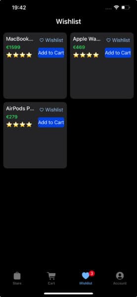
Wishlist: Too Much Information
The wishlist is implemented in UIKit using a UICollectionView. Each cell contains:
- A vertical stack of product name, price, and rating
- Tapping any of these informative elements opens the Product Detail Page
- Buttons to add to cart and remove from wishlist
The initial Wishlist implementation can be found on the file WishlistCollectionViewCellV1 in the same GitHub repository. The fixes below are implemented in WishlistCollectionViewCellV2.
VoiceOver originally treated every subview in the cell as its own element. The star rating came through as an image, and the Wishlist button even switched languages briefly before just saying Wishlist.
Navigating a single product required multiple swipes. Imagine doing that across dozens of items.
Fixing the Wishlist: Grouping Information
To make the experience smoother, the product information needed to be treated as one coherent unit.
To group and label the information stack, I set it as an accessibility element and gave it a proper label. I also gave the Wishlist button a clear, explicit label:
infoStackView.isAccessibilityElement = true
infoStackView.accessibilityLabel = "\(name), \(price), rated \(ratingAsString)"
wishlistButton.accessibilityLabel = "Remove from Wishlist"
Now VoiceOver focuses the entire information block at once and reads it naturally as a single product summary, just like a sighted user perceives it visually.
VoiceOver focuses first on the product information and then navigates to the Cart and Wishlist buttons. It still requires more than one swipe per product, but the flow is much improved.
Added to the Wishlist: Keyboard and Voice Control
After fixing the Wishlist for VoiceOver, I tested the same implementation with Full Keyboard Access to see whether the changes translated beyond screen-reader use.
Using Tab or arrow navigation, Full Keyboard Access can now reach all three meaningful elements in each cell: the grouped product information (which opens the Product Detail Page), the Add to Cart button, and the Remove from Wishlist button.
Grouping the product information for VoiceOver also made it reachable by Full Keyboard Access. Before this change (not shown in the initial demo), keyboard navigation could reach the buttons but skipped the product information entirely.
I then tested the same Wishlist implementation using Voice Control.
Voice Control correctly presents numbers for each actionable element: one for the product information that opens the Product Detail Page, and separate numbers for the Add to Cart and Remove from Wishlist buttons.
In this case, improving element grouping for VoiceOver also produced immediate benefits for Voice Control. Even when using “Show Numbers,” Voice Control exposed all elements with their correct, meaningful labels.
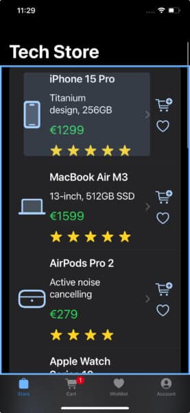
We have a PLP Problem
Testing the improved Product List Page with Full Keyboard Access produced mixed results.
On the one hand, keyboard navigation could move between products using arrow keys or Control–Tab. On the other hand, the Add to Cart and Add/Remove from Wishlist buttons were not focusable at all.
Full Keyboard Access users can still reach these actions by pressing Tab + Z, which opens the accessibility actions menu and allows the selected action to be activated.
However, accessibility actions are not exposed to Voice Control at all. As a result, Voice Control users can only open the product page and cannot access the cart or Wishlist actions at all.
Breaking the Original Premise
Earlier, I set a constraint for this demo: I would not change a single pixel of the original design. To resolve this issue, I had to slightly relax that rule.
On the Product List Page, instead of wrapping the entire product cell in a NavigationLink, I limited the link to the product image and information. The Cart and Wishlist buttons were moved outside of it.
HStack {
NavigationLink(destination: ProductDetailView(product: product)) {
ProductCellNoButtons(product: product)
}
VStack {
// Cart and Wishlist Buttons
}
}
Visually, this moves the chevron indicator so that it appears before the Cart and Wishlist buttons rather than after them. As a blind developer rather than a visual design expert, I can’t say which layout is more common, but the change is subtle and does not alter the overall structure of the list.
With this structure, Voice Control users can now activate all product actions directly.
Because VoiceOver and Voice Control do not always cooperate (Voice Control overlays are not consistently read by VoiceOver), in this demo I activate actions without VoiceOver feedback and confirm them afterward.
I could add a product to the Cart by saying “Tap 2,” add and remove it from the Wishlist using “Tap 3,” and finally open the Product Detail Page with “Tap 1”
And the same approach works to Full Keyboard Access users.
Navigating with the arrow keys or Control–Tab now focuses on the three actionable elements per product: the product information, the Add to Cart button, and the Wishlist button. Each can be activated directly using the Space bar, without invoking the accessibility actions menu.
Using VoiceOver, navigation now requires more swipes per product because each element is treated separately. From my perspective as a VoiceOver user, although the interface is functionally correct, I prefer the original single-element approach with accessibility actions, which allows quicker navigation and easier access to all available options.
In a future article, we will explore strategies to optimize for VoiceOver navigation without conflicting with other assistive technologies.
Final thoughts
Making the Wishlist accessible in UIKit turned out to be relatively straightforward. By grouping elements the way sighted users visually perceive them and providing clear, explicit labels, VoiceOver navigation improved immediately. Those same changes translated automatically to Full Keyboard Access and Voice Control, without requiring any additional adjustments.
The Product List Page required more iteration. Wrapping the entire product cell in a NavigationLink is a common SwiftUI pattern and works well visually, but it hides secondary actions from assistive technologies. Exposing those actions through accessibility actions improved the experience for VoiceOver and, to a degree, Full Keyboard Access. However, it left Voice Control users unable to interact with the Cart and Wishlist buttons.
By separating navigational content from action buttons, all assistive technologies could access every available action directly. The visual change was minimal, but the accessibility impact was significant.
This process highlighted an important distinction between assistive technologies. VoiceOver and Full Keyboard Access can benefit from accessibility actions, assuming users are informed of their existence. Voice Control, however, relies much more heavily on directly exposed, clearly labeled controls. If something is not a button, it is effectively invisible to voice interaction.
As someone who relies primarily on VoiceOver, this was a valuable perspective shift. Supporting Voice Control required rethinking interaction patterns I normally take for granted, and ultimately led to a more robust and inclusive Product List Page overall.
I’m deeply passionate about both iOS development and accessibility. If your iOS team needs someone who truly cares about accessibility and great user experience, I am open to new assignments. Drop me an email at diogo@axesslab.com.