
The article about the Product List Page and Wishlist can be read here: Making an iOS E-Commerce Product List Accessible to VoiceOver and Beyond
And the full webinar recording is available here: Webinar Developing and testing iOS Apps using a screen reader with Diogo Melo.
The Accessibility Issues Hiding in Plain Sight
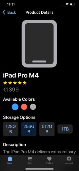
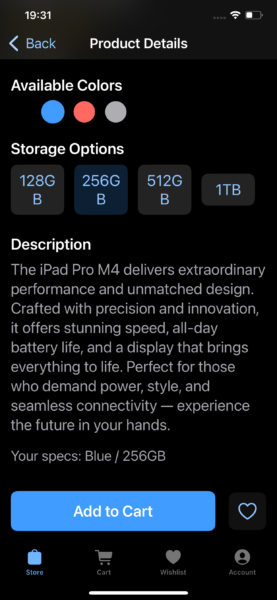
The Product Detail Page is implemented in SwiftUI and presents quite a lot of information:
- A large product image — in this demo it’s an SF Symbol rather than a real image
- The product name as the page’s headline
- The product star rating and price
- The product’s color and storage options, represented as buttons with hard-coded demo values
- A generic product description
- A small text label that announces the currently selected color and storage (added purely for early accessibility testing)
- The Add to Cart and Add to Wishlist buttons, with the latter updating visually depending on wishlist status
In code terms, everything lives inside a VStack within a ScrollView, with inner HStacks for the star rating, color options, storage options, and the Cart/Wishlist buttons.
Testing the first (accessibility-unfocused) version with VoiceOver revealed several issues. The most noticeable one was the star rating: each individual star was treated as a separate image, and VoiceOver tried to run image recognition on each one (“A yellow star against a black background”). The color buttons produced even stranger results (“night sky”, “outdoor”, “chart”, or nothing at all), and VoiceOver didn’t even identify them as buttons.
There were also structural issues:
- The decorative product image should not be spoken at all
- The product name and description were not identified as headings
- The wishlist button didn’t reflect its current state
- While VoiceOver could read the storage options, it didn’t indicate which one was selected.
The initial implementation can be found on the file ProductDetailViewV1 in this GitHub repository. The fixes that follow are implemented in ProductDetailViewV2.
Hide-and-Seek (Labels and Headings)
I started by collapsing the star rating into a single accessibility element, to avoid it being navigated repeatedly, and to give it a single clear label.
HStack {
    ForEach(0..<5, id: \.self) { _ in

        Image(systemName: "star.fill")

    }

}

.accessibilityElement(children: .ignore)

.accessibilityLabel(ratingAsString)
Next, I hid the decorative product image and marked the product name and the “Description” label as headings:
Image(systemName: product.imageName) // proper formatting skipped

.accessibilityHidden(true)

...

Text(productName)

.font(.title)

.accessibilityAddTraits(.isHeader)

...

Text("Description")

.font(.headline)

.accessibilityAddTraits(.isHeader)

.accessibilityHeading( .h2)
Since iOS 18, VoiceOver supports heading levels (1 to 6), just like on the web. I used level 2 here to maintain a logical structure. As far as I can tell as a VoiceOver user, the levels don’t currently change the interaction experience, but I’d love for that to matter one day. For now, I’m just trying to get developers to include any headings at all.
Finally, the wishlist state needed to match the visual toggle. If the app uses one dynamic button, we can simply attach a dynamic label:
// button whose state depends on whether the product is on the wishlist

.accessibilityLabel(existsInWishlist(product) ? "Remove from Wishlist" : "Add to Wishlist")
If the UI uses two different buttons, one for each state, each button just needs its own static label:
If existsInWishlist(product) {

// button to remove product from wishlist

.accessibilityLabel("Remove from Wishlist")

} else {

// button to add product to Wishlist

.accessibilityLabel("Add to Wishlist")

}
Turning Visual Selection Into Accessible Feedback
The storage button was already labeled properly, but VoiceOver had no idea which storage option was selected. To fix that, I added the .isSelected trait so the accessibility state reflects the visual state:
Button(storage) {

    selectedStorage = storageOptions.firstIndex(of: storage) ?? 0

}

.background(storageOptions[selectedStorage] == storage ? Color.blue : Color.gray)

.accessibilityAddTraits(storageOptions[selectedStorage] == storage ? .isSelected : [])
For the color options, the logic is similar. We add the .isSelected trait, give each option the .isButton trait (as explained in this previous article), and give each option a meaningful label:
Circle()

.fill(color)

.overlay(

    Circle()

    .stroke(colors[selectedColor] == color ? Color.blue : Color.clear)

.onTapGesture {

    selectedColor = colors.firstIndex(of: color) ?? 0

}

.accessibilityLabel(color.description.capitalized)

.accessibilityAddTraits( colors[selectedColor] == color ? [.isButton, .isSelected] : [.isButton])
Let’s see how all of this changes the experience.
Bringing the Page to Life With VoiceOver
With these fixes, navigating the product page with VoiceOver starts behaving exactly how a sighted user would expect.
The product name is now read as a heading, and the star rating is a single, clear element.
Color and storage options are read as buttons, and double-tapping to select one announces the new choice as Selected.
The description header can be navigated via the rotor’s heading mode.
And the wishlist button correctly reports whether it will add or remove the item. It also reports the “Remove from Wishlist” button as Selected using the .isSelected trait. This is more of a personal preference, as some apps do this and I intuitively expect it as a VoiceOver user.
In short, the PDP now communicates structure, meaning, and state, not just raw UI fragments.
A Little Less Full Keyboard Access
Testing the accessible version of the PDP with Full Keyboard Access (FKA) mostly works as expected.
Using Tab navigation, I can reach:
- The back button
- All the color and storage options
- Add to Cart
- Add to Wishlist / Remove from Wishlist
However, one unexpected element appears in the tab order: the star rating.
Even though it isn’t interactive, Full Keyboard Access treats it as focusable. This happens because collapsing the stars into a single accessibility element implicitly marks it as something the user might want to interact with.
To fix this, we can explicitly mark the element as static text by adding the .isStaticText trait:
HStack {

    // ForEach with star rating

}

.accessibilityElement(children: .ignore)

.accessibilityAddTraits(.isStaticText)

.accessibilityLabel(ratingAsString)
This tells Full Keyboard Access exactly what this element is: decorative information presented as text. Once marked correctly, it’s skipped during keyboard navigation.
Voice Control Comes Along for Free
Testing the PDP with Voice Control shows that the same accessibility improvements translate cleanly to voice-based interaction, with no additional effort.
Like with Full Keyboard Access, all interactive elements are exposed correctly:
- All color and storage options
- Add to Cart
- Add to Wishlist / Remove from Wishlist
- Tab bar navigation
Voice Control identifies these elements as tappable and allows them to be activated using spoken commands.
Because Voice Control relies heavily on accessibility labels, the earlier work of adding meaningful labels, button traits, and selected states pays off here without any Voice Control–specific code.
Final thoughts
Making the Product Detail Page accessible to VoiceOver turned out not to be a complex or disruptive task. Most of the work involved hiding or collapsing purely decorative elements, providing meaningful labels, and using the correct accessibility traits to reflect structure and state. None of these changes required visual redesigns or custom accessibility workarounds, just more intentional use of the APIs SwiftUI already provides.
Even though this article focused primarily on VoiceOver, testing along the way showed an important pattern: improvements made with VoiceOver in mind often benefit other assistive technologies as well. Full Keyboard Access became more predictable once roles were clearly defined, and Voice Control was able to expose and activate all interactive elements without any technology-specific code.
In that sense, Voice Control works as a powerful validation tool. If an element can’t be easily activated by voice, it’s often a sign that its accessibility role, labeling, or structure needs improvement.
In the webinar, I also presented a more VoiceOver-optimized version of this Product Detail Page, exploring what happens when we go beyond baseline accessibility and start enhancing navigation and interaction patterns. That version, and how to make it work without breaking Full Keyboard Access or Voice Control, will be covered in the next article.
I’m deeply passionate about both iOS development and accessibility. If your iOS team needs someone who truly cares about accessibility and great user experience, I am open to new assignments. Drop me an email at diogo@axesslab.com.