Background about the site
First off: the way the site was built was pretty mind blowing to me.
A friend of mine, an AI-enthusiast, built it only using his smartphone during bus rides to and from work. The fact that you can now build a functional, high-fidelity site into existence while commuting is pretty cool. And you could argue that this is a form of accessibility, making it possible for many more people to build sites and apps.
But yeah, in brief, the site was for a dev conference. It included information about speakers, dates, venue and that sort of stuff. It also included a way secure your tickets and pay for them. So not a super complex site, but still not just a basic one-way info site.
It was built with Lovable and has some third party integrations, for instance in the checkout flow. Accessibility had been prompted to be a priority, but no more detailed requirements regarding that was given.
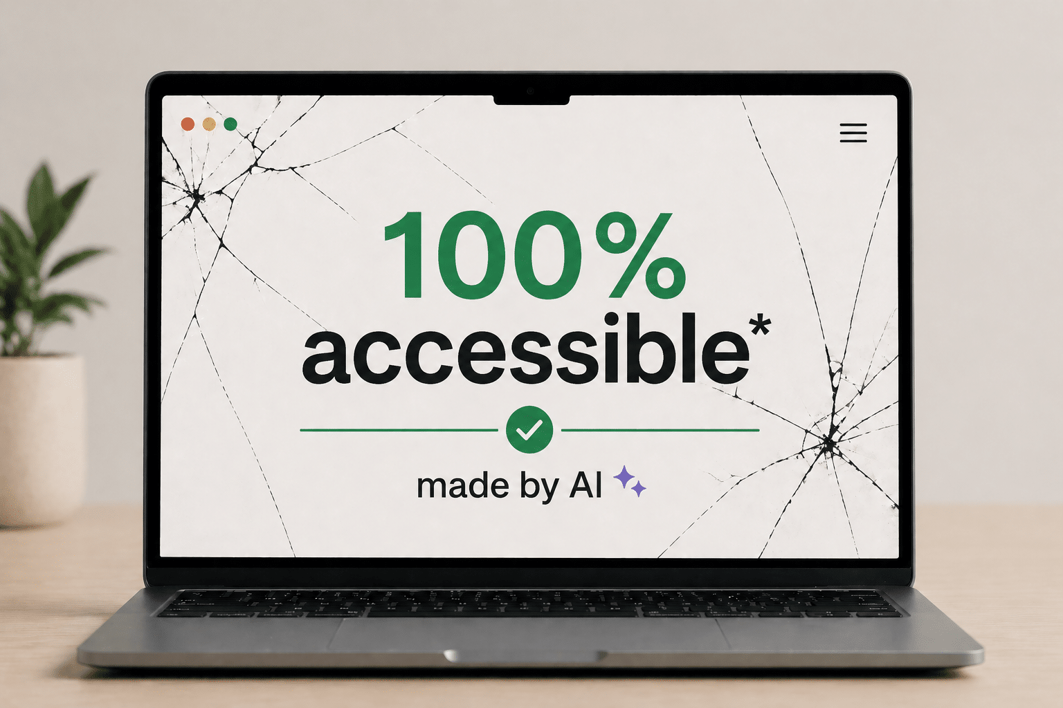
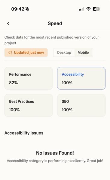
On paper the site was perfect. It got a 100% accessibility score in Lovable’s Speed tool, that runs Axe. By the way: great to see that Loveable has an accessibility tool like this built in!
But how did it work in real life, for an actual assistive tech user? I’ll give a hint: it wasn’t 100%…
The issues
Getting stuck behind components
Let’s look at some of the issues, and I’ll begin with the most critical ones.
One of the most frustrating experiences for a screen reader user is when the visual layer and the code layer lose sync. When the menu was open, the screen reader kept reading content underneath it.
Check out the video if you can, but I’ll summarise it (and others videos later on) after the clip if you for some reason can’t want to watch it.
Basically, the video shows the menu being open, but the screen reader focusing on some object behind the meny. Which obviously causes confusion:
I thought I was in the menu, but it announced the thing I read before from the start page… probably underneath the menu, right? So that was weird!
This “ghosting” effect happened again with the ticket modal.
Here’s the clip on Youtube, for some reason I can’t embed it here in the article:
Buying ticket using VoiceOver on AI-built site (Youtube)
Here Daniel initally uses swipe navigation, where swiping right moves to the next item. It’s a common way of navigating when you’re in new interfaces, or for less tech savvy users. Using swipe navigation, he gets stuck behind the modal.
However, he manages to force focus into the modal when he switches to navigating by touch. Basically dragging his finger across the screen and having what’s underneath his finger read to him.
Far from everyone will figure out that they need to switch ways of navigating, and like Daniel mentions at the end, some users will have keyboards or braille displays connected and not use navigation by touch at all.
Hush! Stop screaming!
Automated security features together with a strange hidden region also caused a bit of chaos. This was the experience every time a new page opened:
So here we had two issues.
One was that there was a strange, hidden region at the top of the page saying “Notification alt+t”.
However, the most frustrating one was that the screen reader began automatically announcing “Cloudflare integrity” and “Verify if you are a human” repeatedly.
For a user trying to get an overview of a site, having a security bot interrupt your flow is the digital equivalent of a megaphone going off in a library.
This is a great example of the issues you can run into if you follow guidelines, but don’t test for the actual experience. The Cloudflare component does update its content, and then having it in a live-region is the general rule of thumb. However, in this specific case it hurts the screen reader experience tremendously, as you probably noted in the video.
Lost in the single-page application (SPA)
Because the site was built as an SPA, “navigating” to a new page didn’t actually trigger a traditional page load. When that’s the case, focus needs to be controlled so it lands in the proper place when new pages load. However, on this site, screen reader focus wasn’t handled well:
Focus was never managed… my screen reader tried to figure out what happened there so it put focus in that visual area where I pressed the link.
The result? Daniel landed on a heading halfway down the page, missing all the content above it.
When “Toggle Menu” tells you nothing
The first thing Daniel reacted to was the menu button. The button was labelled “Toggle menu”, so it wasn’t unlabelled (a common issue). So that’s good!
But there’s a better way to make menu-buttons accessible: using the aria-expanded attribute to indicate if the menu is expanded or collapsed. Let’s see Daniel’s reaction!
As Daniel noted:
It still says toggle menu… I’m not sure if it works because it doesn’t announce if I have expanded something.
So it wasn’t the least accessible menu button we’ve come across, but not the best either.
On top of this, if you use the site in landscape mode or on small devices, it’s not possible to scroll to the bottom menu options:
Missing heading levels
Headings allow screen reader users to jump between sections and understand the hierarchy of information. The AI-built site, however, sometimes skipped heading levels:
So the site skipped from Level 1 directly to Level 3. For a screen reader user this can feels like pages have been ripped out of a book—you simply don’t know if you’ve skipped vital information.
This was probably the most surprising failure on the site, since automatic tools easily can find and test for skipped heading levels.
Label mismatch
I don’t have a video for this next one, but there’s a “Get tickets” button.

The visual text is ‘Get tickets’, but it has an aria-label=”Register for tickets”. This means that the accessible name and the visual name don’t match.
Why is this an issue? Well, mainly because some motor impaired users will use voice control to navigate a site. They will say the visible name of the button, like “Click get tickets,” and if the accessible name doesn’t include that phrase, nothing happens.
This is a clear requirement in WCAG: 2.5.3 Label in name and quite straight forward to test for. So come on AI, you should catch these sorts of things in the future!
Language Confusion
Finally, the language switcher, was inaccessible.
Here’s the clip on Youtube, for some reason I can’t embed it here in the article:
Screen reader user can’t tell which language is selected on AI built site (Youtube)
It just says ‘en button’ and ‘sv button’… I can’t tell which one is which really.
Additionally, the site didn’t include the proper lang attributes for the content that switched language, meaning the screen reader wouldn’t know to switch to the correct voice for the content.
Again, this is something that’s easily testable and the guidelines around it are super clear, so I was expecting more.
Summary
Daniel summarises his thoughts:
Here’s the gist of his quote in text:
In short, it felt okay to read content. But as soon as there was interactive content…there were some problems. Some more severe than others. So there’s still room for improvement to be kind.
Fixing issues from the sofa
So I think we can agree that the site wasn’t 100% accessible.
I do, however, want to end on a positive note.
Maybe the most exciting part of this experiment wasn’t the errors we found, but how fast they disappeared.
After I shared this feedback during a talk, there was a 10 minute q&a. While that was going on, the site creator sat in a sofa and fixed many of these issues using his smartphone. Including some of the more difficult issues regarding focus management and the leaking menus and modals. Very cool!
So with a human expert in the loop, AI tools are more likely to be able to create accessible sites.
However, at least 99.9% of the sites created with these tools will not have an accessibility specialist involved, nor will the site creator have prompted that accessibility is important. So I’m hoping that Lovable and similar tools work hard to make the out-of-box interfaces they build accessible by default. That would be an awesome achievement, however, we seem to be far from that place at the moment.