My dad and his TED app
I love to watch my dad use technology. It’s such a great learning experience for me as an interaction designer.
He is 57, wears glasses when reading and always delays getting a new phone until his old one completely stops working. You see, he does not like to learn new technology. He just wants his stuff to do what he needs it to do without having to think.
My dad does a lot of long distance flying. So recently, he asked me:
Can I download TED-talks to watch on flights?
I answered as I always do to that type of question:
I don’t know. Try!
Then I stood behind his shoulder looking at how he tried to solve it. Not helping, just looking. I love it! The only thing missing was a bowl of popcorn.
He quite quickly found a video. He looked at his options. Four icons.

He hesitated a bit, looking through them. It could be the heart or the list icon with a plus sign. But he decided to go for the down arrow. It looked the most correct. Which it was. But he clearly felt a bit unsure.
He got some sort of notification that a file was downloading by the Android operating system. But then he immediately started looking for the downloaded clip in the app. Did it work? Where was it now?
The main menu of TED is a collection of five icons:
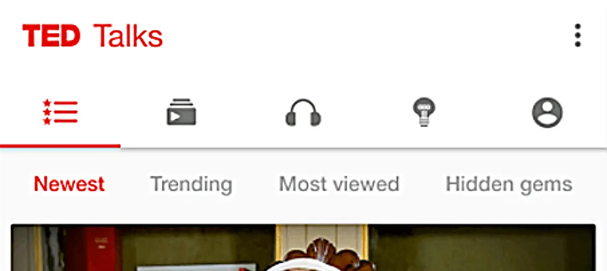
My dad started clicking the icons one by one, clearly not understanding what any of them meant. He could not rule out a single icon. Since he felt unsure of them all, he gave each page a very limited amount of scanning.
When he couldn’t find the downloaded clip in the app he went out of the app and looked for some kind of folder where the video could have ended up. “Maybe it’s in a Downloaded folder” he mumbled. Clearly hoping his Android had a file system like his computer. Which it does, but not as visible as on desktop computers so he couldn’t find it.
Then he gave up. It’s not worth it.
So I had to step in and help, and I found the downloaded clip under the last icon, the one that looks like a user profile. He had clicked that but not had the energy to look closely enough. Too tired from checking every other place that he thought could be correct.
So this story illustrates one key problem with how many interfaces use icons…
Icons could mean a lot of things
The icons are given meaning by the user, in regard to the task they’re carrying out at the moment.
Icons are like abstract paintings. They get different meanings for different people. It’s all through the eyes of an observer. And that ambiguity is really exciting with art. But not so much in user interfaces.

What’s the icon for offline downloads? It could be a folder, star, heart, down arrow. Or even a profile icon, like in the TED app. It’s very hard to rule out any one icon.
So what I’m trying to say is that icons don’t work alone.
Icons should have labels
When icons are used to save space, things go wrong. Icons should not be used in that way. To a designer of tight mobile interfaces, using an icon to save space is really compelling. At first glance, the interface looks so clean and tidy!
However, for the user it’s usually the second glance that counts. The one where they look at the icon when they are carrying out a task.
My dad doesn’t give a poop that the interface has a clean first impression if it confuses him when he’s trying to get something done. And your other users probably work in the same way.
You recognize an icon used to save space by a lack of a text label.
Icons without labels suck
Here are some examples of interfaces with labels without icons.
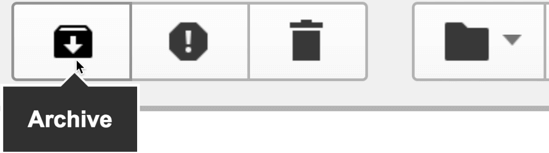
The Gmail app. It took me – an interaction designer – an eternity to find the “Mark as unread” feature which I want to use all the time. It’s the mail icon. And the box with the down arrow means “archive”, not “download”.
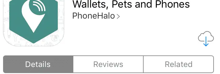
I recall at least three different people I’ve had to help download an app from the App Store after they exclaimed “where the hell is the download button?”. Yes, my dad is one of them. A cloud with a down arrow? Apple, you can do better than that.
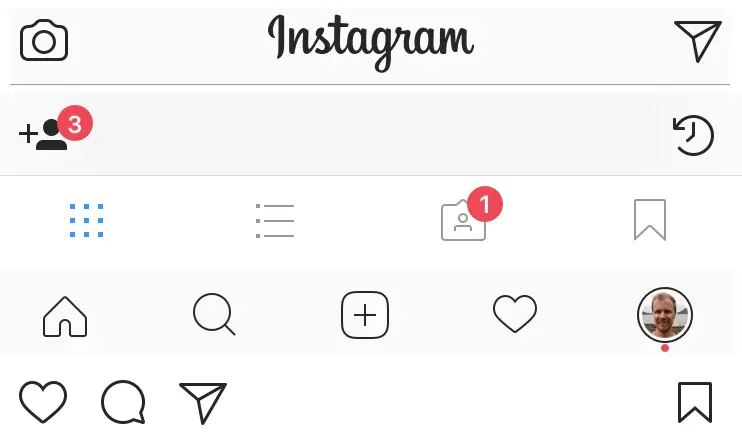
Instagram is packed with icons without labels. You can probably guess what they do, but you probably have to do a fair bit of thinking and you’ll not feel totally confident. You should aim to make your users feel confident.
Icons without labels are not only a problem in digital interfaces. Ever wondered why you always use the same setting on your oven, dishwasher or washing machine? Probably because you have no idea what the other features mean.
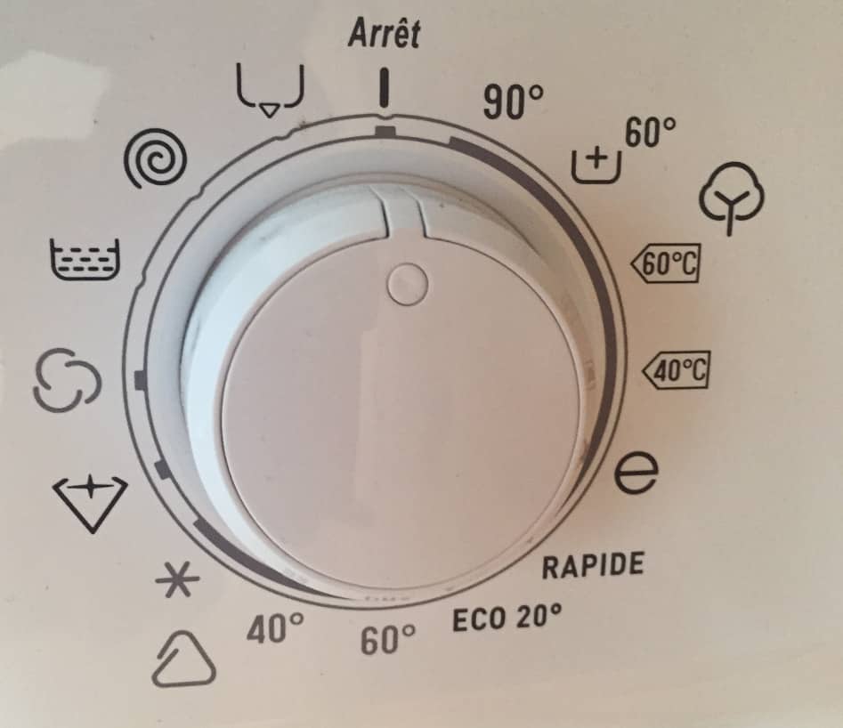
Here’s a washing machine I came across in France that made me go “Merde sacré bleu”!
Icons + labels = true love
If you label icons, they suddenly become awesome, accessible and understandable. An icon with a label:
- makes it easier for the user to find the most important features – the ones with icons.
- makes it easier to remember where you clicked the next time you come back.
- makes the interface more aesthetically pleasing than if there were just text buttons.
A text and icon combination also improves the experience for people who have a hard time reading, like many users with dyslexia, autism, aphasia or other reading impairments.
Icons with labels are awesome
Below are some examples of interfaces that label icons.
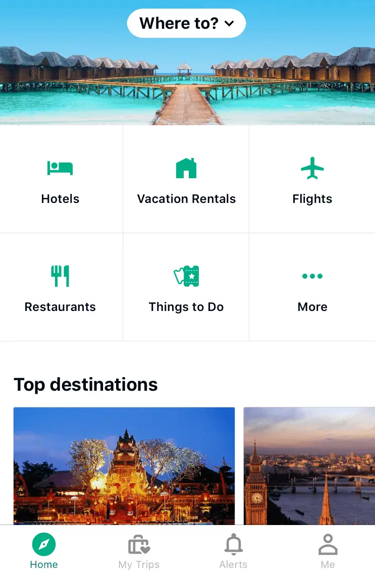
The Tripadvisor app uses icons with text labels on their startpage and on their tab navigation menu.
Just for comparison, here’s what it would look like without the text labels.
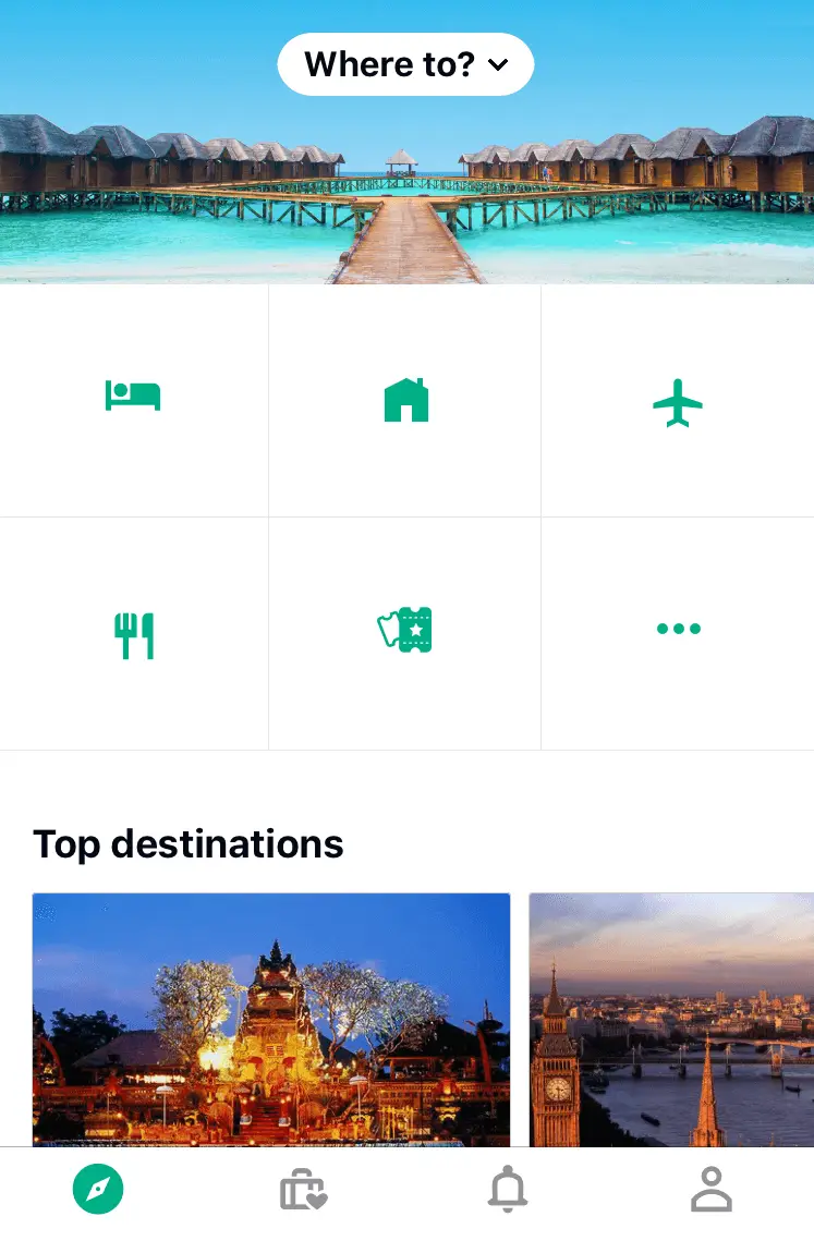
Not as clear without the labels, huh?
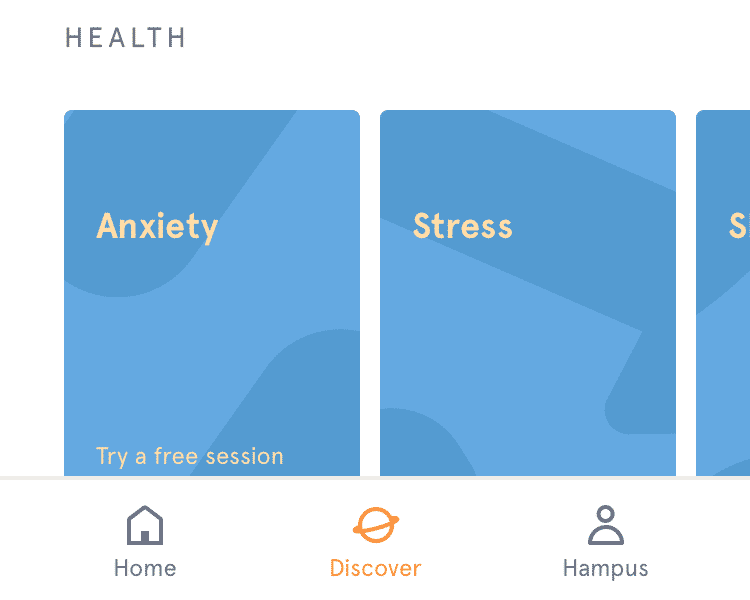
Headspace uses text or icons with text labels. Never icons by themselves.
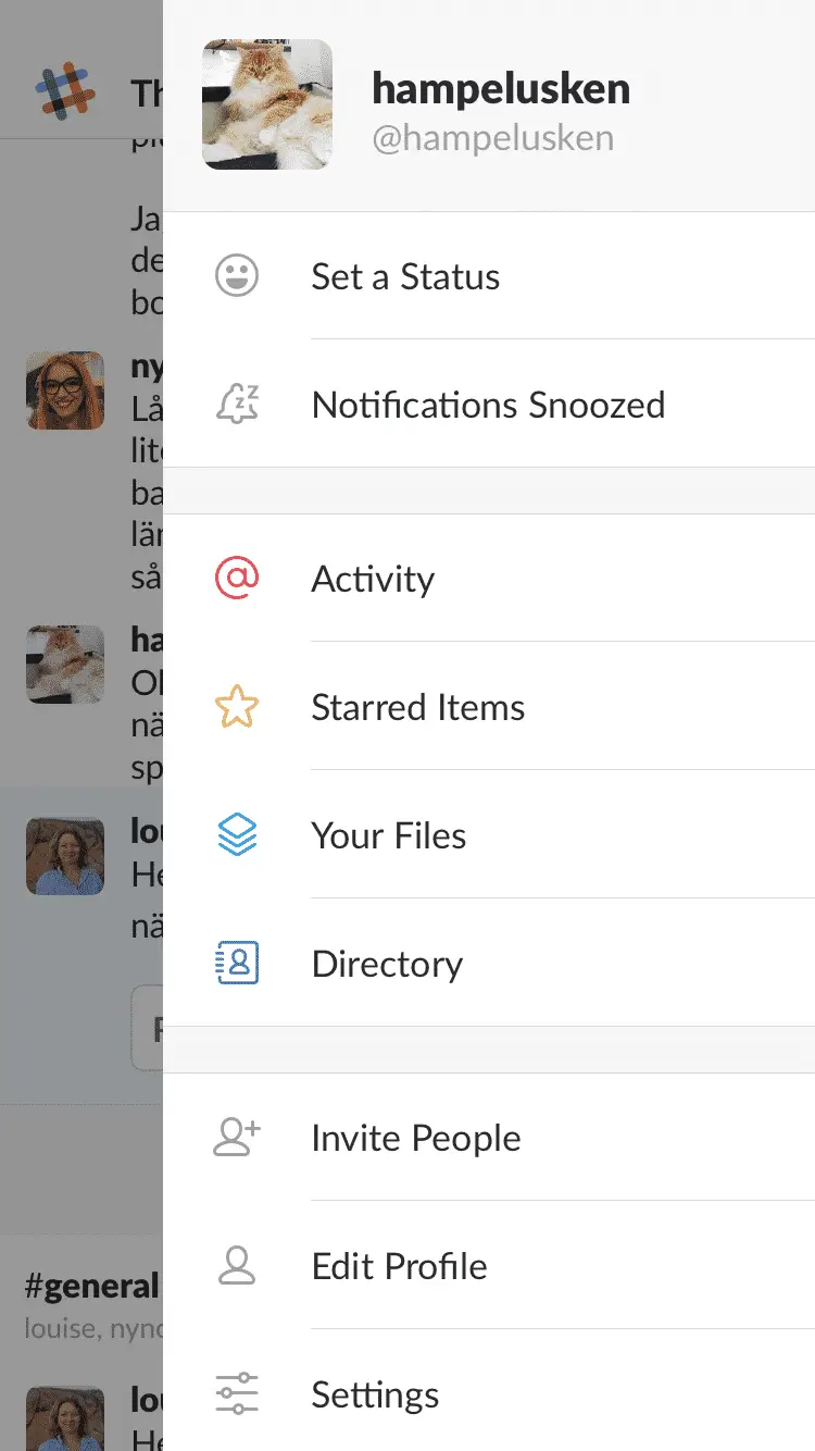
Slack uses icons with labels in their menu. They also use colors to highlight some of them. Together this assists their users’ memory and lightens up the look and feel.
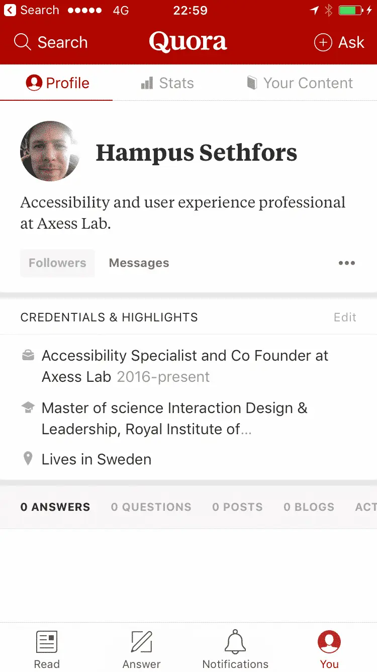
Quora uses icons with text labels both in the header and footer of their app.
But hey, I’ll just show a tooltip!
Are you considering solving the “my-stupid-users-don’t-understand-the-icons” problem by showing tooltips when the user hovers over icons? An understandable – yet not excusable – mistake.
Why is this not a good solution? Well, two main reasons:
- You can’t hover on touchscreens.
- Not all users use a mouse, for example a lot of people with motor impairments. Lesson one in accessibility is to make it possible to navigate your interface using a keyboard only.
Yes, there are exceptions
There are some icons you can use without a label. Like a trash can for delete:
Or the magnifying glass for search. But even that icon’s functionality can differ. Sometimes it means zoom or preview:
The main thing to know is that the number of universally understood icons are far fewer than you think.
If you’re reading this post, you probably live in a bubble where your the people you hang with are far more tech savvy than most people out there. So just because you and your friends and colleagues know what the icon means, doesn’t mean everyone does.
Kids now days don’t even recognize the floppy disk as a save icon. Oh my! Where’s this world heading?
Another good example is the hamburger menu icon. You probably know what it’s for. And it’s in interfaces everywhere! But A/B tests have shown many people don’t use the hamburger menu icon if it’s missing a label.

Icon guideline
So lets boil down this post into a simple icon guideline:
Awesome: Icon with text label
Totally fine: Text with no icon
Almost never cool: Icon without text label
Or to make it even shorter:
Stop using icons to save space.