As an iOS developer, I remember thinking: “Surely this is easy to fix. Why does this problem still happen?”
So, naturally, I decided to intentionally build the most impossible-to-fix iOS app I could imagine, just to prove a point: if this can be fixed, then the same method can fix anything.
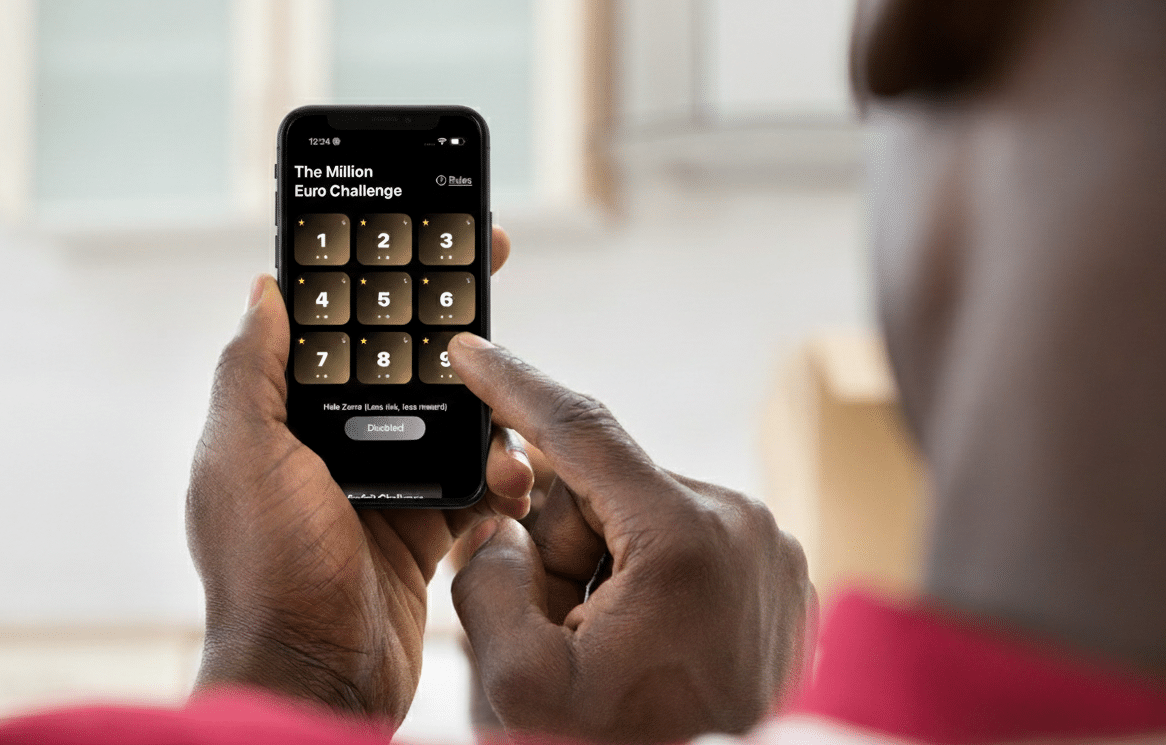
The Most Chaotic App I Could Build (On Purpose)
I built a tiny “game” that’s basically a psychological experiment disguised as a SwiftUI app: a 3×3 grid of playful tiles numbered 1 through 9. Behind them are four zeros, three small prizes, one €1M tile, and one haptic “shock.”
Players can take their single chance by tapping a tile, use “Hide Zeros” to remove the duds (at the cost of halving all prizes), or simply forfeit.
To push accessibility to its absolute limits, I deliberately filled the UI with decorative shapes stacked everywhere, purely to confuse assistive technology.

Watching Three Accessibility Systems Fall Apart
VoiceOver completely falls apart in this UI.
It treats every tile as several unrelated elements instead of a single action.
It first navigates a row of decorative images, then the tile numbers, then another row of decoration. Each tile ends up being five separate, non-adjacent items, none of them announced as buttons.
The “Rules”, “Forfeit”, and “Hide Zeros” elements are split into a pair of items each, and double-tapping the latter doesn’t work.
Navigating becomes a maze of noise.
To Full Keyboard Access, the interface is impossible to navigate.
Because I rely on VoiceOver, it is running in all demos.
Pressing Tab cycles only between the Screen Recording button and a single “disabled” region that represents the entire app.
None of the app’s elements can receive focus.
To the system, there is literally nothing interactive on screen.
Same issue with Voice Control: nothing is recognized as a button.
Voice Control offers zero commands in the app, not a single button name appears.
Even the tile numbers (“one”, “two”, “three”, etc.) don’t work as voice commands: the UI has no semantic structure, so the system can’t guess what’s interactive.
For all three accessibility systems, this app is a complete void.
Small Fixes With Great Impact on Usability
At this point, you’d think the solution requires custom actions, accessibility overlays, rewritten components, or rebuilding the app from scratch.
But no. All I needed were two tiny changes:
Group each tile’s internal visual elements so VoiceOver perceives the tile as a single thing, not many fragments.
Add the .accessibilityAddTraits(.isButton) modifier so iOS knows these elements are actions.
Here’s the simplest version:
// code block 1
ZStack {
    // unchanged chaotic visual layers
}
.accessibilityElement(children: .combine)
.accessibilityAddTraits(.isButton)
Sometimes combining the children wasn’t ideal, so I ignored them and added a custom label. Also, I needed a different approach when the user would hide zeros.
So a second pattern was necessary:
// code example 2
ZStack {
    // unchanged chaotic visual layers
}
.accessibilityElement(children: .ignore)
.accessibilityLabel(hideZeros ? "0" : tileNumber)
.accessibilityAddTraits(hideZeros ? .isStaticText : .isButton)
.disabled(hideZeros)
That’s it. No magic, no custom routing, just proper semantics.
Three Accessibility Systems Fixed at Once
Using VoiceOver, all the decorative noise disappears.
Each tile is now a single clearly announced element like “1, button,” “2, button,” and so on, plus the three action buttons.
VoiceOver even correctly reports dimmed zero tiles after using the “Hide Zeros” option.
Navigation becomes linear, predictable, and effortless.
Using Full Keyboard Access, all elements can be navigated through.
With semantics in place, the system can finally tab to each tile and to the “Hide Zeros” button.
Dimmed elements correctly prevent activation.
Nothing else changed, only the traits.
And with Voice Control, everything works now.
With proper names and traits, Voice Control immediately identifies the tiles and UI actions.
Users can activate actions by speaking the tile numbers or the action buttons, and it just works!
No special routing, no custom speech commands, no keyboard-shortcut handling…
Just proper semantics.
Final Thoughts: Accessibility Isn’t About Extra Work — It’s About Clarity
My absurd little 3×3 experiment taught me something important: .isButton isn’t just a convenience trait — it’s a foundational piece of accessibility across the entire iOS ecosystem. VoiceOver, Full Keyboard Access, Voice Control, Switch Control, and other assistive technologies all depend on these semantics.
Grouping elements and adding a single trait was all it took to turn an impossibly inaccessible interface into a fully navigable one.
Accessibility doesn’t mean adding complexity, it means giving the system the information it needs to help every user regardless of how they interact with your app.
If a UI as chaotic as this can be fixed with two modifiers, imagine how much impact you can have on a real-world interface.
The GitHub project repository can be found here.
I’m deeply passionate about both iOS development and accessibility. If your iOS team needs someone who truly cares about accessibility and great user experience, I am open to new assignments. Drop me an email at diogo@axesslab.com.