What is glassmorphism?
Combining the words “glass” and “skeuomorphism”, the latter derived from the Greek words “skeuos,” (tool or vessel), and “morphe,” (shape). Stated otherwise, glassmorphism is a design technique inspired by glass as a physical material.
Glassmorphism design trend has become rather popular on contemporary user interfaces, including Windows 11 and macOS Big Sur. These days, the trend is followed by Microsoft’s Fluent Design System and Apple via Liquid Glass intended for OS releases in 2026. Its futuristic yet tactile sensation comes from its elegant, frosted-glass form.
Glassmorphism appeals clearly since it creates a visual richness, lightness, and elegance. It defines spatial connections among UI components rather successfully without depending much on shadows or borders. For many designers, it presents a convincing way to improve the polish and elegance of digital products.
But this visual appeal begs a serious concern: How accessible are glassmorphic user interfaces?
For consumers with visual, cognitive, or motion-related disabilities, this style offers great challenges even if it is aesthetically pleasing. Transparency may reduce text contrast; blur effects may cause sensory pain; layered depth may distort information hierarchy. These issues run the risk of excluding a sizable portion of the user population, especially those who use assistive technology or perceive visual information differently.
Here we will look at the potential accessibility risks that glassmorphism poses and how we can eliminate them. Whether creating a bespoke design system, native OS UI, or a web application, you will find strong practical ideas to make sure the frosted glass effect does not unintentionally exclude users.
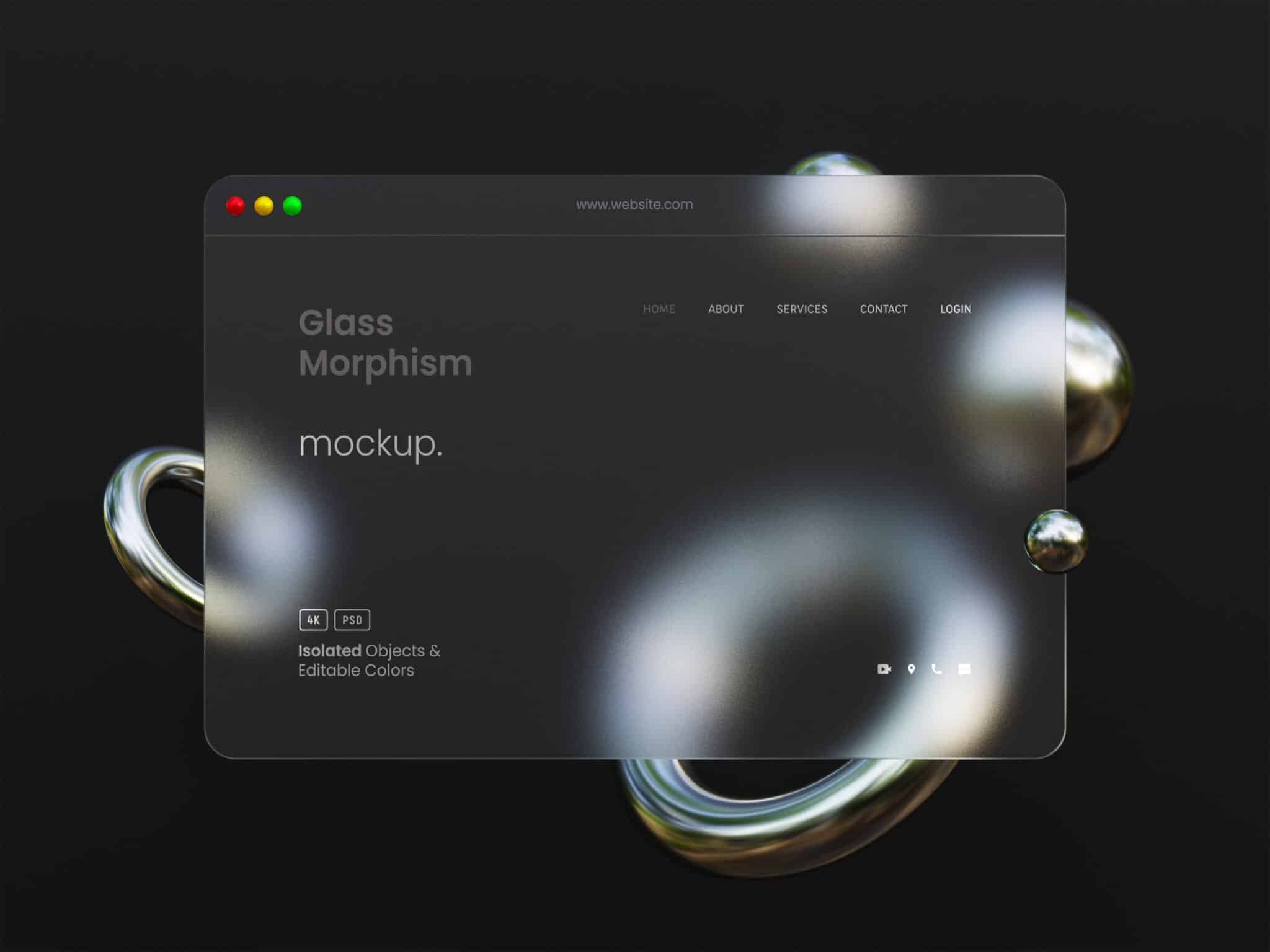
What makes glassmorphism visually appealing?
The goal of glassmorphism is to make digital interfaces look like frosted or translucent glass. By using depth, blur, transparency, and delicate shadows, it creates a multi-layered, nearly real digital environment that is both immaculate and sophisticated.
Glassmorphism is defined by several key elements:
- Translucent layers: Usually with a gentle blur, elements show a portion of what is behind them. This creates the illusion of transparency and depth, similar to looking through frosted glass.
- Effects of blur: Background blur is essential because it highlights the “glass” effect while softening what is behind translucent elements, maintaining readability.
- Soft borders and highlights: Panels often have a bevelled, floating appearance that adds dimension when delicate borders and inner shadows are used.
- Bright backgrounds: Glassmorphism works best when it is applied on top of dynamic images or bright gradients that highlight the transparency.
- Minimalism: The effect works well with simple, minimalist designs, where the glass layers’ visual impact is enhanced by their simplicity.
When used properly, glassmorphism can give interfaces a modern, flowing, and engaging feel. It exudes a feeling of high-end, superior visual quality that is captivating and dynamic. Additionally, it enables designers to create a visual hierarchy without the need for distinct divisions, resulting in interfaces that are more elegant and complex.
Despite its obvious aesthetic appeal, its reliance on visual effects creates a delicate balance that is prone to breaking if accessibility is not incorporated from the beginning.
Accessibility concerns
As visually striking as glassmorphism can be, its core features (transparency, blur and layering) can introduce serious accessibility pitfalls. These issues are not just theoretical; they directly impact users with visual and cognitive impairments.
Let’s break down the most common concerns:
Low contrast
One of the main concerns with glassmorphic design is low contrast.
When text and icons are placed on semi-transparent backgrounds, especially over colourful images, the contrast ratios often fall short of WCAG 2.2 requirements. While larger text and user interface elements require a 3:1 contrast ratio, body text requires a 4.5:1 contrast ratio. As a result, reading the content is difficult for people who have age-related vision problems, colour blindness, or visual impairments.
The truth is that many users find the text hard, if not impossible, to understand, despite the fact that designers may find the aesthetic balance appealing.
Background interference
Glassmorphic layers allow for the visibility of background elements such as colours, shapes, or motion even when blur effects are present. This may result in distracting visual clutter that obstructs the content.
Additionally, dynamic backgrounds like videos, animated gradients, or scrolling elements are making this problem more noticeable, which makes it especially difficult for people who struggle with cognitive impairments or information processing and focus.
Motion & blur sensitivity
Animated effects like parallax and layered transitions are commonly used in glassmorphism, and they can make people with vestibular conditions feel lightheaded or queasy. Furthermore, the blurring effect can strain the eyes, particularly when used excessively or for prolonged periods of time.
Furthermore, these effects demand significant system resources and Graphics Processing Unit (GPU) power, which may impair performance on devices with lower power. This situation disproportionately affects users who have financial or other constraints.
Disrupted focus & information hierarchy
The distinctive softness of glassmorphism adds a sense of elegance, but if it is not applied with discipline and with careful planning, it can also create ambiguity. Establishing distinct visual hierarchies is made difficult by elements’ tendency to blend into backgrounds.
As a result, design elements might not be clear and evidently interactive, which could lead to users—especially those who use screen magnifiers or quickly scan for interactive regions—missing crucial controls.
Incompatibility with assistive technologies
Visual effects and semi-transparent layers do not always work well in high-contrast modes or by using screen readers. These elements may become obstacles to the user experience in the absence of semantic structure, appropriate labelling, and fallback designs.
Designing accessible glassmorphism
Glassmorphic effects can improve usability and aesthetics when applied thoughtfully and with empathy. The secret is to avoid making accessibility an afterthought and to design with inclusion in mind from the start. The objective is to tame glassmorphism, not to give it up.
The following useful tips will assist you in maintaining the elegance of glassmorphism while making sure your user interfaces are accessible and usable by all:
Maintain strong contrast
The most important rule: never compromise on contrast.
- Ensure all text and essential UI elements meet or exceed WCAG 2.2 contrast minimums (4.5:1 for body text, 3:1 for larger or bold UI components).
- Use background overlays or semi-opaque fills behind text to separate it from underlying content.
- Do not rely solely on blur. It softens the UI, but it does not guarantee sufficient separation or legibility.
Offer reduced transparency options
Respect user system preferences with the prefers-reduced-transparency media query or platform-specific accessibility APIs.
In most OS, users can reduce transparency in the platform. Your UI needs to comply to those user preferences.
Control motion & blur intensity
Use blur and animation sparingly and test across a range of user needs. It is suggested to:
- Avoid excessive blur strength (especially
backdrop-filter: blur(20px)and higher). - Reduce animation duration and complexity for interface transitions.
- Respect the
prefers-reduced-motionmedia query and provide fallbacks.
Reinforce information hierarchy
Do not let form override function. Use visual cues that reinforce content structure. It is suggested to:
- Combine transparency with subtle borders or shadows to define layers.
- Use clear spacing, padding, and alignment to indicate hierarchy.
- Avoid placing critical information on heavily textured or animated backgrounds.
Test with real users and assistive technologies
What looks elegant in your designs might break down in practice. Ensure your designs are robust by testing them under real-world conditions:
- Use screen readers like VoiceOver, TalkBack or NVDA to evaluate accessibility.
- Test contrast and legibility across various levels of visual acuity and colour vision.
- Simulate device performance on low-power or older hardware.
- Consider scenarios like high-contrast mode, zoom/magnification, or dark mode
Conclusion
Once thought to be a passing trend, glassmorphism is now a fundamental component of modern UI design. Large tech companies use it because of its intricate and multilayered design. But this strategy requires careful thought. Visually appealing interfaces may unintentionally impact user experience and exclude users if motion, transparency, and blur effects are used without giving accessibility top priority.
Thankfully, inclusivity and artistic excellence can coexist. We can produce experiences that are both contemporary and accessible by putting careful design principles into practice, such as maintaining contrast, offering choices for less transparency, and taking user motion preferences into account.
As developers and designers, we have a duty that goes beyond aesthetics. In addition to being aesthetically pleasing, a truly excellent interface is also useful for all users.
Need help with your design? Send us an email at hello@axesslab.com or read more about our UX design services.