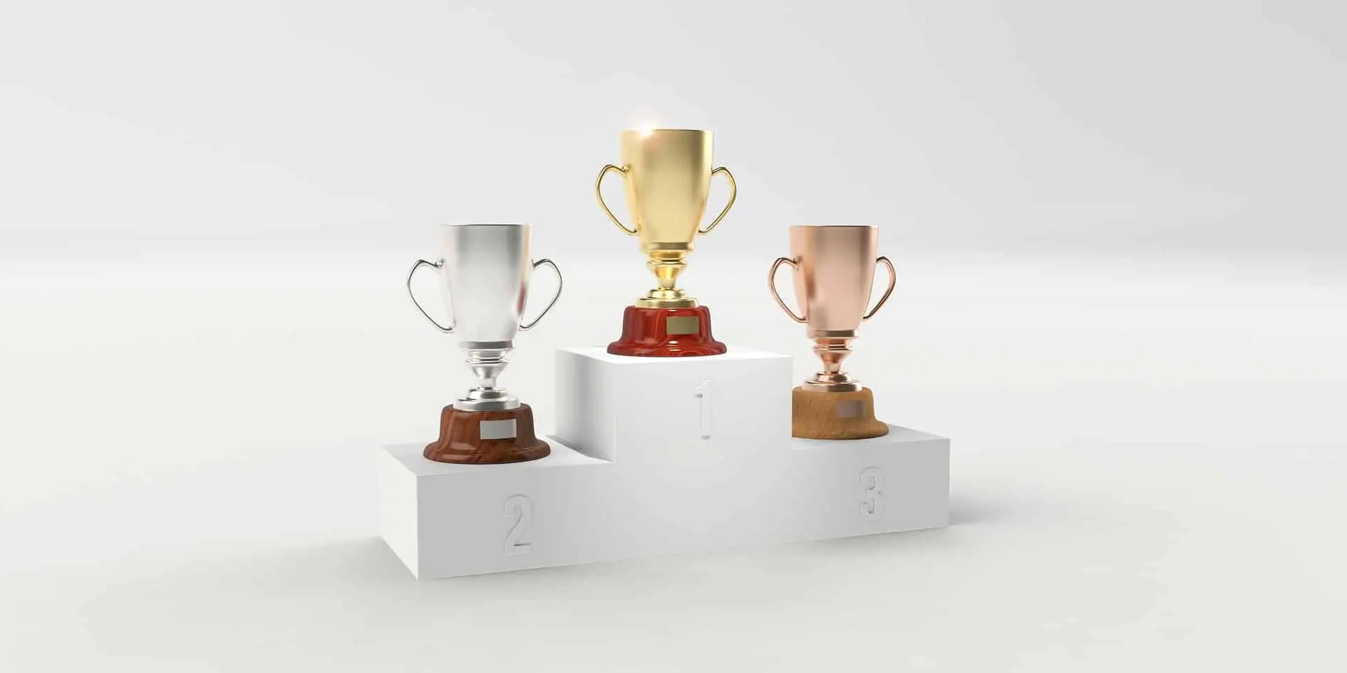
The podium
Here are the top three. Congratulations!
Accessibility According to Actual People with Disabilities
🥇 43 000 page views
“If you have a disability, what’s the hardest thing about browsing the web?” We sum up the answers to a viral Twitter thread.
How Icons are Ruining Interfaces
🥈 18 300 pageviews
More and more designers are using icons in the wrong way. And it’s hurting both the usability and accessibility of interfaces.
Alt-texts: The Ultimate Guide
🥉 15 200 pageviews
Practical tips on how to craft the perfect alt-texts. We also go through when to – and not to – use them.
Happy losers
Here are some articles that fought hard but just missed the podium. Ouch!
Disabled Buttons Suck
Showing buttons as disabled might seem like a good idea. It is not. Here’s why disabled buttons suck and what to do instead.
Fonts Don’t Matter
If you’re an art director, you might want to sit down for this. Here’s why fonts are overrated and what actually matters for readability.
Top 7 Free Color Contrast Checkers
Seven great free tools that help you measure color contrasts and create beautiful, accessible color schemes